
The images:

Click to enlarge
Image #1
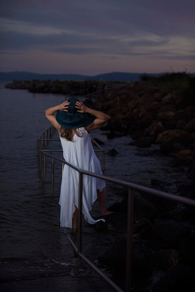
Let’s start with the simplicity here in this first photo. This is potentially a great landscape image that we’ve ruined by introducing a human. It looks like the leading lines through the frame were done deliberately, which is a very good thing.
Posing
A big issue I see is the pose. Posing is just as much part of the image as anything else and with this particular image, there are many things left unsaid. Why is she holding her hat? If you look at the water it’s very calm, so it doesn’t look like she’s holding her hat because it’s a windy day. It just looks like it’s hands-up, right? It doesn’t make much sense.
Off-Camera Flash
I see what’s trying to be done with off-camera flash, but you’ve got to drive the point home and still make sure you’re creating a compelling image. There are good aspects to this photo, don’t get me wrong. I like the range of shot here, I like that she’s really popping, and I like that she’s the brightest part of the image.
I think more could’ve been done with the colors in the sky. It looks like it’s a sunset, so where’s that vibrancy? Where’s the purples and the pinks in the sky? In this case, some of the shadows could be lifted, maybe get a little bit of HDR punch in there, and then you’d have a more compelling shot.
Pro tip: DON’T OVERDO HDR.
The last thing about this photo I would change is I would have had her looking towards the light. By doing that, I would see the rim of her face and get more detail in the image.
Image #2

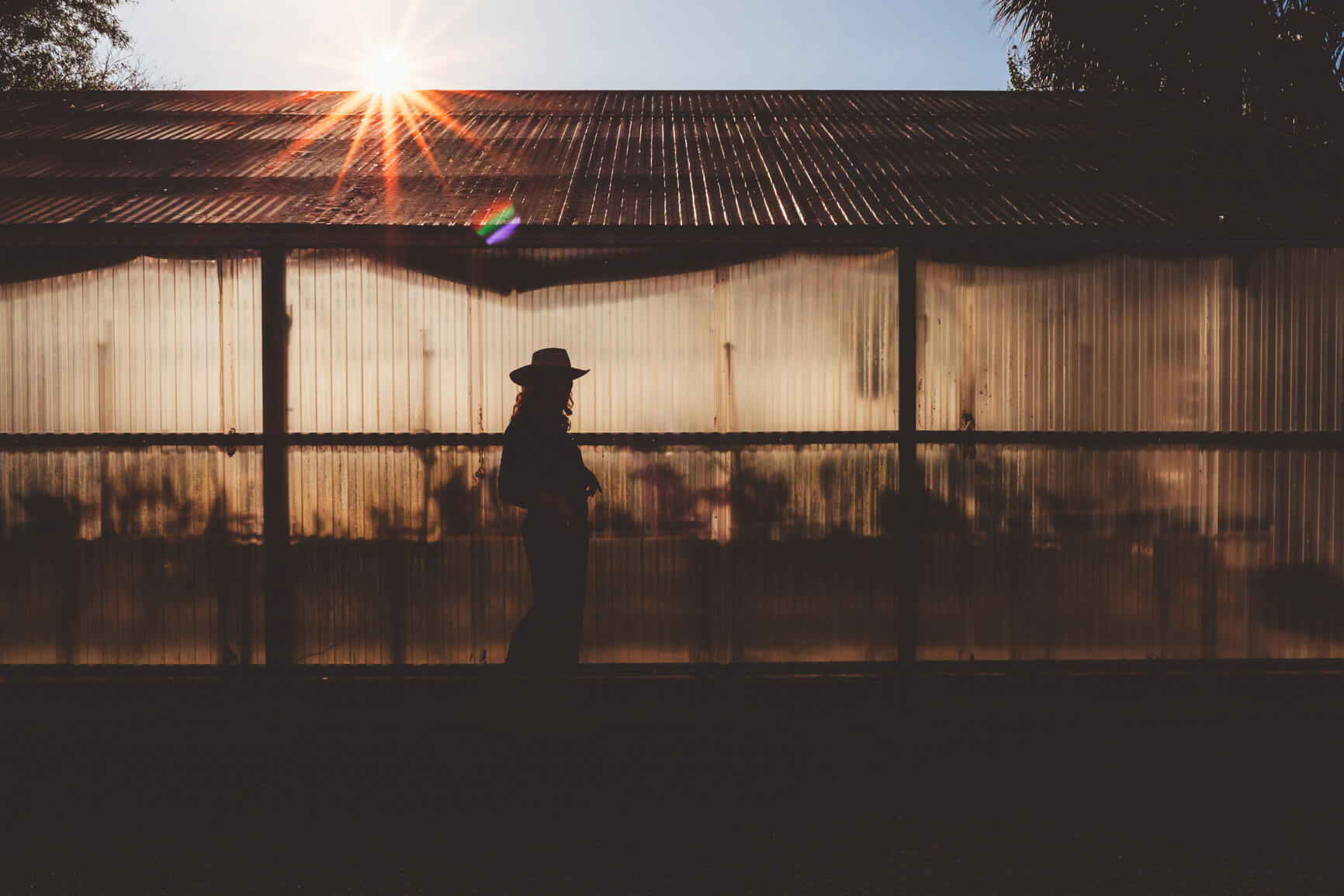
First off, I really like this image. The bones of the image are good, but there’s clearly some room for improvement.
The Crop
In an image, what’s in your frame is either adding to the shot or detracting from the shot. The crop is so important to a compelling image. In this image, there are a couple things that I believe are pulling focus away from the subject. One of them is the large dark area at the bottom of the image. If I crop that out, it instantly becomes stronger because of the crop.
Now, the second thing I’m seeing in this image is a little bit more open to interpretation: the sky. I see why the sky’s been kept in, because of the sun flare, but we have to keep in mind that people’s eyes will always go to the brightest part of an image. Right now, that’s the sky, so my eye just keeps getting lost up there, and the hard line of the roof is becoming a barrier to getting me to the subject.
The Pose
With a silhouette shot, it’s more difficult to master all the aspects of the photo, but here’s a tip on posing: Rather than having her look at the camera where her face is completely in shadow, have her look to the side so I see her profile. By doing this, you’d see the more of the outline of her face, including her nose, possibly her lips – that would’ve made it a better image.
Image #3
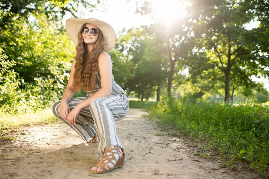
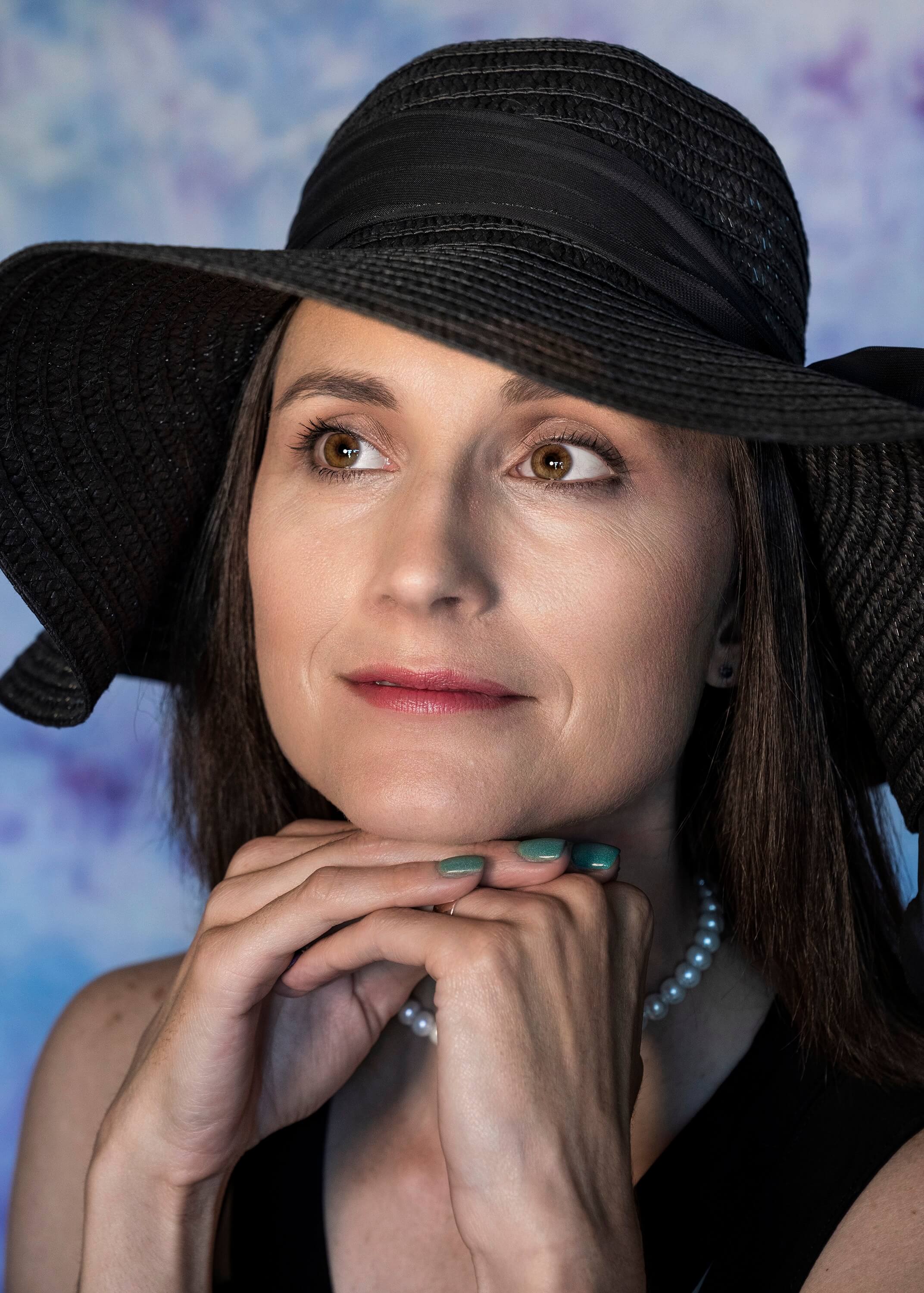
This image looks to be a fashion or senior image. I definitely like it, but let’s put some of our principles to the test here. Your eye will typically go to the brightest part of the image. Where is that? Well, right now it’s not where you want it to be; we’ve got a hot spot on the ground, and the sun in the background.
Fixing hot spots
The hot spot on the ground you can pretty easily fix with some dodging & burning in Photoshop. The sky is a little bit more tricky. I can see the photographer was going for a backlit, sort of blown-out look (which I love, by the way). What I do in those situations is change my perspective, which is called blocking. If this photographer had moved just a little bit to the left, her head would have been framed up really nicely in the gap of the trees, covering one of the brightest parts of the image with the subject, driving the eye there while keeping that nice sun flare.
There are other nitpick-y things that could be fixed in this photo, like filling in the gap in the trees on the right in Photoshop, and adding a little vignetting around the subject. A lot of people will be bothered by the foot in the wide angle lens, but that doesn’t bother me.
One last tip: OPEN UP THE HAIR!
All in all, there are some little things to fix, but this is a good image.
Image #4
Give the subject room to breathe
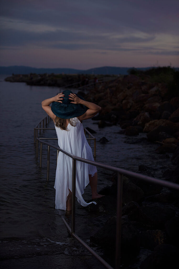
Alright, where do we start on this image? This is SO compressed as a portrait. This looks like an 85mm or 100mm – I have no idea how far away the photographer was – but I’m dying for some breathing room here. There needs to be more room around the edges. Her hat and shoulders are cut off. Again, because it’s so compressed we’re cutting off her forearms, so there’s two nubs popping out of frame. This is the first thing that can be fixed.
Angles
Keep in mind not to keep everything in the image so straight and one dimensional. I like creating angles in the body. It makes it more interesting and it drives your eye through the frame.
The hands
Something else worth noting here (that I know photographers NEVER want to hear about) are the fingers and hands. We have two major problems. The hands are super contrived, they don’t look comfortable, and it doesn’t look natural. The next part of this is the color of nail polish. I know you can’t control what your clients show up with, but you can control putting those hands in the frame.
What would I do in this situation?
- Not put the hands up in the frame and make them so prevalent.
- Change the color of the nail polish in Photoshop. It’s a 10-second fix to change the color of that nail polish, and it would tie it all together.
Get critiqued!
Have you ever wanted PERSONAL feedback on YOUR photography from Sal Cincotta?
Enter your images for a chance to see your work being critiqued by Sal! Need some guidance? Want to show off some of your best work? Submit your images here for a chance to see them critiqued.


