
The images:

Click to enlarge
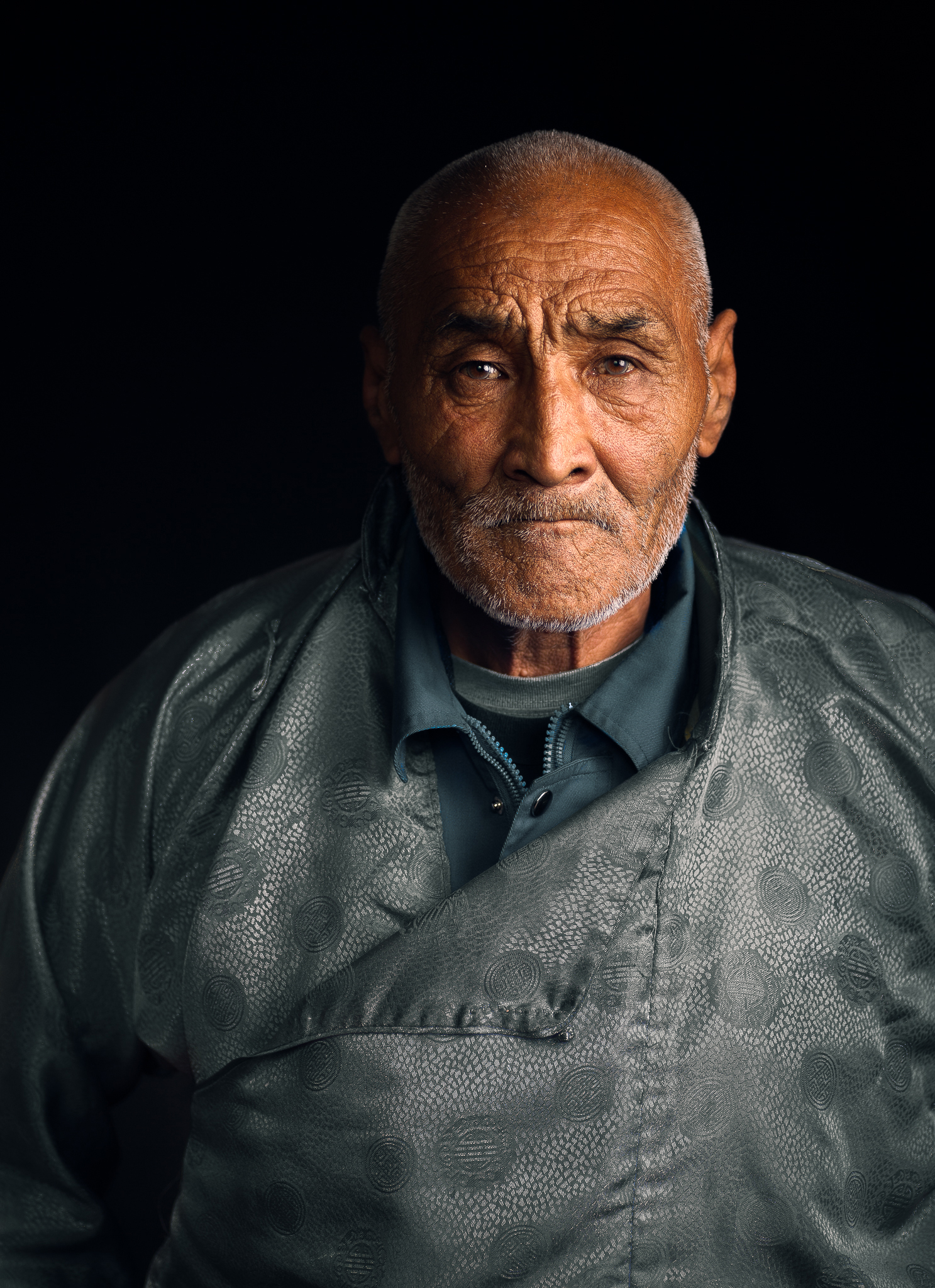
Image #1
First image up is a well-lit portrait. It looks to me like maybe it’s window light or an Octa, having a little bit of a tough time telling. It doesn’t matter. It’s great light, beautiful light. Lighting is always the tougher part, but the easier parts are the things we can control in post. These aren’t being done with this particular image. First of all, the crop is driving me bat shit crazy. Here’s what I would do. You’ve got a choice to make. You always have to ask yourself, the space that’s being left when we leave some negative space, some head room, is it helping or hurting the image? And you know, when photographers get together and they start critiquing stuff like this, if it’s not helping, the argument is always made that it’s hurting, right? I don’t see this head room as helping. I’d crop down farther. I think right out of the gate, that does make the image a little bit stronger because we’re getting right to his face.
Dodging & burning
Here’s the problem, his head is taking up such a small part of this frame, and his body in the foreground is really a distracting element. What I like to see down is his body dodged and burned down a little bit. The dodging and burning, the cropping, it all helps out in this particular case. So hopefully that helps you. Great portrait. I love the lighting on his face. There’s a story being told. I think it’s really good.
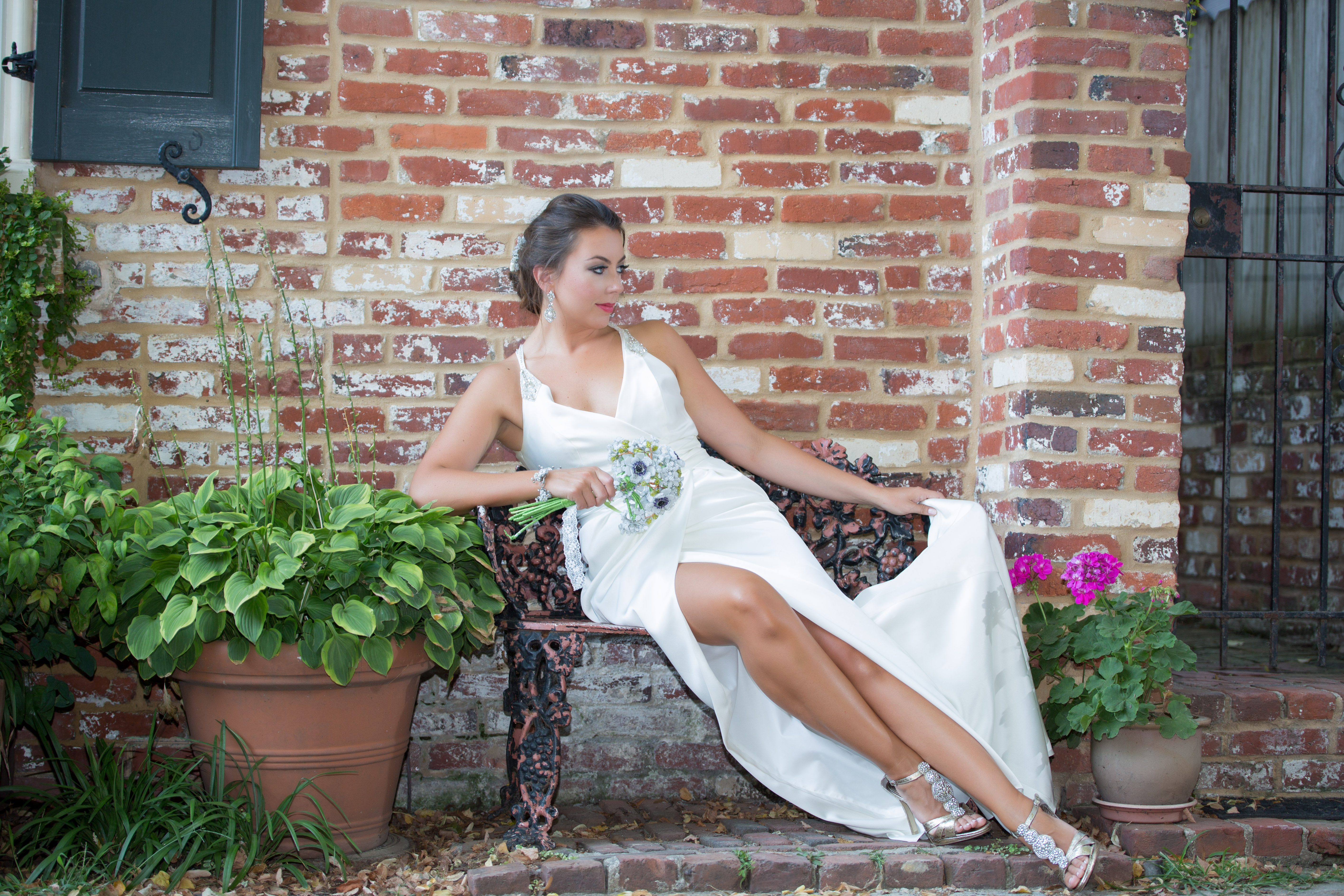
Image #2
Details
So a couple of things, guys, that are going to cause problems here. What’s all this dead grass? This is just dead grass in the frame. I’m looking at this particular image, I’m seeing that it looks like an abandoned house. Can’t quite tell if it’s an abandoned house or not, but it looks that way, feels that way. Maybe that’s what you’re going for. But that dead grass in the foreground is just a distraction. There are other places she could have been placed that would have allowed for this not to be such a hard, horizontal line through the frame. And then there’s all sorts of details that we have to start paying attention to. The necklace is causing a little bit of an issue for me. It’s crooked. The shine on her face. She is very, very shiny here, to a point where it’s not good on the portrait. Side note. Makeup artists are using that highlighter to accentuate cheekbones. It drives me nuts from a photography perspective because it reflects back into the camera. I don’t believe this is the case. I’m seeing a zit. We can clean that up.
Overall, we can burn this image down. There are some other vertical lines, the fence posts, that are competing for our attention and are very bright. Burn that down to get your subject to pop off that image and it even lessens the effect of the grass.
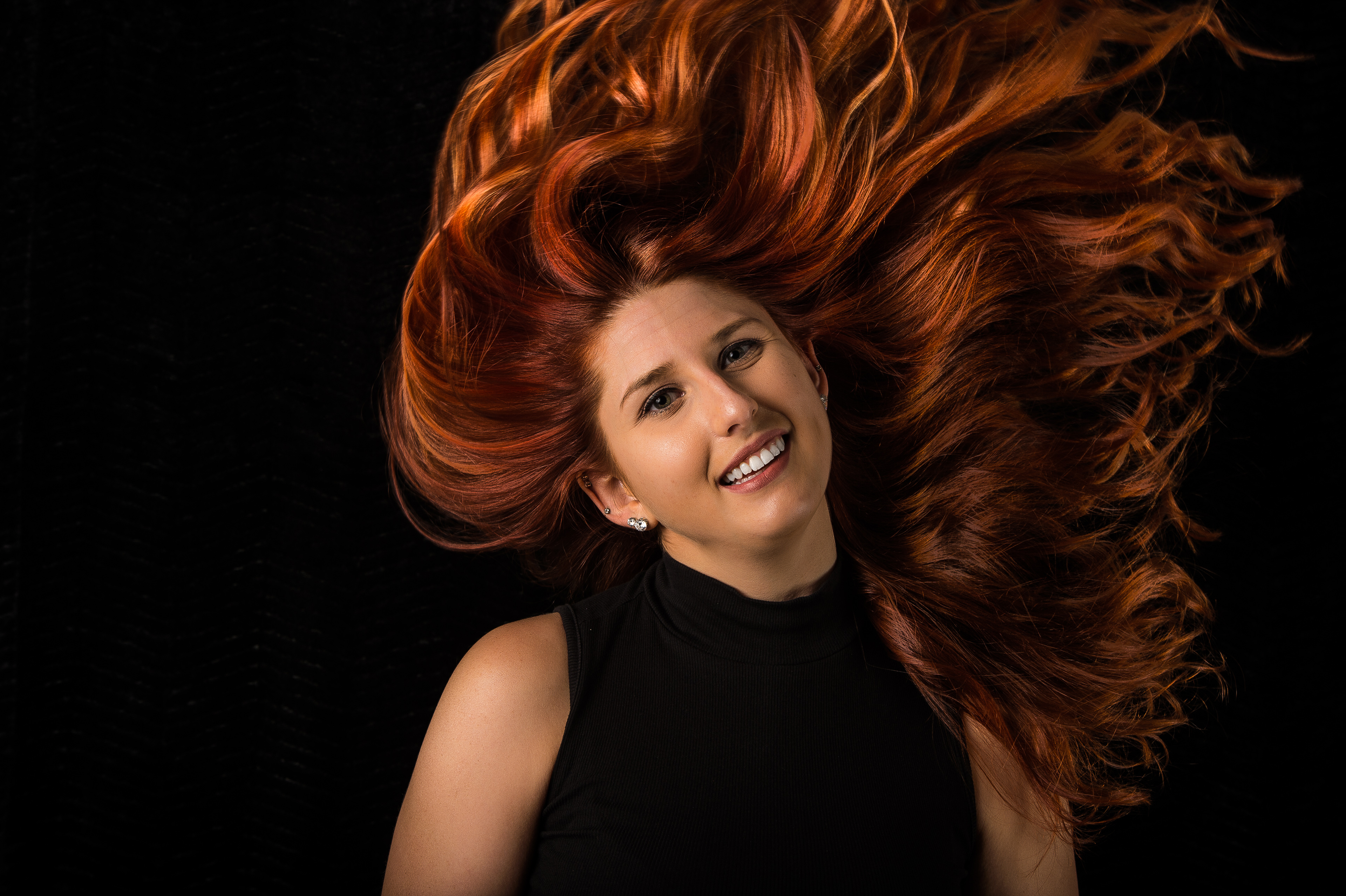
Image #3

The bride is sitting there, she’s holding her flowers. I kind of like the lines of her body coming at an angle. Doesn’t bother me, but there is something that really is bothering me. The area with the iron gate. This is something that is really a distraction because it’s turning this into two separate images. You always have to be careful when you’re shooting like this. You see the scene, it’s great, but you haven’t left yourself any breathing room, and you’re creating this hard, vertical line through the frame, and in essence creating two separate shots. This is something where we can fix in postproduction or fix at the time of capture. I wasn’t there. For all we know, off to the left is something equally as painful. I just have to assume that there’s breathing room on the left, or at worst case, we crop in on the right a little bit and we get rid of that distracting element.
Dodging & burning
You’ve got to start learning how to do simple dodging and burning. Now listen, you might be thinking to yourself, “I’m a naturalist. I’m a purist.” Here’s the thing, man. Just by adding a little bit of burning, she’s popping off that frame. This is not 20 hours in Photoshop. This is, two-minutes. You can do it.
Another thing that’s bothering me here, the bridge of the nose. The bridge of the nose is breaking at the cheek. If you’re going to turn so much to the side, the rule is to generally try to keep the nose from breaking the cheek.
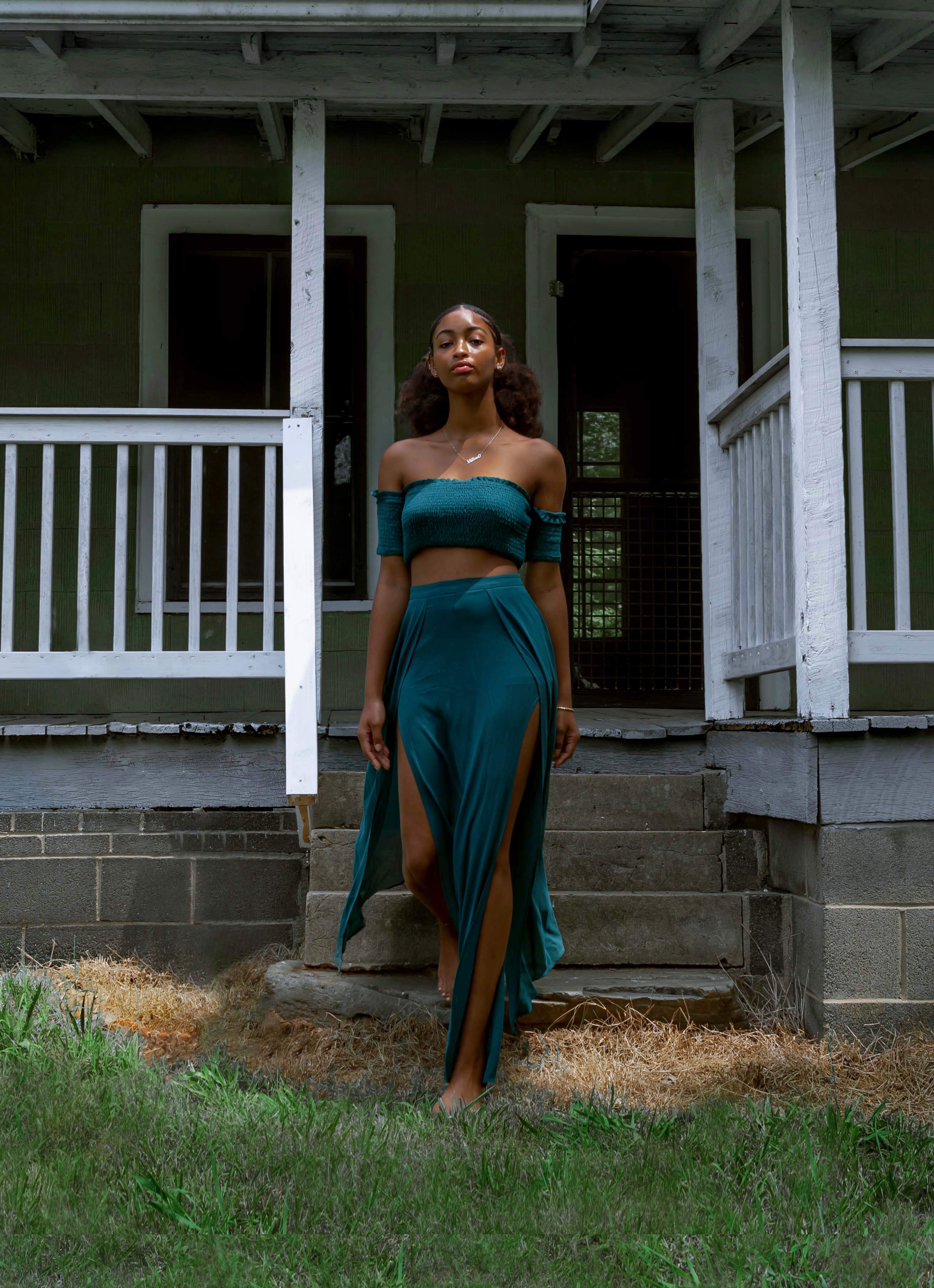
Image #4
I had to look at a few times to make sure that I appreciated what I was looking at. This is a tough shot, because what you’re trying to do is not only get hair, you’re also trying to get expression. Getting those two things to match is not always easy, but in the spirit of how-do-we-make-this-better, here’s a few things that did in fact jump out at me.
There is a pattern here on this background and it’s really difficult to see. We have a choice to make. Either light that background up so that we can see it and appreciate it, or get it dark, burn it all the way down so it’s black. This pattern is a tad bit useless. It’s not helping the image.
Something else I would like to have seen is a hair light to create more separation on that background. A hair light would have made this even stronger.
The next thing that could be done, we lost the top of her head, man. So, you got this whole thing planned out, hair’s going to come out, you missed the top. This empty space is not helping your image. This is hurting your image. So, crop this out. This is one of those cases where the crop is not helping. You could have cropped this and given it a little bit more height. That block area is not useful in the particular image.
Pose
Finally the elephant in the room, her pose. She was thinking so much about her hair and her head that her pose just didn’t hit the mark. She’s like, “Eh, look at my hair.” It’s not a pleasing portrait. I think in a shot like this, you get overly excited because you’re like, “Nailed the hair.” But the portrait we didn’t nail on this particular one.
Get critiqued!
Have you ever wanted PERSONAL feedback on YOUR photography from Sal Cincotta?
Enter your images for a chance to see your work being critiqued by Sal! Need some guidance? Want to show off some of your best work? Submit your images here for a chance to see them critiqued.


