
The images:
Click to enlarge
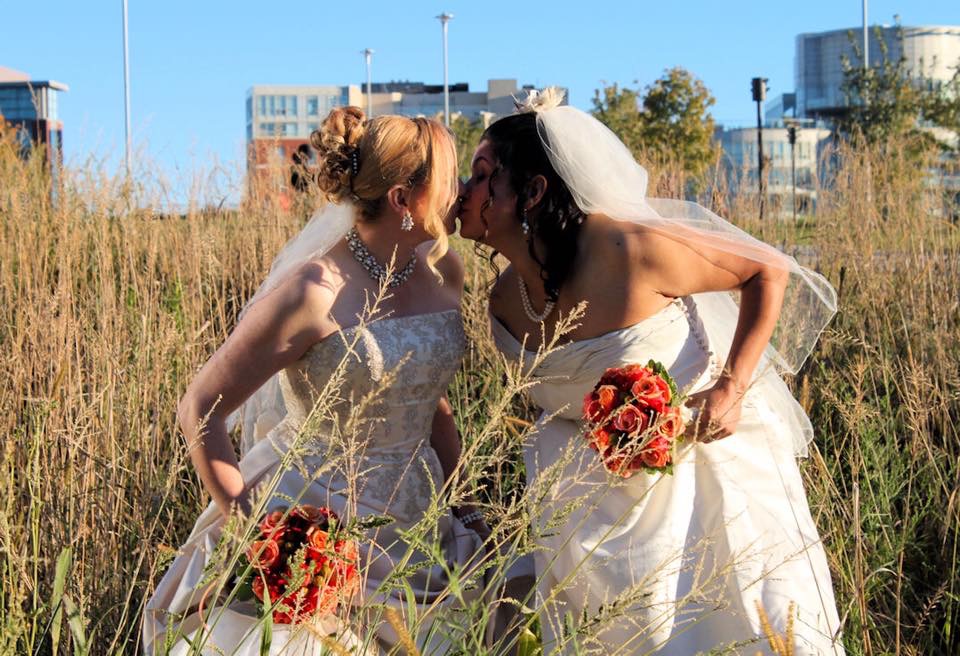
Image #1
I don’t know how to really sugarcoat this, it’s just a bad image. Right out of the gate everything about it is just bad. If you’re the maker, if you’re watching this, if you’re a wedding photographer, and you’re looking at something like this, this is, to me, what happens when you just shoot and you’re not thinking about what you’re doing.
Environment
Let’s just start quite simply with the environment. When we look at the environment, here’s what’s jumping out at me, we’ve got light poles just growing out of their head. We’ve got buildings coming out of their head. These are very distracting elements that all we had to do to correct was to either have them stand up, you get lower and shoot up, and then you wouldn’t have that element growing out of their head. You could shift them one way or another. You could shift them to the buildings. It’s a poor choice of locations. This was a bad decision, so not only is that a bad decision, they are completely covered in weeds. This isn’t a creative choice, this doesn’t look good, this is blocking them. It’s just sloppy. This is really, really sloppy. I’m not there, I’m not at the wedding. I don’t know what’s going on in this moment, but these are choices that we have to make, and make smart choices here.
Where’s the bride?
Where is my bride? Her entire face is blocked by hair. Pull the hair back or choose a different pose. Then the other bride is in complete shadow, so we can’t even see her face. The pose is awkward. Just look at them hunching over, holding their dress, creating really unflattering shadows on her arm. The other brides arm looks awkward in the way she’s holding the bouquet.
Shadows
Look, if you’re the maker don’t be defeated, you’ve got to move on from this, but learn from this. Those of you watching learn from this. Don’t just shoot. Think about the hard light, look at all of this spill just creating really ugly shadows. Think about where you’re shooting, think about how that image has to look, think about if this customer would print this and put it on their wall. I would say no.
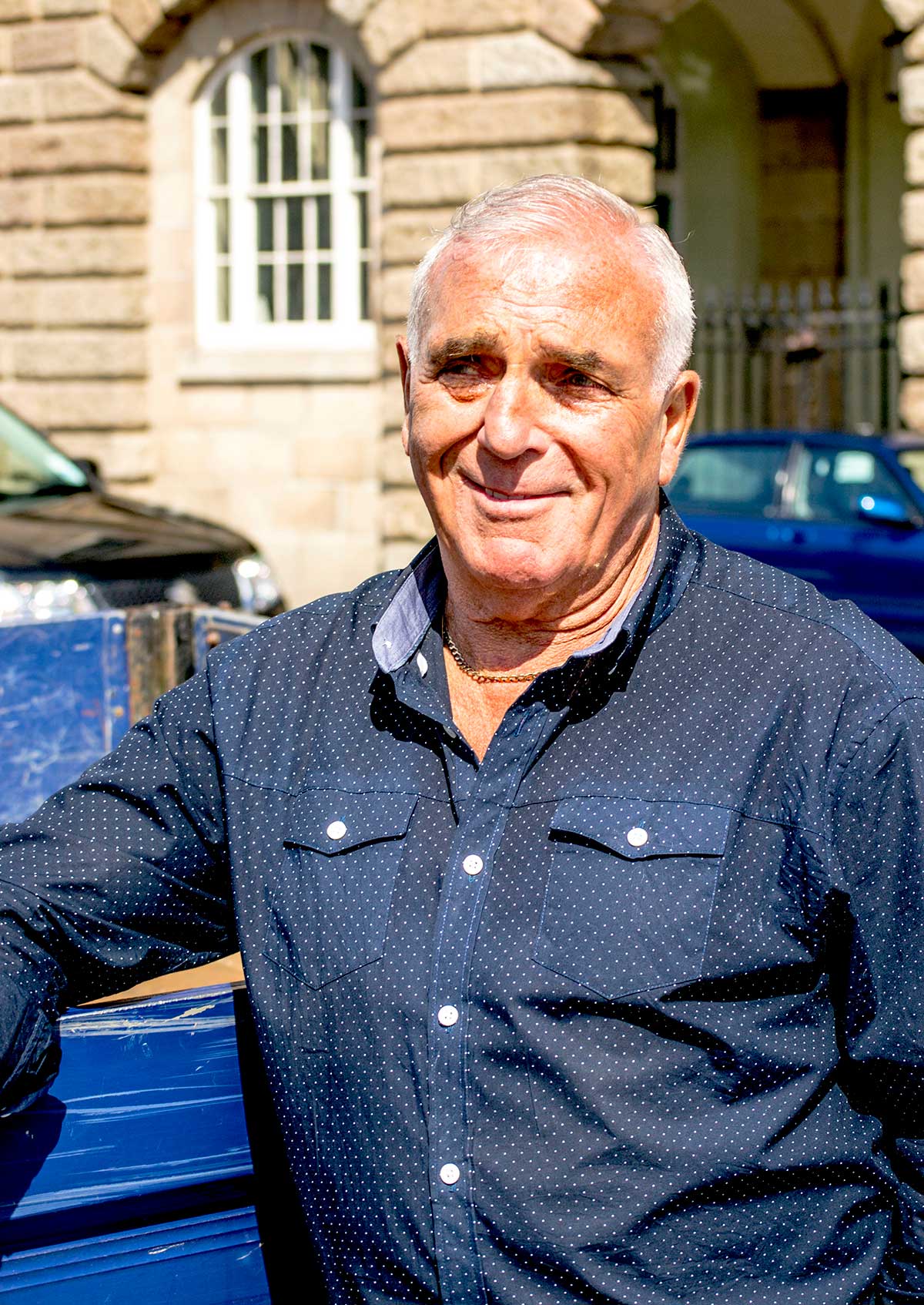
Image #2
Look, we’re making some really bad mistakes here. If we look at an image like this, clearly, this is just a much more casual portrait street shot. It looks like you’re in Europe. Maybe this is somebody in your family. Maybe it’s just somebody on the street you thought looked interesting.
Never cut a joint
Even if we’re doing street photography, we still have to adhere to the rules of photography. One of the rules that I think you should follow more than not is this concept of cutting at joints. We’ve cut off his arm at a joint on the left. We’ve cut off his shoulder, and arm at a joint on the right. The rule is, never cut a joint. It happens, sometimes you might cut fingertips off. I try to avoid it. We all make those mistakes.
Give the image some breathing room
What’s happening is in a nutshell here is that this image is unbalanced. There’s no breathing room to the left and no breathing room to the right. We’re just super compressed on the shot, but yet for some reason we’ve left all of this head room. We’re giving him head room, but not we’re not giving him any side room in the shot. As the viewer of the image, I feel really constrained. I feel claustrophobic. I don’t know where he is, what he’s looking at, what the environment is. These are the kinds of things you can do to make this image better and stronger.
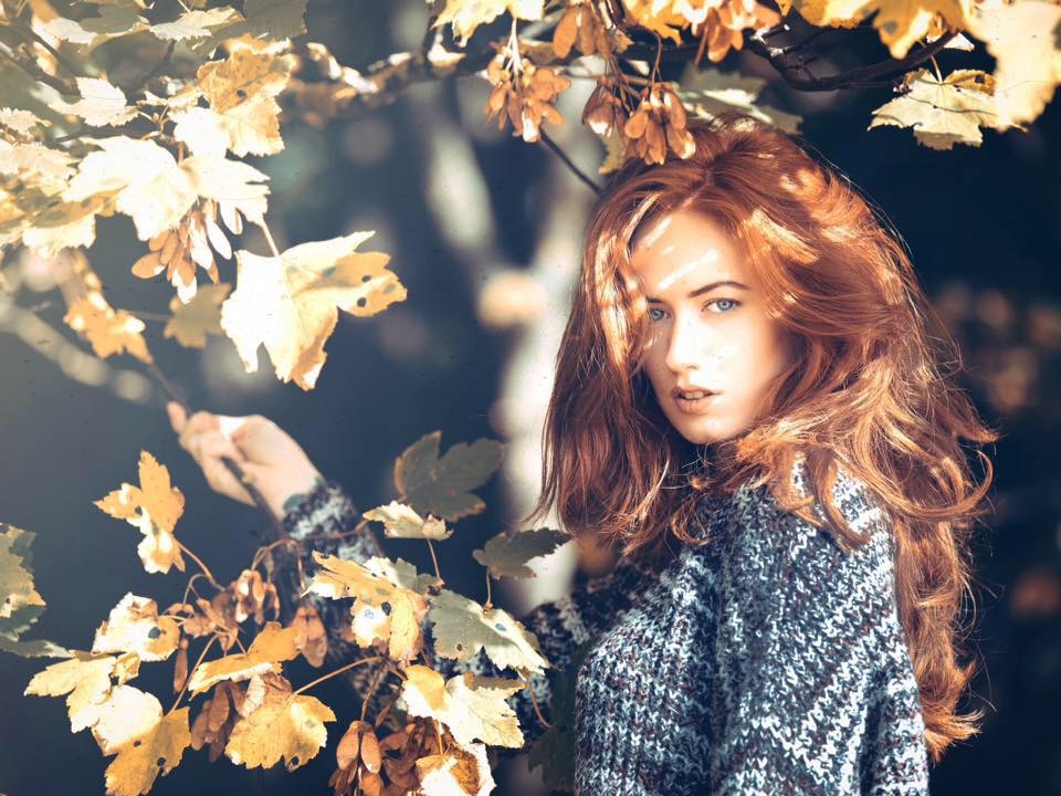
Image #3
I really do like this image. I’ll tell you what I like about it. I love this expression; I love this ethereal look and feel. There are things that could make this better. We always go back to the same rule. Your eye is going to go to the brightest part of the image. What I want you to do is I want you to close your eyes as you look at this image, close them right now, and now open your eyes. Tell me the first place your eye goes. There is no way your eye is not going right up to the bright leaves in the top left corner. There is no way.
This is art. Your eye is going to go right to the brightest part of the image. That’s just how it works. I don’t believe this is where you want to go. This is not a high key shot; it’s not meant to be. Once you’re looking at the bright leaves, you have to find your way to her face to really make your way into the shot. If we just crop the bright leaves out, and just get rid of that bright part, it is now much easier to get to her face. I am not advocating cropping the leaves out. I’m just trying to show you that by removing those bright leaves you’ve got that ability to get to her face a little bit better.
Now, you might say, “Well, Sal that’s how the light was hitting the leaves.” You’re right. There are trees all around you. You are making a decision to shoot here, that’s what you’re doing. You made this decision. Adjust your perspective or, worst-case, use Photoshop to dodge and burn those leaves down. Overall, good image.
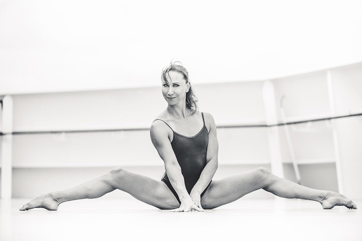
Image #4
Background
I don’t know if she’s a gymnast or if she’s just super flexible. She looks like an athlete. This looks like a fitness portrait. I love that part of it. What I’m not loving is all of the background up in the top of the image. All of that is getting in the way. I’m assuming you’re on a ship of some sort. That is what it looks like to me, could be wrong, doesn’t matter. The hard line in the background is just cutting right through her face. Not only that, but the hard line is crooked. There are ways you could have fixed that in post-production, but there are also ways you could’ve changed your perspective.
Black & white conversion
You probably did yourself some good by converting this into black and white, or this would have either just been a blue sky blown out, which you would’ve had some color issues, because the top portion would have been one color and the bottom portion would’ve been another color. This would create some really bad and strong contrast to drive you away from the subject.
Pose
Pose, it doesn’t bother me so much. The pose is not necessarily a bad pose. I think you’re showing strength and flexibility, so I do like that. There is something else we could have fixed. The hair just looks messy, not stylistically messy. I just think if this were me, I’d want a little bit more control of the hair.
Get critiqued!
Have you ever wanted PERSONAL feedback on YOUR photography from Sal Cincotta?
Enter your images for a chance to see your work being critiqued by Sal! Need some guidance? Want to show off some of your best work? Submit your images here for a chance to see them critiqued.


