
The images:

Click to enlarge
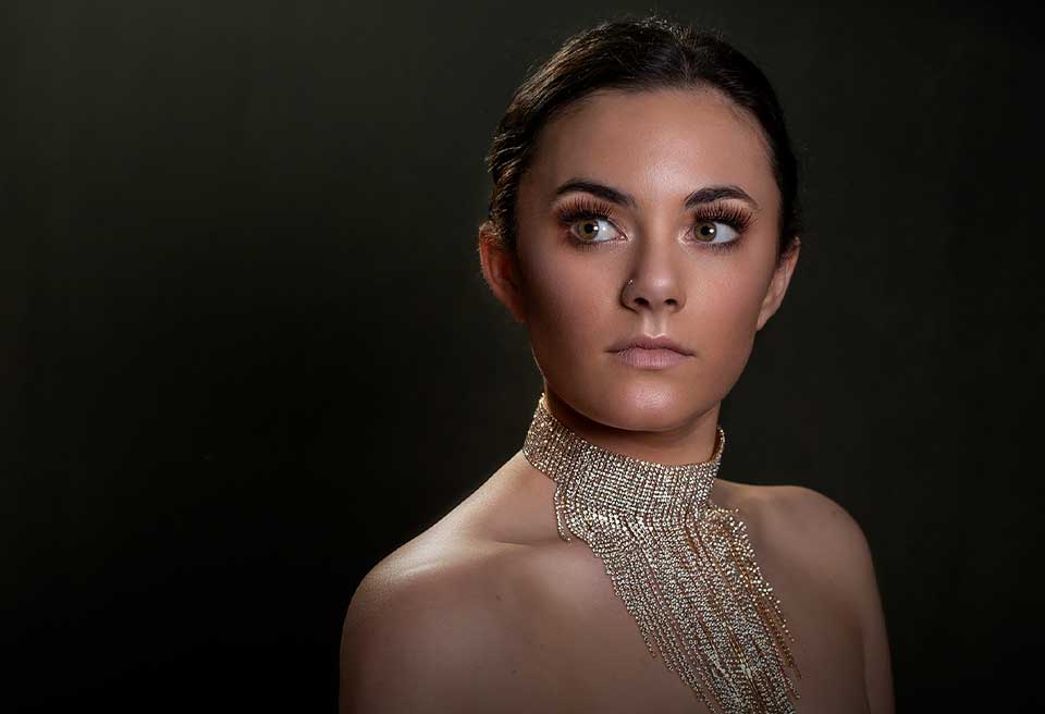
Image #1

This image is very sloppy. Nothing against the maker. We have decent lighting, a hair light, and some nice light dripping on the shoulder, but there’s other issues with this portrait. When I say something like this is sloppy, I’m talking about retouching. So, from a retouching perspective, if you look closer, you’ll see what I’m talking about here.
Tools
Now, this is something that absolutely can be fixed in Photoshop. Look at all the shine that we’ve have. It’s a distraction, right? This is something that a little bit of Photoshop can fix…I’m going to teach you all a little trick right here. Best trick ever. I use it on all my photo shoots. The best blotters in the world, bar none, Starbucks napkins. I’m telling you, I keep them in my car, keep them in my camera bag. They will get rid of shine just by blotting on your chin and forehead. You have to have this in your bag. If you don’t, this is the kind of stuff that happens. It doesn’t matter how good a job hair and makeup did, when the lights start hitting it, you’re going to have some problems.
Eyes
See all that white in the eyes? That white is a problem for me. What I would much rather do is instead of looking so far away, you bring those eyes back and they come in line with your nose. you can see her nose is pointing straight at camera, but the eyes are going across her nose. That’s usually a problem. That’s when you’re going to get white in the eyes. So, let the eyes follow the nose a little bit better and this would be a much better image.
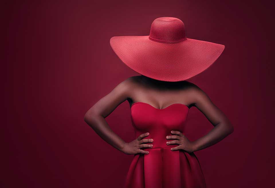
Image #2
This is an interesting image. I’ll tell you what I like about it. I love the color palette. It’s a very colorful, vibrant image. Hair and makeup, well done. Retouching looks really good on this image. So, they did a good job, but what I’m not liking is that this looks and feels like a composite. And maybe I’m wrong, and I’ll accept it if I am, but the problem is it looks and feels like a composite. She looks like she is on that fake background. Don’t know if she was shot on a green screen, don’t know if texture was added afterwards, but it doesn’t look or feel right. The lighting doesn’t look or feel right.
Make sure it looks natural
We’ve got good light on her face, right? Great. That’s where we want to go. That’s our primary interest here, but we got unnatural light on the fan and unnatural vignette falling in this area at the bottom and you can see it and that’s part of the problem. This is very unnatural looking and it’s ruining the image to me. The light fall off should be much more natural. This is not natural fall off. Controlling your light. That’s how we can make something like this better. But I get it. Shit happens, right
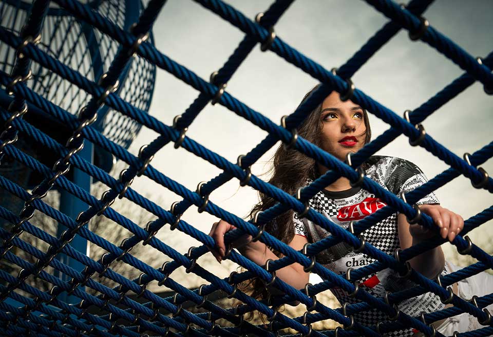
Image #3

I love the creativity in this image, but you failed in the pose. The pose is weak, right? Lets jump right in. Look at the hands. You can see that the hands look like claws, right? Like bam, I’m holding on for dear life and I know that’s not what you’re going for because you’ve got this hair, this wispy, the clouds in the sky, we’ve got this great mesh fence that’s kind of leading lines and taking us through there. Like I said, I like the creativity, I like where you were going, but we got to perfect this particular image. So, the hands are a problem. I would have much rather seen her leaning one way or the other. Right? But as soon as those hands got like this, bad portrait, right? The hands are what’s jumping out at me.
Remove Distractions
Ah, okay. Let’s look at something else here. If we maybe cropped this, see this big thing on the left hand side of the image? That’s throwing me for a loop. It’s getting in the way. Also, In this area over here, see how bright that is? Your eyes are always going to go to the brightest part of the image. So, that in and of itself is a problem, but we can dodge and burn that and get back to basics here and now if we fix those hands, get rid of that large element because it’s a distraction in the left hand corner, do a little DB work and then zoom in where we’re getting to a point, not zoom, sorry, not zoom in digitally, not zoom in with your focal line, zoom in with some dodging and burning so that my eye is going to her face, not the top left hand side of the screen. It would be a stronger image.
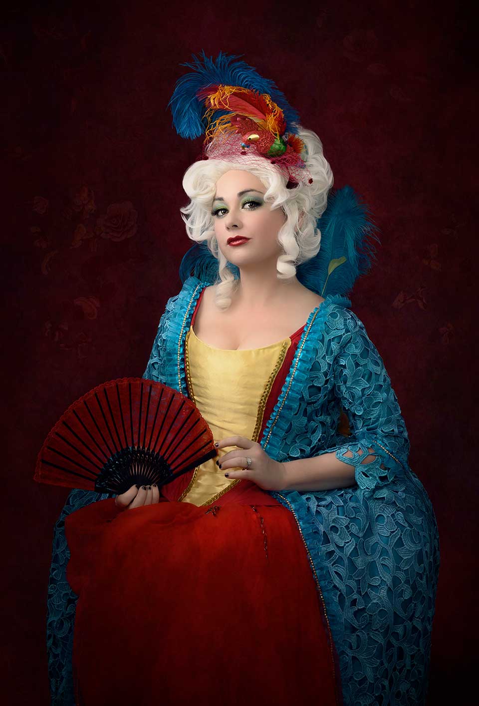
Image #4

So, I really love the image. I love the color combo, but there’s things that could be better. I’m going to guess, I could be wrong, that we did some color adjustment in post-production? I’ll accept the fact that maybe I’m wrong on that, but I don’t think so. That hat, that dress, the background, we did not do a good enough job of getting them into the same color palette. If you did adjust the colors in Photoshop, you didn’t do a good enough job. If you didn’t do it in Photoshop, you should’ve done it in Photoshop and here’s what I’m saying. The dress is one color. The hat is another color. The background is another color. You’re talking about hue, saturation and luminance levels. Your HSL have to be brought together to get these all to look close to the same. I’m not saying everything’s going to be identical, but right now this hat looks a little bit peach to me. The dress looks a little bit red. The background looks somewhere in between, right? So, we haven’t done a good job of creating this monochromatic style image. So, we’ve missed on that, but still a good image, right? How can it be better?
Details
Last piece of a critique, but it’s important. Check out the arms. That light is not falling off naturally, which leads me to believe this was DB work and it could be better.
Get critiqued!
Have you ever wanted PERSONAL feedback on YOUR photography from Sal Cincotta?
Enter your images for a chance to see your work being critiqued by Sal! Need some guidance? Want to show off some of your best work? Submit your images here for a chance to see them critiqued.


