
The images:
Click to enlarge
Image #1
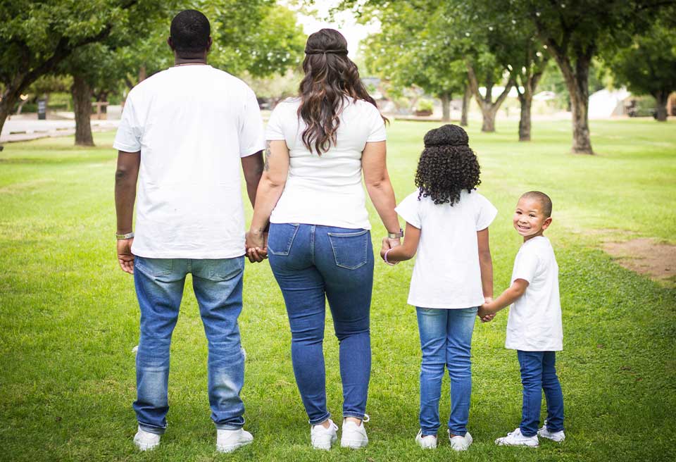
First image up. Here we go. This is a family portrait, but unfortunately not a very good one. Here’s what you’ve got to look at, right? I mean, we’re just being honest here. We’re going to learn from the mistakes of others. That’s what this is all about. Don’t ever forget it. And so in honest critique, this little kid in the bottom right hand corner is adorable. But this is an adorable shot of one person.
Connection.
So what’s happening to the other three people that we’ve alienated from the shot? We’ve got three people, mom, dad, and I’m assuming sister. Have no idea because I’m just staring at the back of their head. And we’re showcasing the back of their body. This is not a good family portrait. Maybe picked a different angle, shallow depth of field, shot from the side across their bodies. But you’re losing the emotion and connection of an entire family here, so that’s a big miss right there.
Storytelling.
Also, mind you, your eye’s always going to go to the brightest part of the image. Well right now you’ve got four white tee shirts. Your eye can’t stop staring at the back of dad. So this is where my eye wants to go, unfortunately. And that’s not the focus of the image. And so, I would have changed this portrait some way somehow flip them all around. Maybe a tight shot of the hands, maybe zoom in on them, but right now, this is not a family portrait that a family would want to put on their wall. You want to show the connection. You want to show the intimacy.
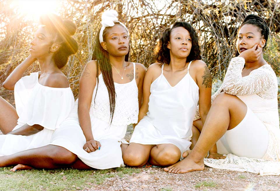
Image #2
Alright, Next picture. I like the overall mood that we’re going for. I love the sun flair. Little bit of attitude. I’m going to guess they’re friends, they’re sisters, they’re family somehow. I’m guessing, right? I don’t know. But what I’m not liking is the cropping on this. There’s a lot of problems with this image. So what could we do better? I like that everybody… You know this is pretty common where people are wearing all white, all denim however they’re going to dress so that there’s unity in the shot. And you’ve done that, right? Everybody’s kind of in all white. But here’s the problem.
Details.
We’re going to start with the woman on the right. She’s clearly in an ivory lace dress of some sort. But man, this is just an ad for Spandex at this point, right? The Spandex should not be showing. That’s a problem in the shot. This person, the next girl in. Sorry, next girl in right here, right? Where do her legs go? She has nothing from the knees down. They’re gone. No hands. Everything’s gone from the shot. Okay, next girl – You’ve got to work on expression. There’s a difference between looking away and being sassy, mean mugging, and then just like, “Really… really” Just annoyed, right? And right now those two girls in the middle look annoyed. Girls on the end, they nailed it. I love what they’re doing. And my girl here, all the way on the left, she has got no breathing room whatsoever. We’ve cropped her off at her knee. We got feet missing. We’ve got hands missing, but I do love her expression.
Image #3
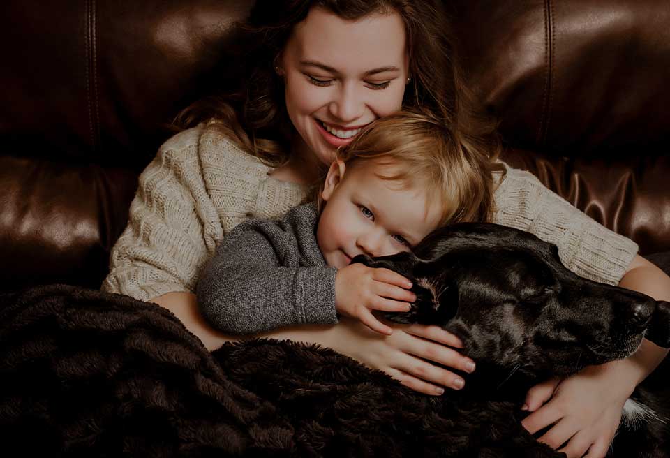
I don’t know, maybe I’m just getting soft on this one but I really do like this image. The little boy in the middle sells it right? Absolutely sells it. What could be cuter than a boy and his and his dog? Love the image, but in the spirit of this, this is a really tough image to overly critique, right?
Cropping.
So once again, like everything else, how can we make it better? No matter what level you’re at, this is good control of light, good editing, we haven’t blocked up the shadow so the shadow details there. You’ve got a black dog, you’ve got a kind of an ivory tan sweater, you’ve got all the detail there. So the person, kudos to the maker for hanging onto that detail in this. But once again, how do we make it better? And just like the last image we looked at, I’m going to get on you for cropping. I may… Sometimes I’ll give you a latitude on cropping at the head. I do this all the time. I like it because top of the head sometimes just gets in the way. This gets us into the shot.
We’ve got some bad cropping on those fingers. Either there or they don’t… They’re not. Rule is never crop at a joint. We’ve got some cropping issues here by the paw, right? Hey man, dogs paws matter. You can’t just get rid of dogs paws. These are some of the things that I think could make this image better. Hopefully you guys agree.
Image #4
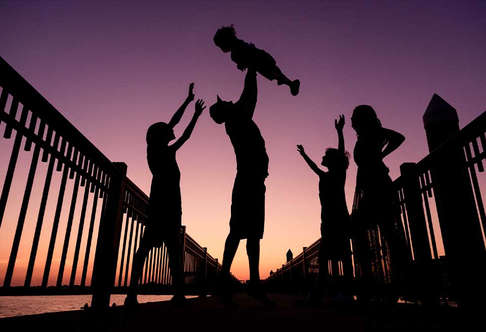
This is a nice… Looks like family portrait that we’ve got going on here. I love the silhouette. Love the color of the sky. I don’t know if it’s Photoshop or it’s natural. We’ve all seen these very vibrant skies. I’ve been in places where I’ve had skies this color. It’s like a five minute window. So, right? That part I’m not going to critique, love the silhouette, love everything we’re doing, but, here’s where this image could be better, and this is on you as the photographer to make this image better.
Pay attention to the story you’re telling.
Here’s what I mean by that. Look, you’re going to go and tell your client, Hey, go stand over there and just throw your kid in the air. Hopefully you’ll catch them. It’s getting kind of dark, they fall down, just roll them around. We’ll be fine, right? No, I’m kidding. The point is, you’re setting up the shot. This is clearly a set up shot. So you’re responsible for everything that’s going on in this shot. So let’s look at this shot a little closer. What are these people here doing? Right? This looks like a prayer rally and everybody’s just raising their hands. That’s not the goal of this shot. Doesn’t make any sense. There’s also no connection. So no connection between any family member, including Mom. Mom is completely disconnected and her hands aren’t up in the air either, right? So if, I’m guessing mom’s just completely annoyed, like if you drop my baby, you’re dead.
To make this better, there has to be something other than throwing the baby in the air or the silhouette. Like it’s really easy to look at the silhouette and get very excited about the whole thing, right? Because it is a beautiful frame up. You’ve got all these leading lines, but you also missed on the leading lines and that’s the last piece of critique. Look, you’ve got these strong leading lines and dad is right where he needs to be, right? That V is driving you right to dad. He’s exactly where he needs to be, but no one else is. So they’re getting cut in half, cut in half. This is a shot that needed to have a little bit more work to be better.
Get critiqued!
Have you ever wanted PERSONAL feedback on YOUR photography from Sal Cincotta?
Enter your images for a chance to see your work being critiqued by Sal! Need some guidance? Want to show off some of your best work? Submit your images here for a chance to see them critiqued.


