
The images:
Click to enlarge
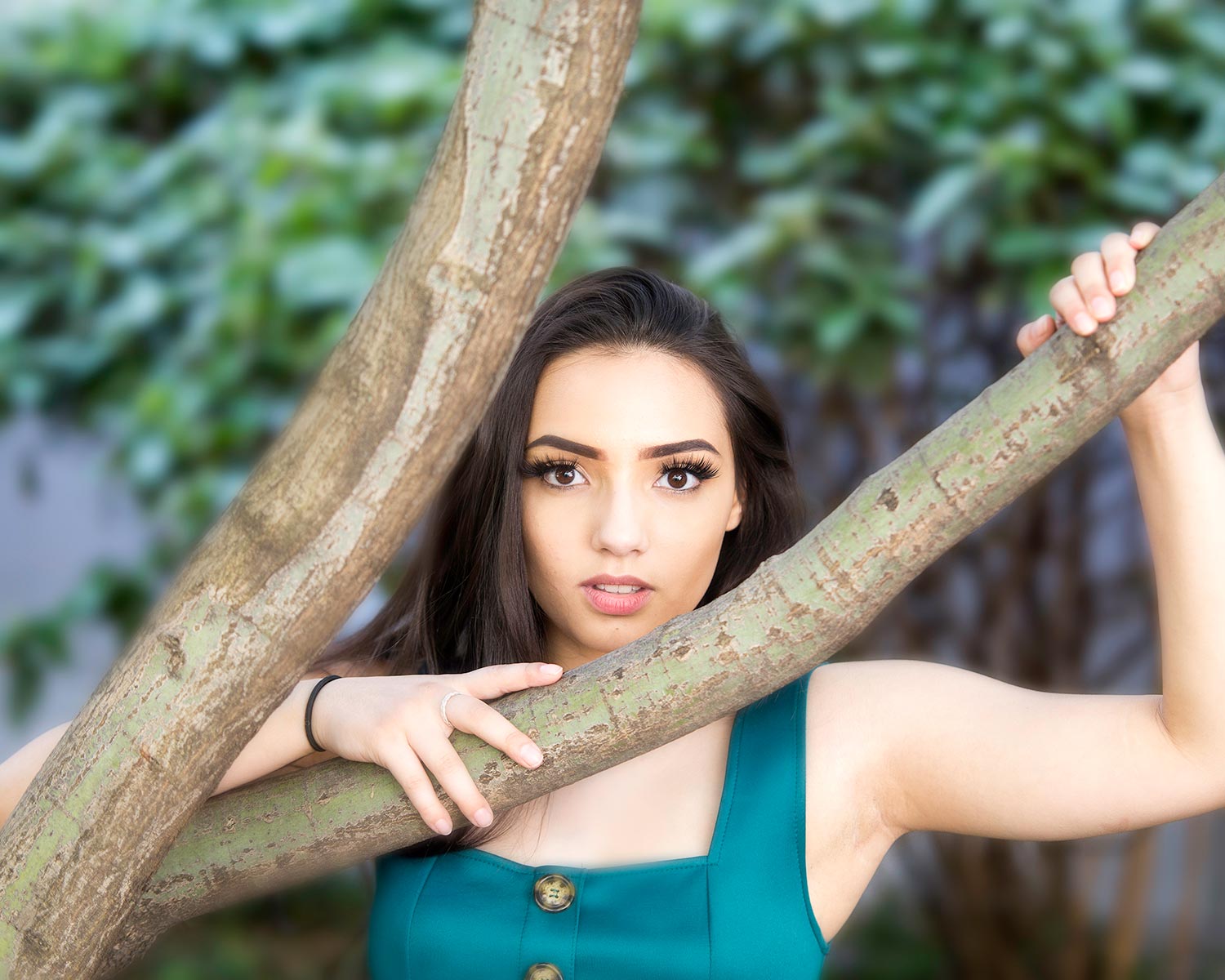
Image #1
First image up. This is a really nice image, but it could be better. I notice some mistakes from the photographer’s standpoint.
Get rid of the hair ties!
The first one that jumps out at me is the hair tie on the wrist. High school seniors, models, females in general are notorious for having this on their wrist. It is a distraction in the shot and it should not be there. As the photographer, you are in complete control of getting that out of the shot. Tell them to take it off and the problem is solved, I do this every time I’m working with my high school seniors.
Composition
Moving on to some of the other aspects of the photo, the expression stands out to me. I actually like this expression, it’s pleasing. But compositionally there’s all sorts of problems here. These are problems that again can be fixed both in camera or in post-production. The problem is she’s completely bullseye. I’m not always anti-bullseye; sometimes it works and sometimes it doesn’t. Here, it doesn’t. The branches in the picture create these really hard lines that are basically cutting the picture into 3 different zones, which makes the picture difficult to enjoy or look pleasing. An easy way to fix this issue is to crop the photo. Ultimately, we want our eye to go right to the subject, so by cropping it and making it a little left-heavy, you can make the branches look like they’re driving the eyes up from the bottom-left through her eyes and her face. This puts more emphasis on her, and makes a stronger image.
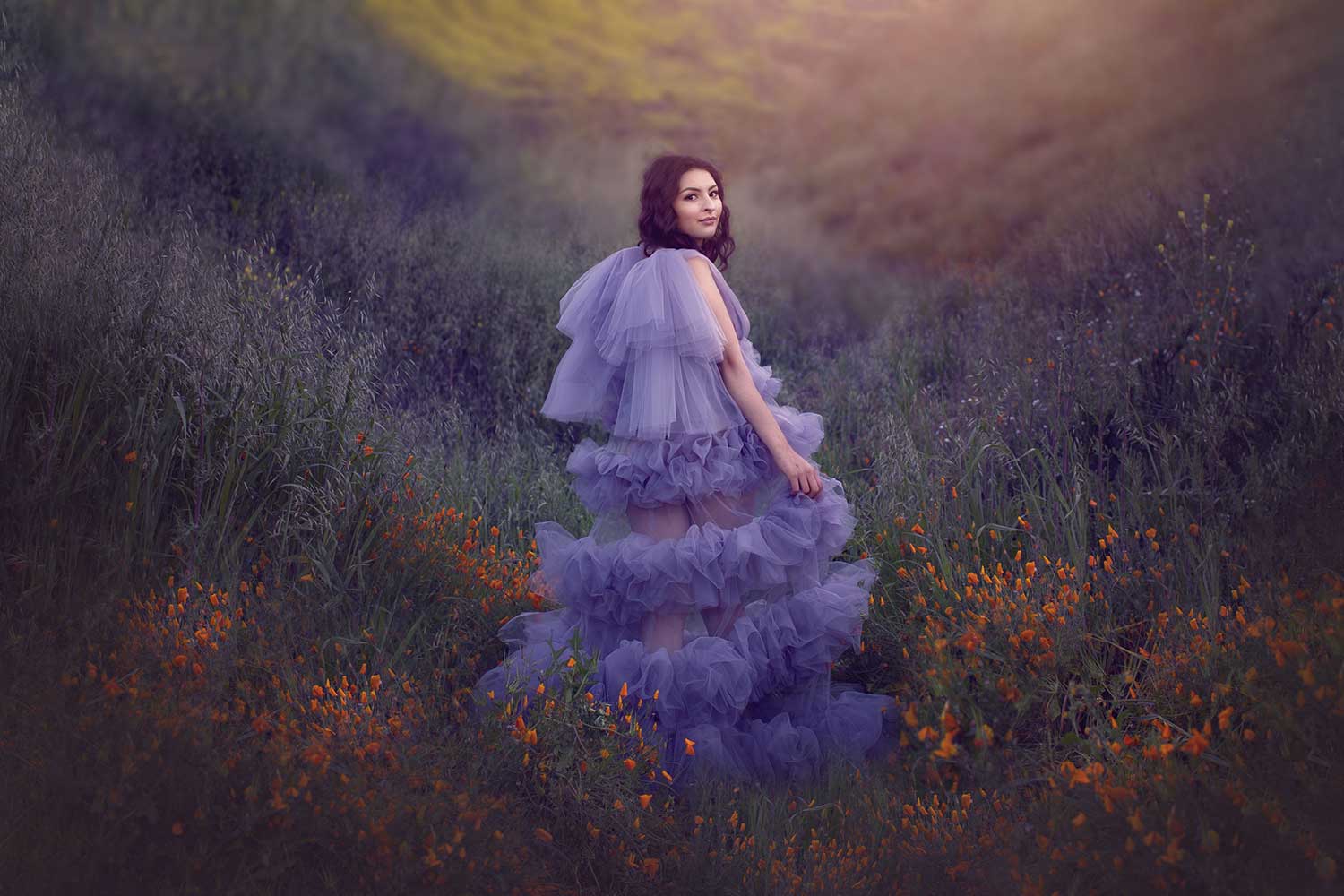
Image #2
I want to start with what’s right about this image because I really do like it. I like the editing on this image. I’ve seen this kind of surreal, fantasy style of editing pop up recently, but I have a feeling this is going to turn into an overdone style. I also like the way it’s styled. The dress fits the scene. If the subject were out there in a pair of jeans and a T-shirt, it wouldn’t make sense with the edit.
Color
Let’s move on to how this image can be improved. This image is Photoshopped, but I wish there was more time spent on the color of the image. Color is just as much part of the shot and composition as anything else. If more purple were added to this image, I think it would’ve been much stronger.
Focus
I also see some focus issues. Some areas are bright, some are muted, some are focused, others aren’t; I don’t understand what the point of some of these edits were. If you take time to Photoshop your images, make sure you’re doing it right.
Pro Tip: Make sure there is a reason behind your edits. Make sure your edits are driving the eyes to the SUBJECT.
Hair
Now, let’s take a look at our subject. My biggest pet peeve in the world is hair. Not because I don’t have any, (shame on you) but because in most pictures it chokes out the subject. Get the hair off the shoulder and get it going down her back. That way, when she’s looking at the camera it doesn’t just look like a face, you can see some of that open area.
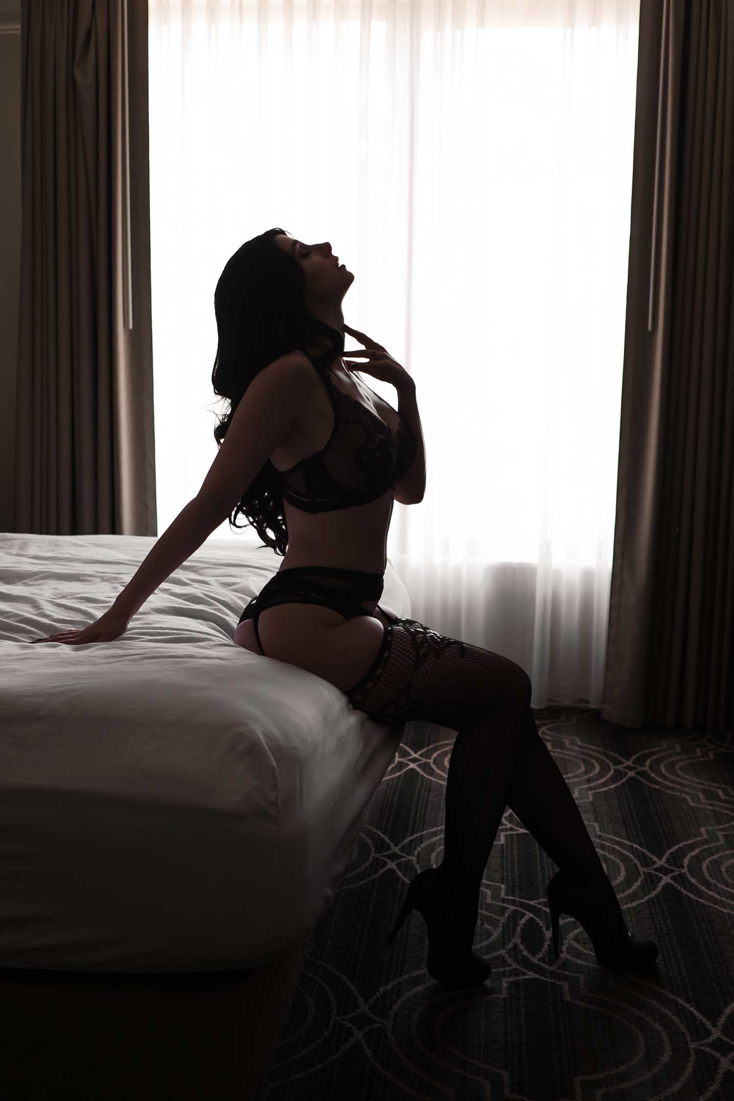
Image #3
This is a very nice beauty/boudoir shot. I’ve seen it done a million times, so part of taking a shot like this is making sure you’re not just recreating something you’ve seen. Here’s the question: how do we make this better? Let’s look at some of the things that are wrong.
Removing distractions
First and foremost, look at how distracting that sliver of wall is on the left side by the curtain. It doesn’t belong there. This could be cropped, extended, etc. Bottom line, there are a number of things that could be done without losing her hand.
Pro Tip: Do everything possible to make your image less distracting.
Leading lines
Now, compositionally this image is driving me nuts. I see a perfectly framed up window, and in the middle of that window there is a hard leading line; I would like to see her head moved into that area. How do you do that? You as the photographer, shift left just a little bit.
Last but not least, the dreaded hair. Why is she getting choked out with that hair on her shoulder? Push it back and showcase her hair, make it look longer and create a stronger image.
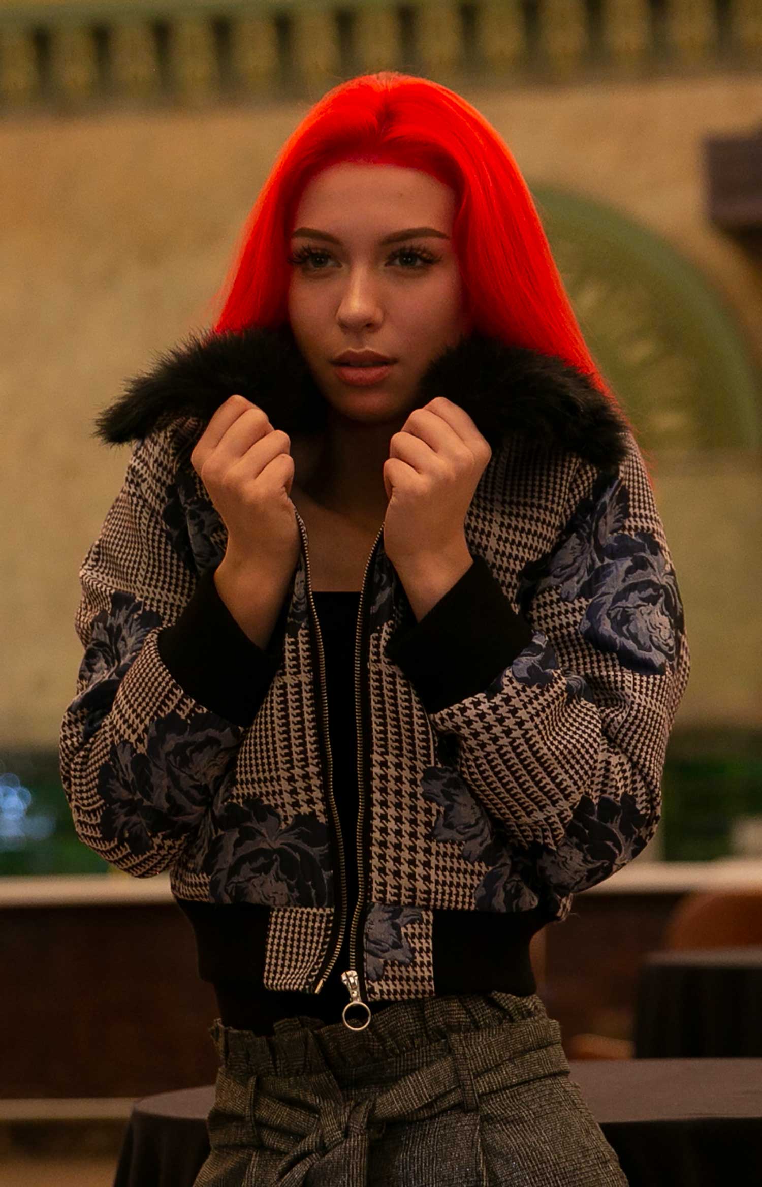
Image #4
Lighting & Exposure
First piece of critique: this is a poorly lit, poorly exposed image. You’ve got to recognize flat light. Nothing is popping in this image. Brighten up her eyes at least and watch what that simple edit does to this photo.
If you look closely, her hairline looks completely fake. This is an easy fix in Photoshop, but you don’t want to miss that when editing.
Eye contact
Another problem is she’s not looking at the camera. The lack of eye contact is the biggest issue I have with this shot. You’ve got to get that eye contact because it changes the shot. There’s a difference between having your subject looking away from the camera and this. She looks like she was looking at another photographer’s camera and it is killing the shot.
Stylizing
Last thing worth noting is that from my perspective, the stylizing and editing of the shoot is lacking any clear direction. There’s no style, the exposure is off, etc. These are basic things that can be done to make this image better. Fix those little mistakes, and I promise your images will get better immediately.
Get critiqued!
Have you ever wanted PERSONAL feedback on YOUR photography from Sal Cincotta?
Enter your images for a chance to see your work being critiqued by Sal! Need some guidance? Want to show off some of your best work? Submit your images here for a chance to see them critiqued.


