
The images:

Click to enlarge
Image #1
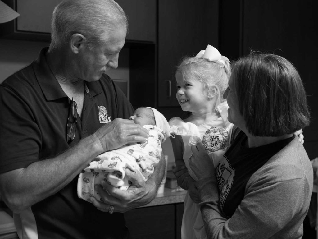
Let’s take a look at the first image. This looks like it’s supposed to be a photojournalistic style image but the truth is, it feels very staged.
I see a couple problems up front. The hat in the left-hand corner feels like it doesn’t belong there, that’s a bit problematic for me. This can easily be edited out, problem solved.
Now, your eye will always go to the brightest part of an image, and the brightest part is the little girl’s face, which is very nice. There’s nothing wrong with that, that drives me in.
Expression
The problem is dad (or grandpa) doesn’t look as excited as everybody else, which is what makes me feel like this is very much a contrived or posed shot. In and of itself a posed shot isn’t necessarily bad, but you’ve got to be very careful that expressions are matching up, and you accomplish the mission that you’re looking for in that particular shot. Here it doesn’t feel that way.
Bright Spots
also just feel really compressed in this shot; I’ve got all this space in the top right that really isn’t adding to the frame. There are also multiple distracting bright spots, like the one on mom’s shoulder. Mom also has massive exposure problems on her face. Don’t get me wrong, shadows and highlights are very important to drive the viewer through the frame, but make sure you’re using them to get the eyes where you want them to go. If you don’t use shadows and highlights correctly, they are going to become very distracting.
These are all things that you can absolutely fix in post-production. If you’re going to be a purist, that’s fine, but make sure you fix all these little details before you ever make your frame.
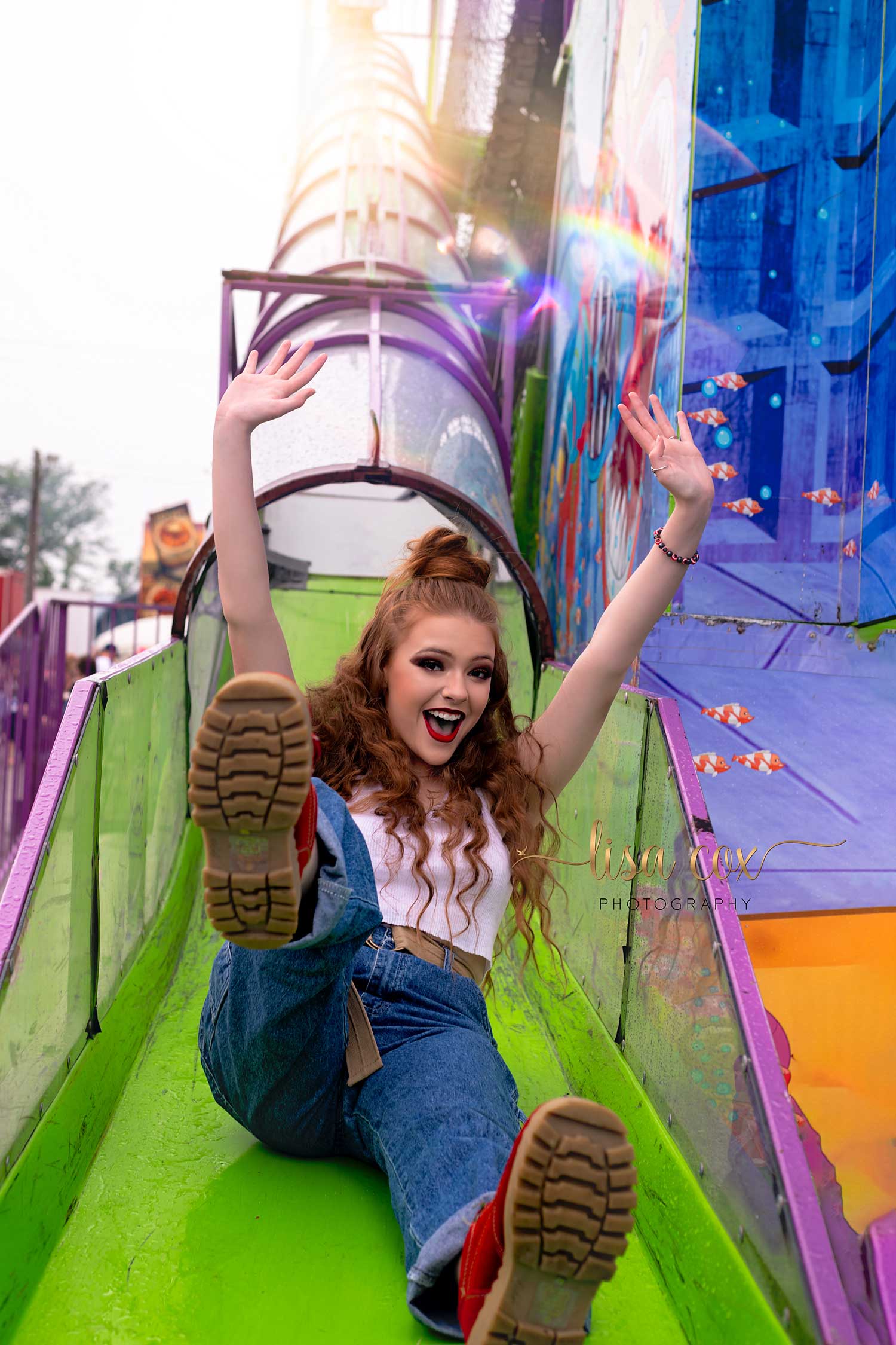
Image #2
This is a beautiful, fun image. A couple things are getting to me, though. The brightest part of the image is the sky above the slide, and not the subject. That’s not what we want because it pulls the viewer’s focus up to the top left corner. There are a couple ways to fix this issue – brighten her face (which is as simple as dodging and burning), OR change your perspective as the photographer.
I do love that we’ve got the model somewhat bulls-eye. But, I’m also distracted by the bottom of her boot. I don’t mind that this foot is cut off on the bottom, that really doesn’t bother me as much as all the other potential issues here.
If we take a closer look at this image, thinking about contrast and tonal range, It looks like there’s two completely different images here. One on the left, and the blue on the right. If the photographer would have just slid to the left, these issues would be fixed. It would’ve cut off more of the building that is seen on the right side, eliminating the brightness that is coming in from the top right corner. This slight movement also would’ve taken the top-left corner out of the frame, driving the eyes more towards the subject. Overall, this would’ve not split the photo in two and given us a much more tonally pleasing image.
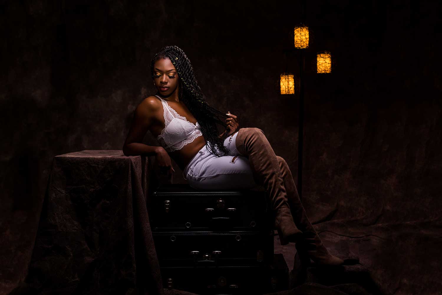
Image #3

Composition
I think this is a very beautiful image, but it’s not without issues. Compositionally this image is struggling. If you put a grid on this photo, you can see she’s not in a third. She’s kind of all over the place, but cropping can help this. If you bring the photo in a little bit to the edge of the table, it helps the composition tremendously. Or if you bring it up from the bottom just a bit, it becomes more pleasing just by introducing a little bit of cropping.
Cropping out the excess
I like the funkiness going on with the lighting from the 3 lights, the beautiful model, I love it. It’s all working for me. My eyes are kept where they should be, bouncing back and forth between the model and the lights. If you think about it, everything else in the frame is kind of useless – why do we need it? If we crop this image with more of a square crop, it takes all the extra room out of there and drives the point home.
Lift the hand
One more thing, the hand in this picture is driving me nuts. I love the way the hand is lit but because of how it’s positioned, it looks like a nub. That hand should’ve been positioned up more, then the light would’ve been hitting the back of the hand and it would’ve been a much more pleasing shot.
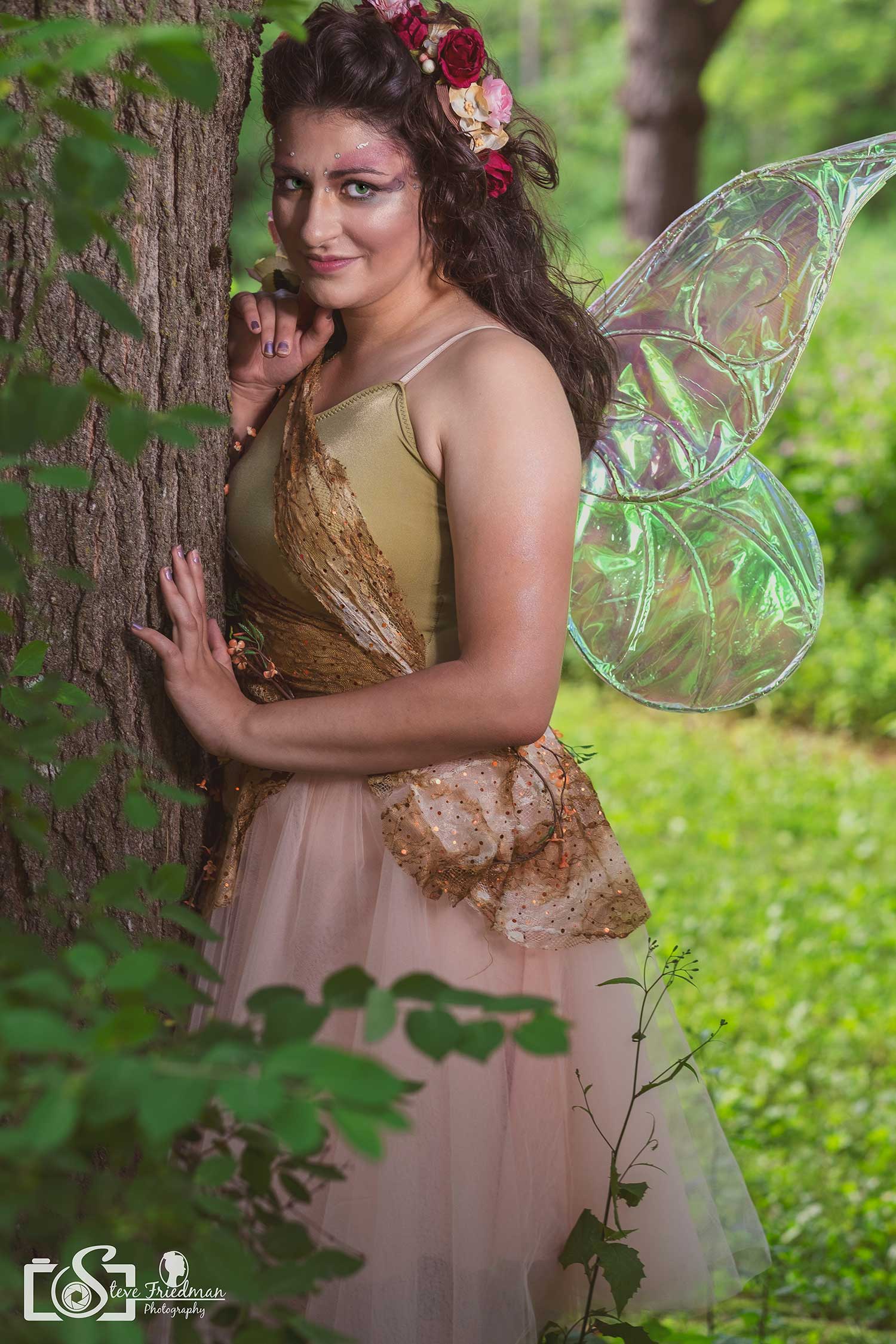
Image #4
Control the details
I’m not going to lie, a lot of things are wrong with this photo that are kind of irking me. As a photographer, you’ve got complete control of what you’re doing. With that being said, if your client shows up with chipped nail polish why would you show hands in the photo? No matter how bad you want to bring the hand up to the face, you should not do it for this exact reason.
Pro tip: To try and avoid this issue, tell your clients how you want their nails to look for the shoot before they show up.
Pose & composition
Let’s keep digging into some other problems with this image. The pose is super cheesy. It feels overly contrived, and reminds me of bad senior pictures. I don’t mean that as an insult, I mean it as a way for you to improve, and so here’s some things you can do to improve. There’s no reason for that single weed in the foreground to be in the photo. Do some public service and pull the weed out. 🙂 The weeds on the left side of the image aren’t bothering me though, I like how that adds to the depth of field. Also, the tree in the back that looks like its growing out of her wing can be easily fixed in Photoshop in 10 seconds or less. It’s not about being a purist, it just doesn’t belong there, growing out of her.
Cropping
Watch how you’re cropping. Her wing is cut off and that’s distracting; there’s no reason for it. The last thing is be conscious of tan lines that make for a less pleasing image. This is another easy fix that can be done in post-production.
Get critiqued!
Have you ever wanted PERSONAL feedback on YOUR photography from Sal Cincotta?
Enter your images for a chance to see your work being critiqued by Sal! Need some guidance? Want to show off some of your best work? Submit your images here for a chance to see them critiqued.


