
The images:
Click to enlarge
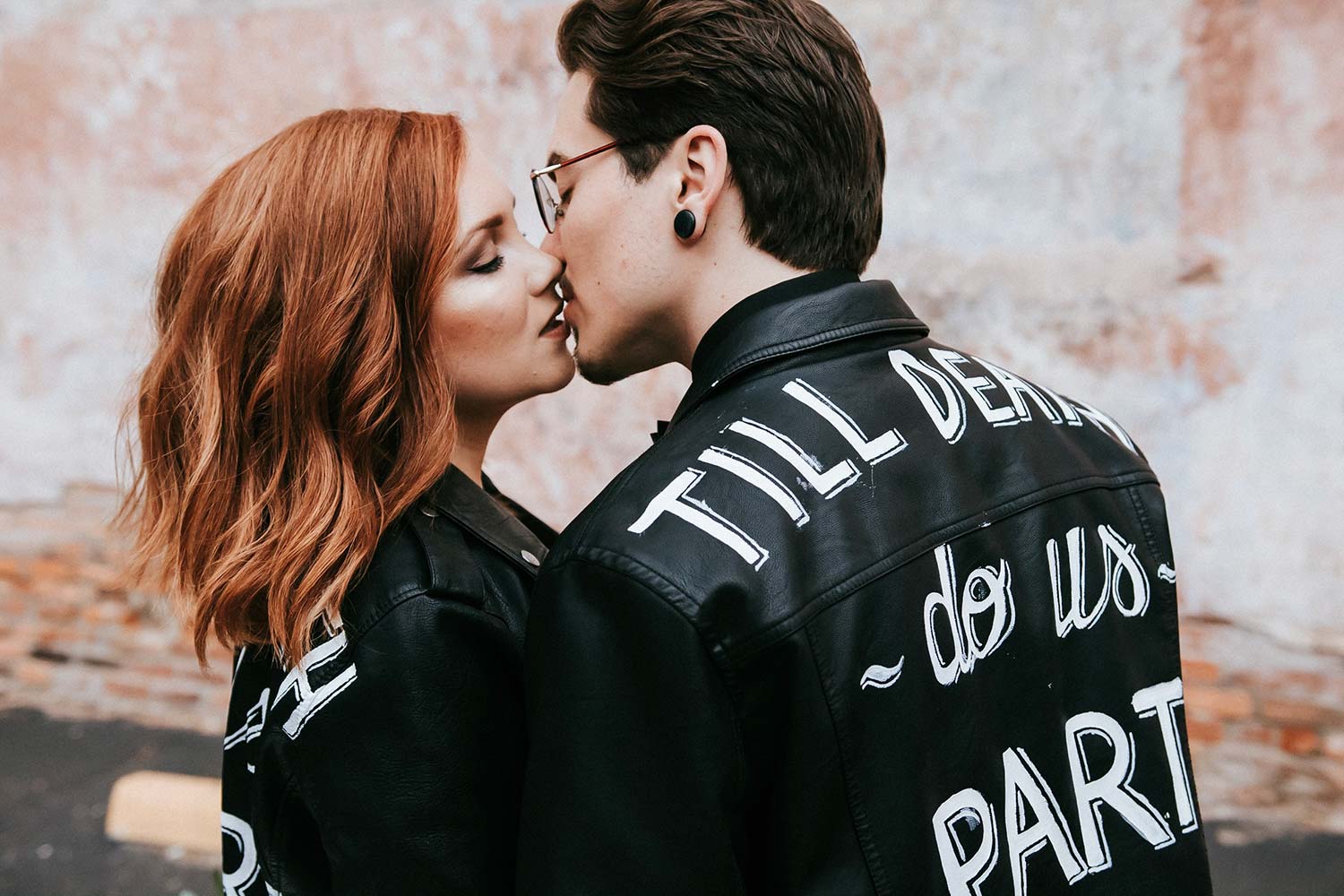
Image #1
I love this image. Let’s call this, “Till Death Do Us Part”. It’s got a romantic feeling, and I love the almost kiss. This is a really good image.
Let’s jump into what we can do to make this image better, starting with the bright spots. I feel like I’m repeating myself when I say it – your eyes will always go to the brightest part of the image. This will ALWAYS happen. Not sometimes, not maybe; always. You want the brightest part to be the place of interest and in this photo, the two subjects are the place of interest, but they’re not the brightest part of the image. It’s a simple dodge and burn to fix that, so spend the extra couple minutes to really polish your image.
Polish the details
One thing that is absolutely irking me in this photo is the inability of the maker to polish it. This is a portrait. Their faces are the main focus in this shot. It takes less than 30 seconds to clean up the blemishes. I’m not saying make their skin look like plastic, but take advantage of the clone stamp tool. Clean that skin up!
The last thing I would critique about this image is the parking block behind the couple that didn’t get edited out; it’s very distracting. Get rid of it, it’s not adding anything to the photo.
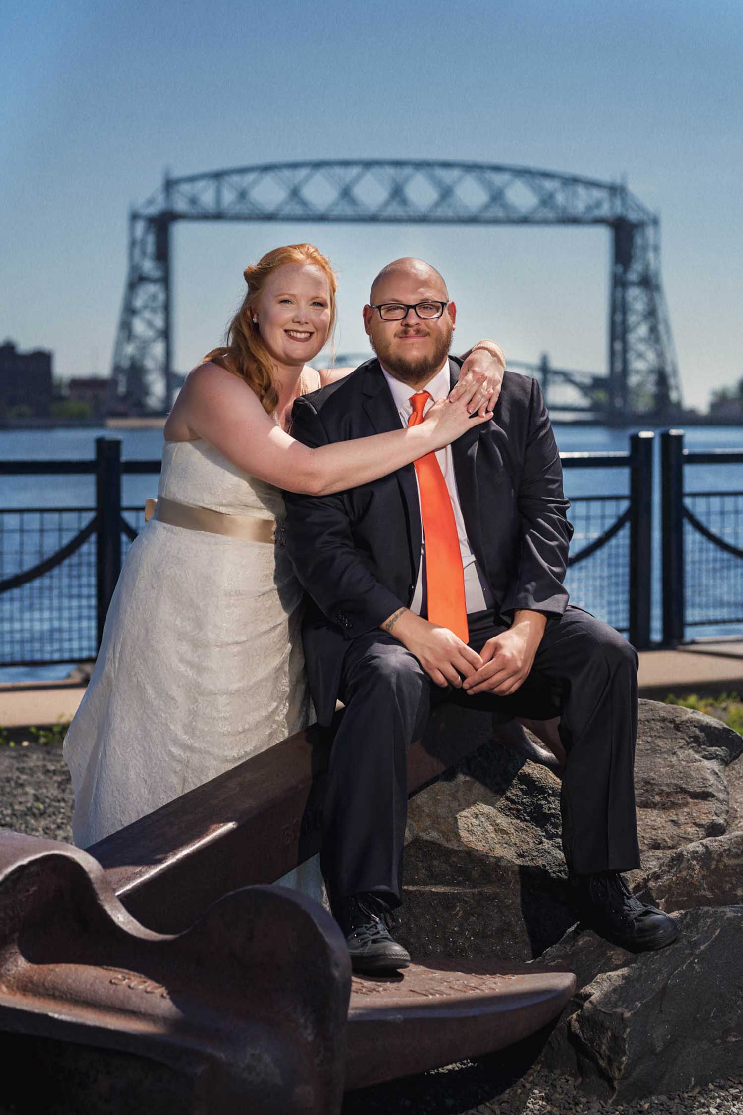
Image #2
Pose
The first thing I need to address is this pose. Your couples have to feel comfortable, and this looks and feels the opposite of comfortable. She’s draped over this shoulder, her arms are stretched out, his sleeves on the jacket are pulled up, the jacket is open; this is a mess. However, it is framed up nicely – so that’s a positive here. This pose is also making the bride look heavy, which she’s not going to be happy with. Overall, this shot looks sloppy.
Keep primary elements in the shot
Looking past the posing, why is there an anchor between them? The anchor being there doesn’t bother me as much as the fact that part of the anchor is cut off. You, as the photographer, made the decision to cut out a primary element in the shot. As the viewer, I can’t figure out why it makes sense to have that partially cut off. To me, this is just as bad as cutting a joint off.
The lighting and everything else is irrelevant to me here. You can get away with a lot of bad lighting if you’ve got your pose down and the couple looks good and comfortable. As the photographer, you need to take a step back and take all of these little details into consideration as you’re shooting. These are the little things you can fix that will have a big impact on your images.
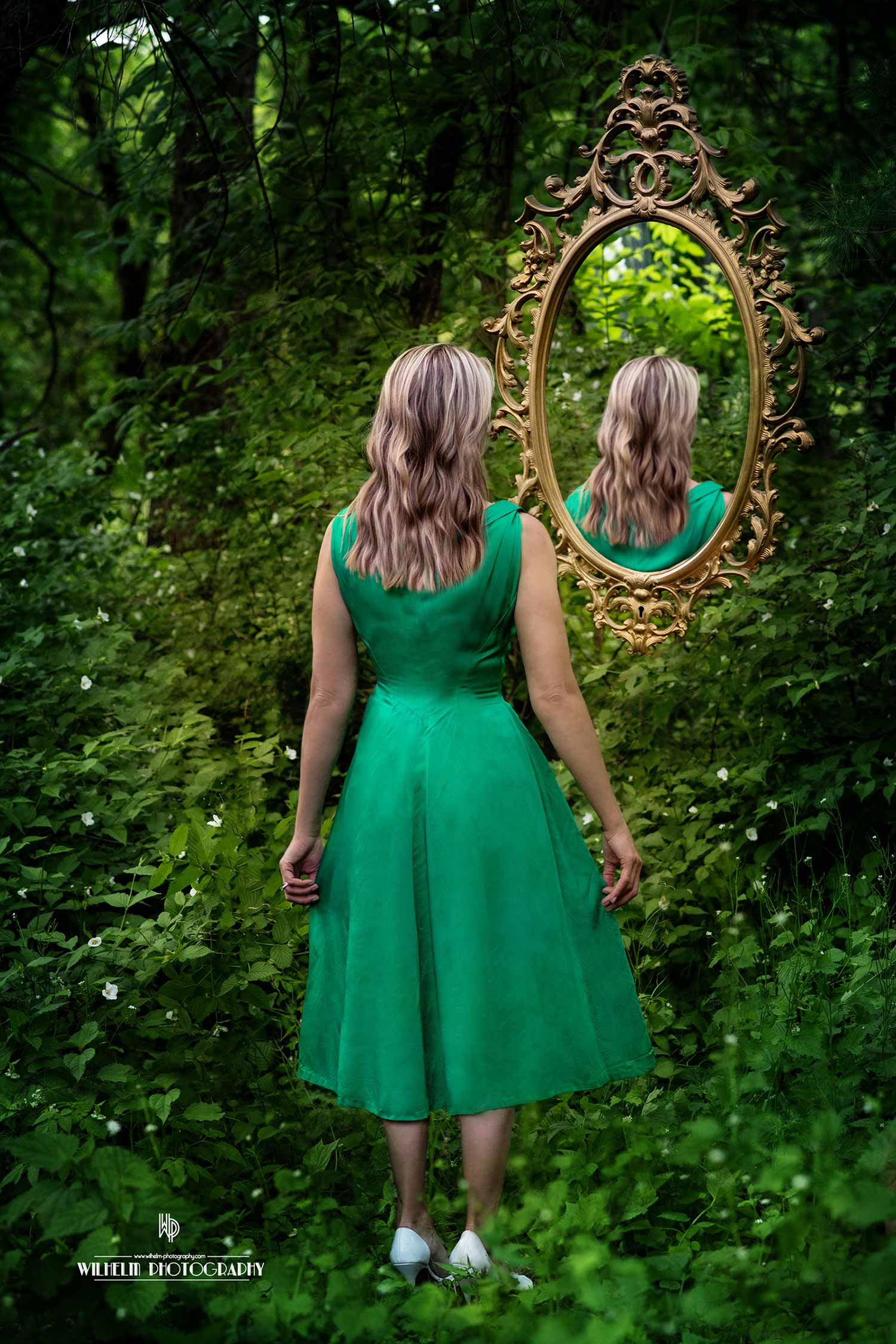
Image #3
I’m going to guess we’ve got a fine art image here. If I’m being honest here, I don’t get what I’m looking at. She’s looking at the back of her head in the mirror. Is she looking at her past from behind the rear view mirror? At the end of the day, it’s fine art, and the maker is trying to send a message, so I’m not going to critique the message. I am going to critique the glaring mistakes in this image that should’ve been fixed.
Fill in the bright spots
My first question is why is the top left corner not filled in? You took the time to drop that mirror in, fill it with the back of her head, etc., so why didn’t you take the time to fill in that area? It’s very distracting, because it’s a white area that doesn’t belong and it’s also the brightest spot of the image. It takes 10 seconds to clone it out; don’t overlook little mistakes like this.
Do you see the bright leaf above her head? I can’t stop starring at it. I feel like it’s not supposed to be there. From far away, I thought it was an apple on her head. Again, this can be fixed with a little clone stamping. Even though it’s a little detail, it is night and day once that is fixed. Don’t forget to fix it in the reflection too.
Fix the reflection
Overall, a good image, but there’s one last thing that’s driving me batshit crazy. You took the time to fix the subject’s hair in the field, but you did not fix the hair in the reflection. Giant fail. Look at that spot that was left, you can see the gap of her dress in the reflection, but not when she’s in the field. Details matter! I can’t stress this enough. I like the direction you were going, but these little things really make a difference, and if you want to be a fine art photographer, they definitely matter.
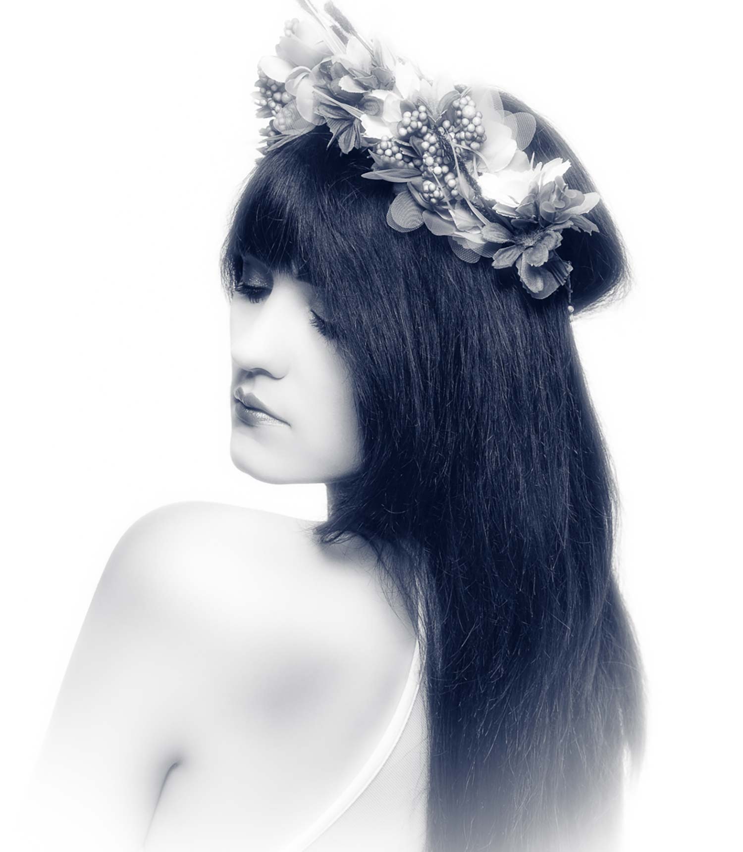
Image #4
This image is clearly a high key beauty portrait. Let’s dissect it. Let’s focus on something here; I’m always talking about how the eye will go to brightest part of your image right? This image is a perfect example of a situation where the opposite is true. Since it is high key, everything’s bright because of the contrast, so your eyes will now go to the darkest part of the image. The darkest part is her hair and that’s where we’re getting sucked into.
Remove the white vignette
How do we make this better? I don’t mind the high key, but the white vignette is really making her hair look horrible, I feel like it doesn’t help the image.
Move the hair
One of my pet peeves is the hair choking her out and blocking us from seeing her neck line. When I’m on a shoot, I’ve got an assistant who’s constantly coming in and sweeping that hair back to get it out of there so it’s all going in the same direction. In this case, that’s off her back. Everything is draped off that left shoulder, so why not have that little chunk of hair be draped as well? If you want to block her neck line a little, that’s fine, but I want that hair back.
I’m also seeing a lot of stray hairs by her left eye that’s looking messy. I don’t mind natural stray hairs, but this isn’t working for me. Fill that in, or pay attention during the shoot so you can fix it and not have it be an issue.
Nose to cheek
Last thing, we never want the nose to break the cheek. It is a rule most photographers live by. Here, the nose is just grazing that cheek line. It’s okay to break rules, but if you open her face up just a little bit or let her go complete profile, that would improve this image significantly.
Get critiqued!
Have you ever wanted PERSONAL feedback on YOUR photography from Sal Cincotta?
Enter your images for a chance to see your work being critiqued by Sal! Need some guidance? Want to show off some of your best work? Submit your images here for a chance to see them critiqued.


