
The images:
Click to enlarge
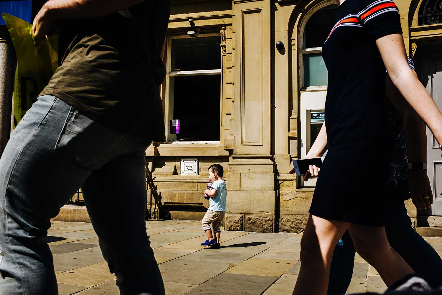
Image #1
I’m seeing what I’m going to assume it’s just more of a street photography shot, a photojournalistic shot. But look, at the end of the day, saying it’s street photography doesn’t mean that the rules of photography go out the window.
Where’s the story?
I know how street photography works. You’re waiting for these moments. What we have to do is when we’re looking at this kind of image is: where’s the story? What story are you telling me? If we zoom in, this is an adorable image. I don’t know if he’s trying to eat the bottle or drink from the bottle, but it’s enough to get you to smile. But, I’m seeing more of the back of his head. So, I’m really losing the most important element here, I think, of this shot, which is his expression, his response, his face. I know this happened fast, but I want to see his face. I want to see that expression because I think that’s where the real shot is in all this. It’s about him, right? It’s not about her random arm that’s out of frame. It’s not about his leg or his upper body. That’s useless. That’s not adding to the shot.
Use cropping to adjust your composition
We do have some issues here where we’re cutting off joints. Other than trying to frame him, I’m not sure that these two people are helping as much as they should. They’re creating a lot of distraction for me. Don’t be afraid to use cropping to get in. Sometimes you got to shoot wide, but use cropping to adjust your composition.
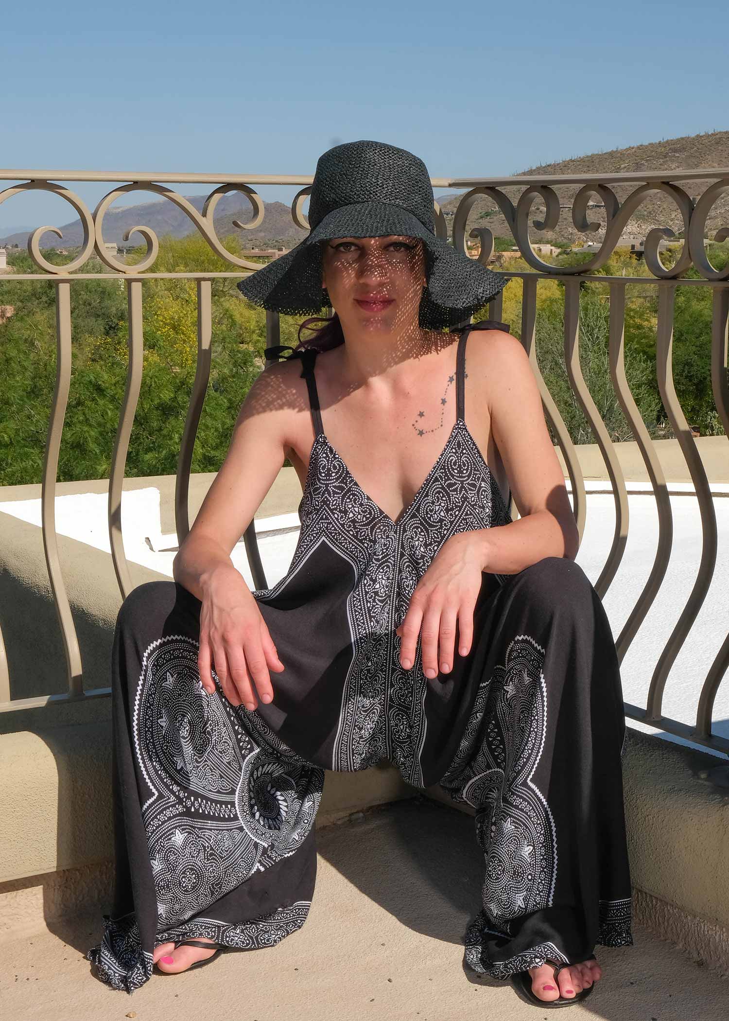
Image #2
Posing
So we’ve got all sorts of problems. The first problem for me is she looks like a catcher, right? This is a problem. You never want to shoot directly into the crotch. It doesn’t look good. It doesn’t feel good. It feels awkward. And we’re creating, even with the hands, we’re creating this kind of open area on the body. And the body lines don’t feel right. So, what I like to do with something like this, is stagger the feet. Have those feats stagger a little bit. Have one foot out so they’re kind of adjusting their body. I like to get her a little sideways, create some angles in the shoulders, have them leaning in a little bit, adjust those shoulder angles. And then the hands, instead of having them wide open, one hand can be on the wrist and then this becomes a little bit better.
Crop
Realistically, the sky is not adding to the shot. Because of this hard horizontal line through her head, it’s actually a distraction. With everything else going on in the shot, I think it’s just a distraction and it’s not making it the best it could possibly be.
Hard Shadows
We’ve got to think about where we’re posing. Look at the light and hard shadows that are being cast across her body. Hard shadows aren’t always bad, but we’re not using them in the right way here. The shadows being cast by the hat are also a distraction. Maybe the maker wanted to do something here with the pattern, but it’s just being lost in all the other things going on in this shot.
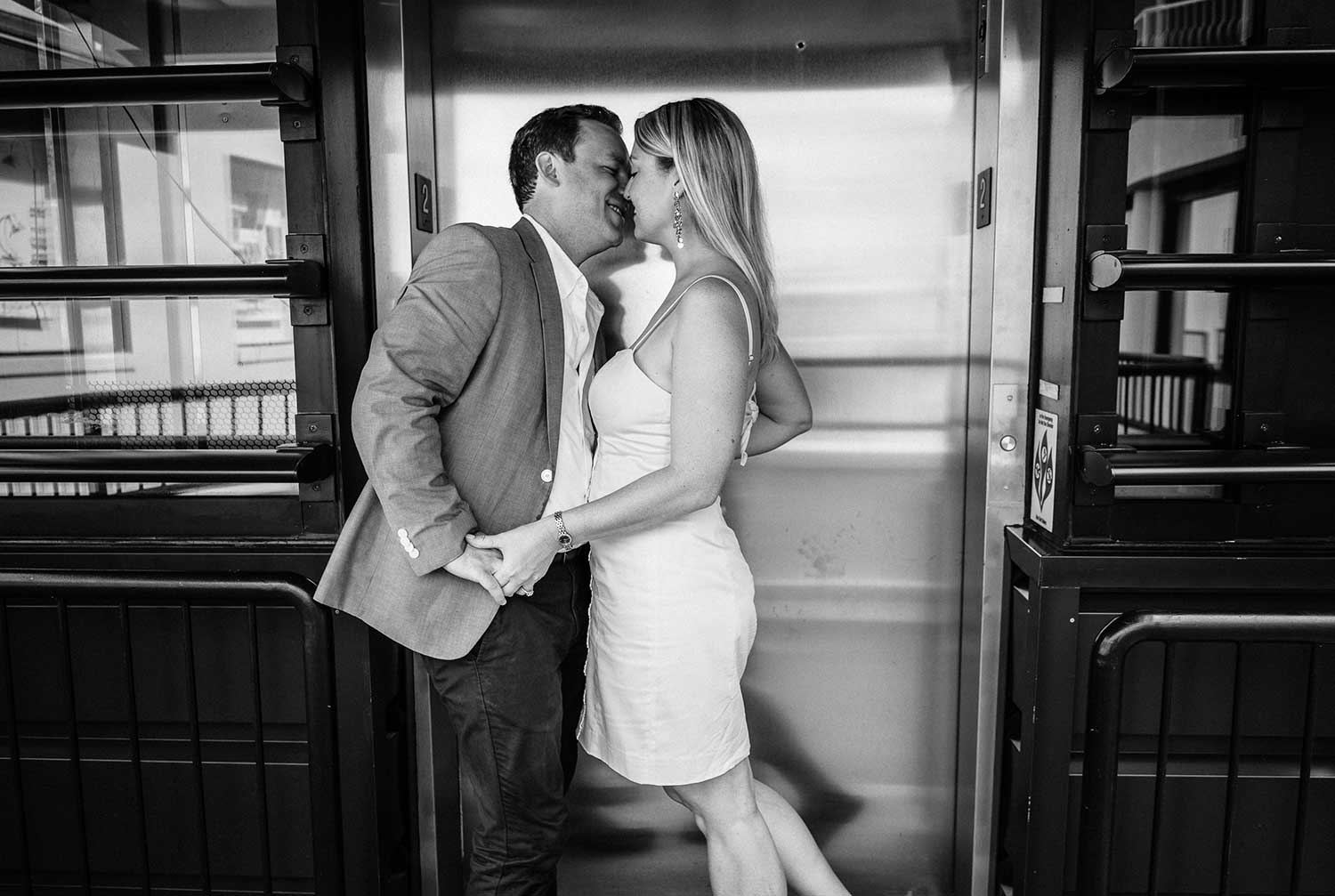
Image #3
Details Matter
I don’t know about you guys, but I cannot miss the paw prints on the elevator. That was the first thing I saw when I opened this up. Like, “Dude, whose greasy kid was all over this elevator,” right? It’s a distraction. Our job as professionals are to fix some of these distractions. You might be thinking to yourself if you’re watching this, “How am I supposed to remove hand prints from the elevator, Sal?” Grab a napkin, grab a rag. If you don’t have that, that’s fine to. Fix it in post-production. Imagine if this was a big 20×30 print. The couple is not going to put it on their wall with handprints all over. That becomes a distraction in my opinion.
Image Skew
The image is also skewed. We’ve got this peeling off kind of down to the left. So this is probably because we’re shooting it with a wider angle lens, and we are off to the side and that’s creating that skew. That is why we have to get squared up to a shot like this, especially when there’s architecture involved.
These are the kinds of things that you have to control in the field, which we can’t always do. Or in post-production, we have to look for ways to fix this stuff. I’m looking at it through the eyes of how can it be better, or through the eyes of, “How do we sell this to our clients?” Is it a saleable image?
Get critiqued!
Have you ever wanted PERSONAL feedback on YOUR photography from Sal Cincotta?
Enter your images for a chance to see your work being critiqued by Sal! Need some guidance? Want to show off some of your best work? Submit your images here for a chance to see them critiqued.


