
5 Tips for Better Black & White Editing in Lightroom Classic with Dustin Lucas
When you are photographing a couple, you want to make sure you have a great tonal range. This really helps as we convert to black & white later while editing. Many of us look for contrast and texture while shooting for black & white and enhance these elements in post-production. Of course, there are multiple ways to get your Raw images converted, and in this article I have 5 tips for better black & white edits in Lightroom Classic.
Tip #1 is conversion. I highly recommend converting to monochrome using Lightroom’s Black & White Mix tool. This gives you a lot of flexibility and control for tonal range. Tip #2 is using Tone Curve to dial in contrast. Tip #3 is creating punch with the presence tools like texture, clarity and dehaze. Utilizing these sliders can really make your edit standout. Tip #4 is dodge and burn. This is one of the most important tips as this will direct your viewer to the couple. This is my favorite part of editing to see everything come together. Tip #5 is push your creativity, create multiple copies, and do not stick with a single look. Add in some warm or cool toning to push your black & white images.
Tip 1. Convert with Black & White Mix
This is the simplest tip but crucial for converting your images to black & white. Strike the “v” key in Library or Develop mode and your image is instantly changed to monochrome. Another popular method is dropping the Saturation slider to -100, however, this is a bad practice and here’s why. Once you drop Saturation you lose all ability to adjust HSL to dial in the luminance of each color. Remember, you just cut all color out of the image so there is nothing for HSL to grab onto. This is why converting to monochrome with Black & White Mix is better for control.
After our image is converted we can navigate to the Black & White panel to adjust the color mix. What I love about Lightroom Classic is the ability to use a target adjustment tool to help control this as well. In the upper left corner of the Black & White panel I can choose the target tool and begin altering my image. Simply click anywhere in the image and drag the cursor down to decrease luminance or darken based on colors represented. I like to darken the blues in the sky, so starting there I can click and drag down to darken all the blue and aqua colors of the image. We can also quickly brighten skin tones by clicking and dragging upward. Keep in mind this will alter orange and red color across the entire image. We might want to save this for dodging and burning later, but you can see how simple and powerful Black & White Mix can be.
Keep in mind this only works if you have a color image to start with. If you shot with a black & white effect baked on the Raw image, you can’t do this either. So in this case, shoot in color so you have options later to convert! Let’s move on to Tone Curve to expand our range of tones.
Tip 2. Control Contrast with Tone Curve
Curves is a heavily utilized tool for most editors and if you have been using the contrast slider for toning, it’s time to convert to Tone Curve. You can work more simply from the sliders or create your own custom curve with points. Another simple way to tone is by using the target adjustment tool to click and drag upward to increase or click and drag downward to decrease specific areas of the tonal range. My preference is to use the point curves to flatten or matte the blacks and subtly darken the brighter tones in the image. Using Tone Curve lets me achieve this look much better than lifting the blacks slider or lowering contrast in the Basic Panel.
Using the point curve and the target adjustment tool I can really isolate specific tonal ranges and recover muddy skin tones, for instance. This image is almost done with these two adjustments alone, however, I may want to add some more creative effects in the next tips. Let’s move to the presence sliders to add some punch to this image.
Tip 3. Create Punch with Presence
I really like adding impact to my images with the presence sliders like texture, clarity and dehaze. There is a level of intensity I like to create, especially with black & white images. Starting with texture, you can immediately see the edges are sharpened while the tonality is not altered. This does a much better job for skin tones than clarity. You can now quickly soften skin by dropping clarity below zero and increasing texture as a sort of softening and re-sharpening technique. You can take this a step further and apply these same effects with local adjustments so we don’t sacrifice the background while softening skin. We will cover more on that next.
Clarity has always been the go-to tool for adding intensity to skies and architectural elements. Let’s save the softening technique for later and move into dehaze. Dehaze is a unique tool that shifts the mid-tones, shadows and blacks in unison to add a deeper tonal range for the left half of the histogram. It really adds dimension to the sky that we were lacking before using only the Black & White Mix panel. Keep in mind this will greatly affect our subjects as well, so you want to be subtle on the global changes and save the fine-tuning for local adjustments.
Let’s dive into using the radial and adjustment tool to really take this image to the next level.
Tip 4. Direct Viewer with Dodge and Burn
Dodge and burn is the key element to direct your viewer and keep focus on the couple. In Lightroom I want to work fast and the radial filter is the right tool for the job. In Develop you can hold shift and strike the “m” key to turn this on. Then we need to click and drag an oval to lightly surround the couple to get started. You can toggle the “o” key to see where the filter will be applied, which is where the color overlay appears. This is the opposite of Photoshop where the color overlay would be the masked-out area. You will notice the couple is highlighted here as the invert option is checked. If you want to apply an effect to everything but the couple, you can uncheck invert. Keep this in mind for later.
I would generally lighten them by lifting exposure, shadows and adding some texture. Pretty simple application. To reverse this effect, I can add another effect by right-clicking the pin and choosing duplicate. Remember, these are right over top of each other so we would need to move it slightly. Then, uncheck the invert option and drop exposure, lift clarity and dehaze to activate the intensity of those presence sliders. This is a really simple dodge and burn technique and it’s a really good base to start from. Next, we can add or remove areas from the radial filter by using the brush tool. It would be necessary to darken between their legs so the background is synonymous. Definitely leave the auto mask option checked as this works well here.
Additional changes would include using the adjustment brush for softening skin as well as slightly lightening their faces. Overall, I’m pretty happy with how this image is turning out. Let’s push the creativity of this edit further with the next tip.
Tip 5. Push Your Creativity
This next tip is geared towards adding a subtle color grade or temp to the black & white. This is where we can flex some creativity using the Tone Curve. Using the point curves you can choose specific RGB channels: Red for adding cyan or red, Green for adding magenta or green, and Blue for adding yellow or blue. I like to use the blue channel to add some warm tones to the shadows. We can click the lower-left point and drag right to achieve this look quite quickly. If you don’t like the color grade effect but want to keep your previous tone curve changes, right-click on the curve and choose flatten. This will only affect the specific channel curve you adjusted.
Split toning allows you to do this as well from a more limited range of adjusting highlights or shadows. You can also quickly choose which color you’d like to shift the shadows to much more effectively than the Tone Curve. This also makes it fast to toggle this on or off versus having to flatten the channels individually. Now we are done!
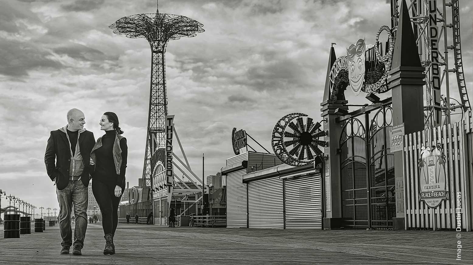
The Results
These are the 5 tips to better black & white in Lightroom Classic. Start by converting to black & white the proper way to maintain control of your edit with the Black & White Mix tool. Use the Tone Curve and presence tools to push the tonal range and intensity of your edit. When it comes to dodging and burning images in Lightroom, I usually start with radial filter to work fast. If I have to refine a mask I can, but I ultimately prefer efficiency over perfection in this case. Duplicating and inverting custom masks can really cut down my time! At the end of the day you should push your creativity and make virtual copies of an edit. Don’t be afraid to explore!


