
5 Tips for Better Black & White Portraits with Michael Anthony
Monochromatic photography is one of my favorite ways to display art. Our clients know us for our use of color vibrancy, but there are many times when removing the color from your image is appropriate to either set the mood of the story or just make the aesthetics of an image look better.
However, shooting an image in black & white is so much more difficult than just slapping a black & white layer over the top in post-production and going about your day.
In fact, the best black & white images are planned from the start and post-produced to match the artist’s vision.
As a wedding photographer, I have many uses for black & white portraits, whether designing an album or creating artwork for my client’s home. The truth is, however, I’ve never converted an image to black & white in post-production without envisioning it to look like that from the start.
Black & white should be used to remove distractions from your image and help bring more focus to your subject. A black & white portrait can help focus on your subject’s emotion, as well as eliminate color patterns that take attention away from them.
The key is to use black & white to help communicate your vision more efficiently than a color image would do.
So today, I’m going to go over five tips to help you create better black & white portraits.
Tip #1: Look for Natural Contrast First
Our eyes are drawn to points of contrast, and when an image is in color, the interrupted color patterns separating our subject from the background can help direct our eyes to a particular part of the scene.
However, when you remove the color from any image, the viewer’s eyes tend to look at the luminance levels in their entirety as opposed to looking for breaks in a color pattern. Therefore, when you are looking to create beautiful black & white portraits, you have to look for a background that will allow your subject to stand out. As it’s possible to manipulate a color’s luminance levels in post-production, you can keep your eye out for colors that are opposite from skin tones, or entire backgrounds that fall into darkness while your subject is in light, just as you would do for a color portrait.
By finding the natural contrast between the subject and the surroundings, either through light or through color, we can know that we’ll have the base to be able to separate our subject from our background.
A great example of this would be to find foliage or greenery. Skin tones are naturally orange, with a bit of magenta, so if you have green or blue hues in your background, you will be able to utilize the natural contrast to separate your subject from your background without using color in your image. This will help them to stand out, and it will bring them into focus.
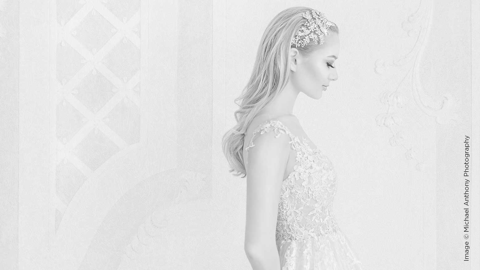
Take a look at this image. The colors of our subject’s gown and background were taking attention away from her eyes. However, after we applied one of our black & white presets to the image, we were able to remove the distracting elements surrounding her and bring attention to her face and eyes.
Tip #2: Shoot in a Black & White Picture Profile
Digital cameras have a lot of great features. One of my favorites is the ability to utilize a picture profile on your image to see what a particular style would look like for your photo. If you are shooting an image in the Raw format, don’t worry—this won’t be permanently destructive to the color of your image. It will just give you a preview of what your image will look like after a black & white conversion is completed. Utilizing a black & white picture profile with high contrast will help you to see the final version of your image prior to even bringing it to a computer. This will allow you to see if you are photographing on the best backdrop possible.
On my Canon 5D or Sony A9, I use the monochrome picture profile with the contrast turned up and no additional filters placed over the image. This will allow me to see if there is enough separation between my subject in my background to be able to create a beautiful image in post-production. I often shoot bridal prep in this mode, along with any situations that have mixed lighting, where I am unable to utilize flash gels to compensate, like an indoor ceremony that doesn’t allow strobes.
This will help me get as close as possible to my end result, leading to a much better image in the frame.
Tip #3: Use a Backlight
I’m including this tip because often, we are photographing subjects who are either wearing dark attire or have dark hair. By utilizing a hair light for a room light, we can create separation between the subject and the background. Per Tip #1, you want to look for contrast first, but that often means that you will be photographing a subject with dark hair on a dark background. If that is the case, then you need to find a way to make sure that they stand out by adding separation in the form of a rim light or hair light.
If possible, I often use a soft light modifier to get the most three-dimensional look out of the separation light. I try to keep it opposite the key light for the most efficient three-dimensional look.
Tip #4: Stay Away From Plugins for Your Black & White Conversion
There are some really popular pieces of black & white conversion software available … and I will be the first to tell you that you should stay away from all of them. First of all, almost every plugin that Photoshop uses just uses Photoshop’s tools. And the ones that don’t tend to use its proprietary algorithms for conversion. Adobe is the leader in image manipulation software; there really isn’t even a close second as of today. Photoshop has really amazing tools to help create a beautiful black & white image. If you check out the video attached to this article, I will show you how to use my favorite tool to create stunning black & white portraits, which is the gradient map. This will allow you to define highlights and shadows and really micro-adjust your contrast when creating black & white portraits. Gradient maps also allow you to properly desaturate an image that isn’t intended to be fully black & white.
Most plugins will remove detail in the highlights and shadows of your image, which is where you need to have the most detail present to create beautiful portraits. Because of this, I think it’s a good idea to stay away from them when creating your black-and-white conversion in post-production.
I prefer using a combination of gradient maps with curves and the channel mixer to get really beautiful black & white conversions for portraits, whether shot in the studio or on location.
Tip #5: Use Black & White Conversions to Emphasize Emotion in Your Photographs
This tip doesn’t apply to just wedding photographers, although in wedding photography there will be many uses for its application. Black & white conversions help remove distracting elements in an image, allowing you to focus on telling the story and relating the emotion in your photo. Color becomes a distraction, especially when it leads to the viewer looking all around the frame to find the subject of an image. When emphasizing emotion, every little detail needs to lead the eye directly to the story of that image. This is why many powerful black & white photographs convey emotion or story.
Think about it. Picture a beautiful moment between a bride and her father—the dad’s expression is perfect, you can see a tear in your bride’s eye, and then bam! Your eye goes right to Grandma wearing a bright yellow blouse in the background. That instant of disconnect takes the viewer’s attention away from the story, refocusing it to the distracting element in the scene, and once that emotion is gone, that flame is hard to reignite.
So there you have it—those are my five tips for creating better black & white portraits. By utilizing one or all of them, you can create better pictures that will help you focus the attention on your vision, rather than on distracting elements in the background.
For a quick tip on how to make a good black & white conversion, please make sure to watch the video attached to this article, as I will dive into one of my favorite techniques for these conversions in post-production.


