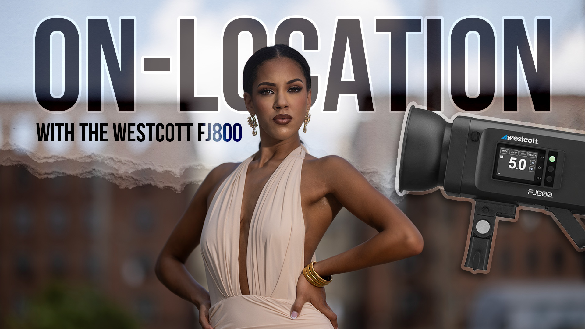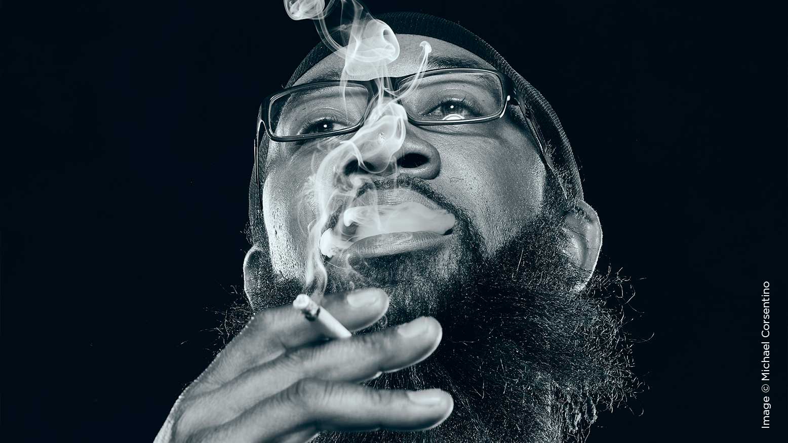
Hip-Hop Portraits! with Michael Corsentino
Whether in the studio or on location, creating great portraits starts with your vision for the images. This is known as pre-visualization—“pre” because no images have been captured at that point, and “visualization” because whatever concept you have in mind is what you hope to produce. This all takes planning and creating a road map to realize your pre-visualized ideas.
Once your pre-visualized concept is locked in, the next step is choosing the right tools, techniques and props necessary to get there. That means the lighting, location and background, wardrobe, and hair and makeup. All these elements need to be consistent with and in support of the pre-visualized concept.
For this series of hip-hop-inspired black-and-white portraits, I wanted a dramatic, moody, high contrast look. In the studio, nothing says drama like a black background. My concept was all about black on black—black skin, black wardrobe, on a black background. Lit properly, this monochromatic palette would isolate, elevate and highlight the subject in a punchy, dramatic way. Lit poorly, everything would merge into a flat, black blob. To keep this from happening, to separate the subject from the background and maintain detail in the wardrobe, the lighting design needed to be just right. With black skin, black hair, and black clothing on a black background, the lighting is all about separating the subject from the background and holding detail in the clothing and shadows.
Some people just look the part, and Vlad is definitely one of them. Despite the fact that he isn’t a hip-hop star, he easily could be! So we set out to create a series of rap- and hip-hop-inspired portraits. Naturally, we had a killer hip-hip playlist accompanying the shoot to set the mood in the studio. I always shoot with music; many subjects bring their own or select their favorites on the studio iPad. Wardrobe and styling direction were communicated prior to the shoot, and Vlad showed up with a range of options. I knew that I wanted all black for the black-on-black effect and that I wanted smoke to play a role—Vlad always has a cigarette hanging off his lip, and I wanted the white of the smoke as a counterpoint to all the black happening in the images. I also requested eyeglasses, sunglasses, jewelry, and any hats Vlad liked.
For me, lighting is always a problem-solving exercise. Even with a solid plan in place, issues and curveballs often crop up. The expected result from your plan may need tweaking—mine often does! Good lighting requires an open, inquisitive mind and the ability to adapt on the fly. I’m continuously refining as I work toward the final lighting solution. Solving these issues is kind of like solving puzzles—if you like one you’ll like the other.
My plan for the key light was a strobe with a Mola Demi silver interior beauty dish. The highly polished interior of this reflector does something really special to black skin by imparting a beautiful specular quality and beauty-dish sizzle, perfect for these portraits. To create the separation I wanted from the background and add highlights to the left and right side of Vlad’s face, I added a strip box with a 30-degree egg-crate grid. These were placed behind where Vlad would be standing, on the left and right side, both opposite the key light. The reason I used grids on these “kicker” lights was two-fold. First, both lights would be facing the camera, and grids help keep light on the subject and out of the camera’s lens. Second, grids confine the light into a narrow, defined beam, allowing you to light more precisely. In this case, they allowed me to throw a narrow, vertical shaft of light onto the left and right sides of the subject.
I chose f/16 for my aperture setting (my usual suspect in the studio,) 100 ISO, and 1/125-second shutter speed. Remember, in the studio with flash, shutter speed is essentially immaterial. In most cases, you set your shutter speed at your camera’s max sync speed and leave it there for the entirely of the shoot. In the studio, it’s all about f-stop and flash power. This is why a flash meter is such a useful tool. With a handheld flash meter, you dial in the same setting you have on your camera and measure the strobe output until it matches those settings. If the meter reads f/22, you dial down the power of the strobe until it meters, in this case, f/16. What’s cool about this is once that’s done, your first exposure is spot on, zero guesswork. Then you can noodle and season to taste. So my first step is always metering! I start with the key light only and then add in additional zones. I meter the kicker lights to match the key light at f/16. This is higher than I typically meter accent lights, but I started there and I liked the look for these portraits.
With lights dialed in, we began shooting. I started with tight portraits and really liked the result. You can see from the step-by-step images included here what a dramatic difference adding the kicker lights made over using the key light alone. Without the kicker lights, everything blends together and there’s virtually no separation between the subject and the background or the subject’s beard and clothing.
When I switched lenses for wider head-and-shoulders shots, that curveball I mentioned above reared its ugly head, as it always does. In this case, the kicker lights were now contaminating the exposure, creating unwanted lens flare. This was because now, with the wider field of view, the lights were pointed into the lens. To remedy this, I added two 4’x8’ black-faced v-flats, one on either side of Vlad to block the kicker lights from the camera’s lens. This way, they were still able to create the lighting effect I wanted without contaminating the exposure. You can see their position relative to the kicker lights in the step-by-step images.
Once the lighting is dialed in, I also create a color grade for the shoot. In this case, I started with a black-and-white conversion and then added a cool blue-tone overlay to give the color grade its finishing touch. I created the color grade using one of Phase One’s Editorial Style Packs for Capture One Pro. The styles are akin to Lightroom Presets. I like to create a color grade at the beginning of the shoot so I can better asses its effect on the lighting in real time and make any adjustments necessary. Check out the three before-and-after color grading images to see the progression.