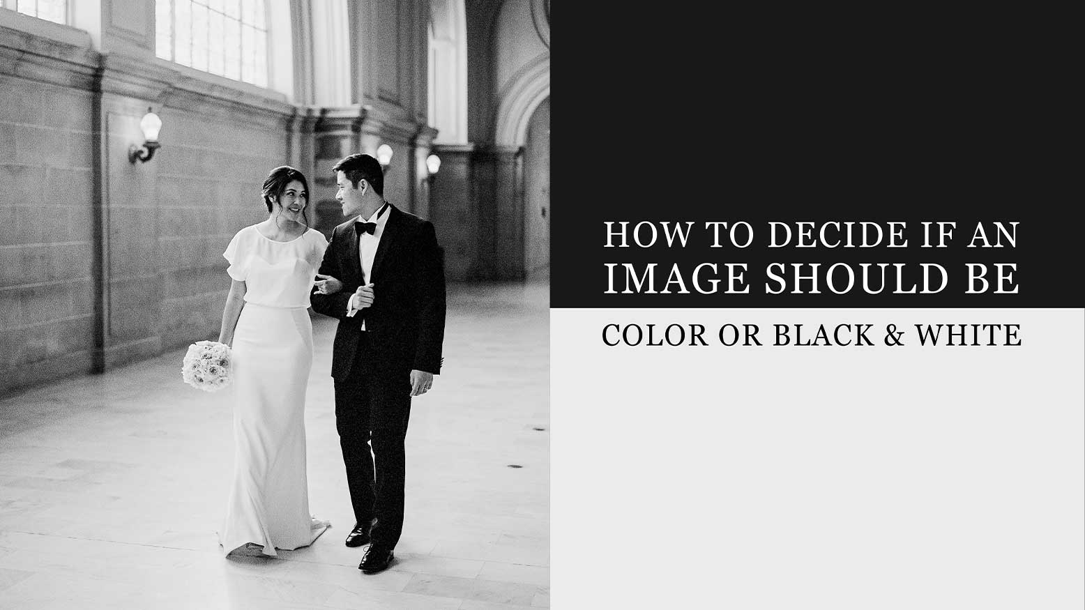
How To Decide if an Image Should Be Color or Black & White with Jeremy Chou
When modern-day photography was invented in 1839, the only option available was black & white. It wasn’t until Kodachrome came around in 1935 that color photography became more widely available and started gaining popularity. It goes without saying, some of the most important and iconic photographs of our generation were all captured on monochrom film. Just the mere mention of these images conjures nostalgia that echoes the ghosts of our past. Some of these images include the sailor and nurse in V-J Day in Times Square by Alfred Eisenstaedt, Raising the Flag on Iwo Jima by Joe Rosenthal, the Hindenburg Disaster by Sam Shere, or Migrant Mother by Dorothea Lange. These black & white images inevitably documented our collective history in its raw form. Some of these images helped to shape public opinions and record our legacy. Some could have even changed the course of history. I truly believe we have an innate emotional reaction to black & white images because humans have been conditioned to see these images as iconic and of utter importance.
Once all the colors are stripped from an image, the viewer is forced to focus on light and shadow, emotion, and composition of an image. It’s the essence of how an image makes us feel when it’s viewed. Without the distraction of the presence of colors in an image, the true intent of the photographer can be revealed. The most raw and innate response a human can have is when presented with an image. It brings our reality to a different dimension and allows our imaginations to run free.
As a creative, ultimately it comes down to the artist’s interpretation of when a moment will be best presented in black & white. Although a lot of times it’s a very subconscious decision, there are often consistent deciding factors that I take into account. It usually comes down to the following: emotion and mystique, motion, contrast in shapes, pattern or lighting, or when images have technical imperfections.
However, with that being said, of course color images are critical and should always be utilized when appropriate, especially in storytelling where color is of importance, such as cultural events, concerts, fashion shows, etc. Many events will benefit from colors being represented so a more cohesive storyline can unfold. For example, I am primarily a wedding and portrait photographer. I would guess my clients could be pretty upset if I decided to present their colorful bouquets and decor in monochrome.
Here are the four factors that inform my decision if an image should be presented in color or black & white.
EMOTION & MYSTIQUE
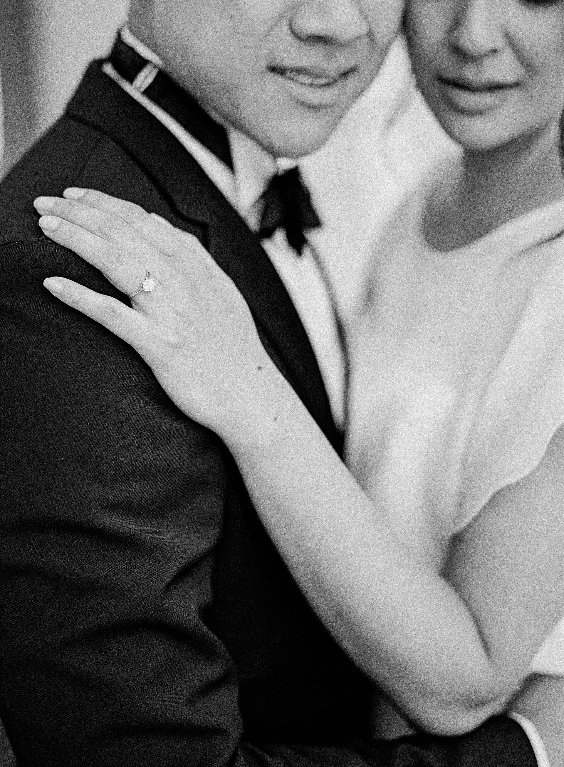
Typically, when an image is tugging the viewer at their heartstrings, it’s usually a tender or joyous moment. These heart-wrenching moments happen regularly throughout a typical wedding day. It could be during a fleeting moment during the speeches, where the best man and the groom exchange an understanding nod and a huge laugh. Or a sweet first dance embrace between the newlyweds on the dance floor. What about a crying father who can’t quite let go of his baby girl after walking her down the aisle.