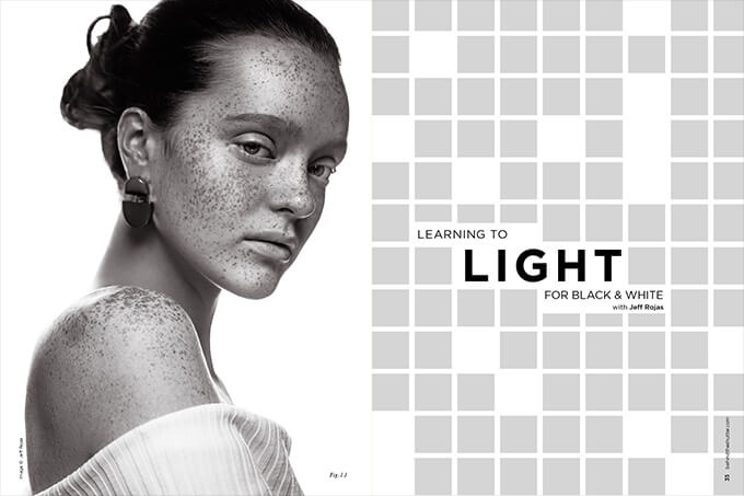
Learning to Light for Black & White with Jeff Rojas
A quick search on Google reveals hundreds of tutorials explaining different ways to convert your vibrant color images to beautiful black and white. What most of those tutorials fail to mention is that the key to creating compelling black-and-white images happens long before post-production. It starts with lighting.
Deconstructing a B&W Photograph
No two black-and-white images are created the same way. Don’t believe me? Try downloading any toning preset for Adobe Lightroom or Capture One, and use it on images with different lighting and exposure. Even when you’re using the same settings, you’ll quickly see that the results are different. Why? Because you haven’t taken into account that the black-and-white preset you’re using has a fixed formula. It’s not accounting for the exposure, highlights and shadows of the image. Presets aren’t intuitive. It’s still up to you to tweak that preset to create your ideal black-and-white image.
In theory, if you wanted seamless black-and-white toning across all of your images, you’d have to use the same lighting, exposure and contrast, but for most of us, that’s simply not practical. Being aware of those discrepancies between images allows you to selectively adjust them to be more in sync with one another. Take the images in Figures 1.2 and 1.3. The image in Figure 1.2 is photographed using an octabox in a controlled studio environment, while the image in Figure 1.3 is photographed using unmodified available light. Even though the intensity, quality and direction of the light is quite different, the tones in the images are similar. That’s simply because I’m very aware of how each of those lighting elements affects my final image. I can better control my settings and direction of light to accommodate for those variables so that my final images are more aligned with one another.
If you’re deeply enamored by black-and-white images like I am, don’t focus solely on toning. Pay close attention to how the light affects the overall visual contrast and mood of the image. You’d be surprised how that mindset changes your overall view of how the final image was created. Look at Figures 1.5 and 1.7. The image in Figure 1.5 is high key and Figure 1.7 is dramatic, but both use the exact same main light and reflector to light the subject. Both have the same preset in post-production, as you can see in Figure 1.6. The only difference between the two images is the inclusion of the background light facing the camera, which you can see in Figure 1.4.
So why is that important to know? Remember that the only variable I changed between Figures 1.4 and 1.5 was the inclusion of the background light, which directly affects the way our eyes view the final image. That’s the impact that light plays in creating black-and-white images. It influences how our minds perceive contrast and toning, long before we adjust the final toning.
Why Light Matters in Black-and-White Photography
The most boring topic for new photographers studying light is the characteristics of light. While I could literally write a book about it, I’d rather you have a working knowledge of how light works and learn to master it, through practice, than have a theoretical understanding without practice. Keep it simple. There are four main characteristics of light: quantity, quality, color and direction. Some of those characteristics overlap, but to keep it simple, let’s discuss them separately.
Remember that when you’re shooting black-and-white, you’re effectively photographing grayscale, which is a range of gray shades from pure white to pure black. That’s true whether you’re delivering your images in print or digitally. Understanding how light affects contrast, or the difference between light and dark tones in your image, becomes evidently more important.
QUANTITY/INTENSITY
Quantity refers to the intensity of light you’re introduced to, whether natural or artificial. It’s a term used to determine how much light you have in your image. By introducing more lights into your image, you’re affecting the overall contrast. For example, if you’ve created well-defined shadows with one light, adding a second light to the shadow areas reduces the overall shadows, and influences the perceived contrast of the final image, as we see in Figure 1.5.
Remember that contrast is the difference between the highlights and shadows of your image. If your goal is to photograph a dramatic black-and-white portrait (like the image in Figure 1.8), you’ll need more contrast. Adversely, the less of a difference between your highlights and shadows, the flatter your image will be. Images with similar tones (flat images) aren’t bad. If you study the histogram (Figure 1.10) of the image in Figure 1.9, you can see that there aren’t very many pure whites or pure blacks. The small blue dots represent the pure blacks in the image, and red dots represent pure white parts (there aren’t any). The range of tones are much closer together compared to the histogram of the image in Figure 1.1.
When you photograph a subject in flat light, you have to create that contrast in post-production for a more dramatic lighting. While that sounds practical, you may have a difficult time replicating the tones you would achieve photographing more contrast in-camera, especially if you haven’t accounted for the quality of light.
QUALITY
Because there isn’t a quantitative way to score light quality, we discuss how “hard” or “soft” it is. You’ll know that you’re working with hard light when your images have well-defined shadows and lots of overall contrast. The shadows in soft images transition to areas of light without definitive lines of shadow. Always remember: Shadows are created by the absence of light.
If your image looks flat, you’ll have to use less light, use a different modifier or reposition your light to create more contrast.
COLOR TEMPERATURE
Light has a temperature. While color does not play a factor in your black-and-white conversions, it’s still a characteristic of light that you should know. All light is not equal. A candle produces warm light, while a fluorescent bulb emanates cool light. Similarly, the color of light outdoors shifts depending on the time of day, weather conditions and a variety of other factors. Light is measured on the Kelvin scale, which is a standardization of color.
Quick Tip: Because color doesn’t play a factor in your black-and-white images, change your picture profile (or style) on your camera to monochrome if you’re shooting Raw. This allows you to see your tone and contrast right on the back of your camera, and makes it easier to see the overall position of light.
DIRECTION
The direction of light refers to where the light is coming from. It influences the shape of the light in your scene. The direction of light changes the overall pattern of light.
Position the light high and to the side at a 45-degree angle, and you’ll create traditional Rembrandt light (my favorite form of light), like in the image in Figure 1.10. Reposition that same light to the side of the subject, and you’ll have split light, like in the image in Figure 1.8. Each position of light influences the overall contrast of the subject’s face and affects the mood and tone of your image.
Remember that before you ever convert your images to black and white, you should be aware of how lighting influences the final output of the image so you achieve the results you were hoping for.

