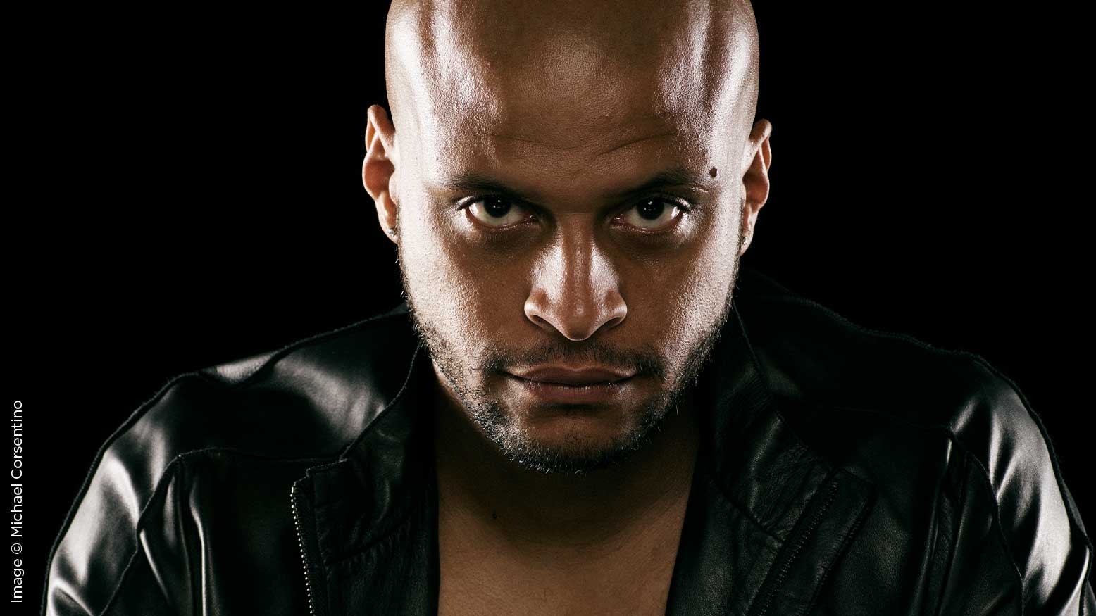
Lighting Recipes Series: Hatchet Light with Michael Corsentino
Those of you who follow this column know the main goal of my monthly lighting tutorials is to teach you how to think about light, show you how to effectively use lighting tools, arm you with knowledge you need to think on your feet, teach you how to solve the lighting problems you’re likely to encounter, and help you learn how to design lighting that can support a range of subject matter. My approach is always to try to teach you how to fish rather than just give you a fish. With the former, you never go hungry, while the latter only feeds you once.
For this reason, I’ve shied away from outright recipe-based tutorials in the past. Recipes have their place, but anyone who’s tried to follow lighting recipes knows their results don’t always match the sample images they’re trying to replicate. This is especially true on location, where ambient lighting conditions (among other factors) can differ widely. In the studio, things are considerably more consistent, but even there, reproducing an exact match of tutorial images can be a frustrating exercise. I know—I’ve tried.
Despite that, everyone loves a good recipe, and there is much to be gleaned when they’re approached with realistic expectations. So with those caveats in mind, I’ve decided to share a series of studio and location lighting recipes with you in the coming months. I want you to view these more as guidelines than biblical proclamations. Your mileage is likely to vary, and that’s not only OK, it’s to be expected and embraced. Each subject’s face is unique and responds differently to light, the power of your strobes may differ, your lighting modifiers may not be an exact match, you may have a smaller or larger studio, etc. The good news is that these lighting recipes will get you into the ballpark, and after some honing and experimentation, they’ll allow you to develop a solid, repeatable repertoire. Have fun with these, and season to taste when necessary.
Be sure to check out last month’s primer on foundation lighting patterns and my two favorite, highly versatile patterns. These classic forms of lighting are the ultimate recipes for consistent, predictable results based on light distance, direction, and angle relative to the subject.
For the inaugural lighting recipe, I’ve chosen a lighting pattern often referred to as hatchet light. It sounds painful, but the results are worth it. This pattern generally consists of a key light in front of the subject and two accent lights on the left and right behind the subject. These two accent lights sculpt each side of the subject’s face, providing the majority of the light. The key light in this case is used only for a subtle-but-essential fill light. This is a look you’re probably seen a lot, especially as political season ramps up—I know I have. It’s power lighting at its best: very dramatic, muscular and sculptural. It’s also a popular look for sports and entertainment portraiture. I’ve seen it successfully used with both male and female subjects, and it’s a style I continually come back to.
The direction you take the quality of light for this or any other portrait is based largely on your choice of modifiers. I wanted a specular, edgy look, so I chose a 22-inch Mola beauty dish with a silver interior for my key light, with a Lastolite Triflector with three silver panels beneath it. The reflector was there to provide fill light, opening up shadows under the eye sockets and chin. This over-and-under key light and reflector arrangement is known as Clamshell Lighting, and it’s my go-to for a wide range of awesome looks. See last month’s feature for more on this.
In most situations, this arrangement plays a pivotal role. In this case, the effect was minor but evident, as the key light was used more as a fill light than anything else. The majority of the light being contributed came from the two accent or kicker lights on the right and left of the subject. Be that as it may, silver interior modifiers and reflectors are the way to go when you want a punchy, specular look. If you want a softer look, it’s as easy as using modifiers with white interiors and reflectors with white surfaces. Adding additional diffusion material on your modifier is another useful option for creating softer lighting.
The whole game here is the kicker lights. These are both placed behind the subject and angled toward the camera position, casting light on the subject’s left and right sides. Where this light begins and ends on the subject’s face is a season-to-taste affair. In some instances, you’ll want to avoid it hitting the subject’s nose. In this case, it wasn’t an issue. Refer to the included behind-the-scenes images for a better idea of placement and angle relative to the subject. Kicker lights for this look are most often strip boxes with egg crate grids placed on them to confine their light into a narrow beam. Grids are an essential component for this look, as they shape the light from the strip box into a narrow beam, making it much easier to control and place exactly where you want. Despite strip boxes being narrow modifiers by nature, absent grids, the light would be much wider. Grids are available in a variety of models, typically 10º, 20º, 30º and 40º, each controlling the spread of light to a different degree. The smaller the number, the narrower the beam of light cast. I used 30º for both the left and right kicker lights. The strip boxes I used were Elinchrom 14x35s, and the grids were LightTools. FYI, Elinchrom recently announced a long-clamored-for line of grids—rejoice! I opted to leave the strip box’s diffusion fabric in place; their silver interior fabric was too harsh without it in this case, and I knew I wanted flexibility with contrast levels in post.
Using a handheld flash meter, I set each of the kicker lights to f11, matching the aperture on my camera. Shutter speed was 125, and ISO was 100. That ISO and shutter speed are my standard settings in the studio, with the aperture typically ranging between f8-f16. I also metered the key light at f11, so that all the lights were on an even playing field to start. This ended up being way too much light, and I lowered it down by eye, making a few captures until I was satisfied with the balance between the key light and kicker light zones. You can see in the step-by-step images that despite it being properly exposed, setting the key light at f11 washed out the entire effect, losing all the drama. For best results, the key light contributes just a kiss of light.
The last step is polishing off the image in post. A good color that supports the look you’re after does wonders. For me, that happens in Capture One Pro 12 using styles and adjusting to taste. If you’re a Lightroom or Photoshop user, you have Presets, Actions, and Curves adjustment layers to accomplish the same. I chose a punchy look, and the rest is history. I hope you’ve enjoyed this recipe as much I did sharing it with you. Have fun with it, try it out, and let me see what you come up with. Until next month—go forth and light!