Portraits With Impact with Michael Corsentino
The best portraits, and those I strive to produce, have impact. The elements that provide that are numerous and differ from subject to subject. But they remain a fairly consistent and solid list of potential contributors. The longer I’ve made portraits, 40-plus years, the more steadfast I am in the belief that it all starts with lighting. Whether soft, hard or anything in between, each quality of light and shadow imparts emotion and drama to help tell a unique story. Lighting’s job is to support the story you’re trying to tell rather than distract from it.
Other elements that can add impact include your choice of background: a location or color, physical attributes, skin color, wardrobe, hats, jewelry, cigars, cigarettes, sunglasses, cars, motorcycles, musical instruments, essentially anything that helps tell your subject’s story. I refer to many of these as props, and I always ask my subjects to bring a range of options. They make a significant difference in the end result, give your subjects something familiar that comforts them and something you can use to build a portrait around.
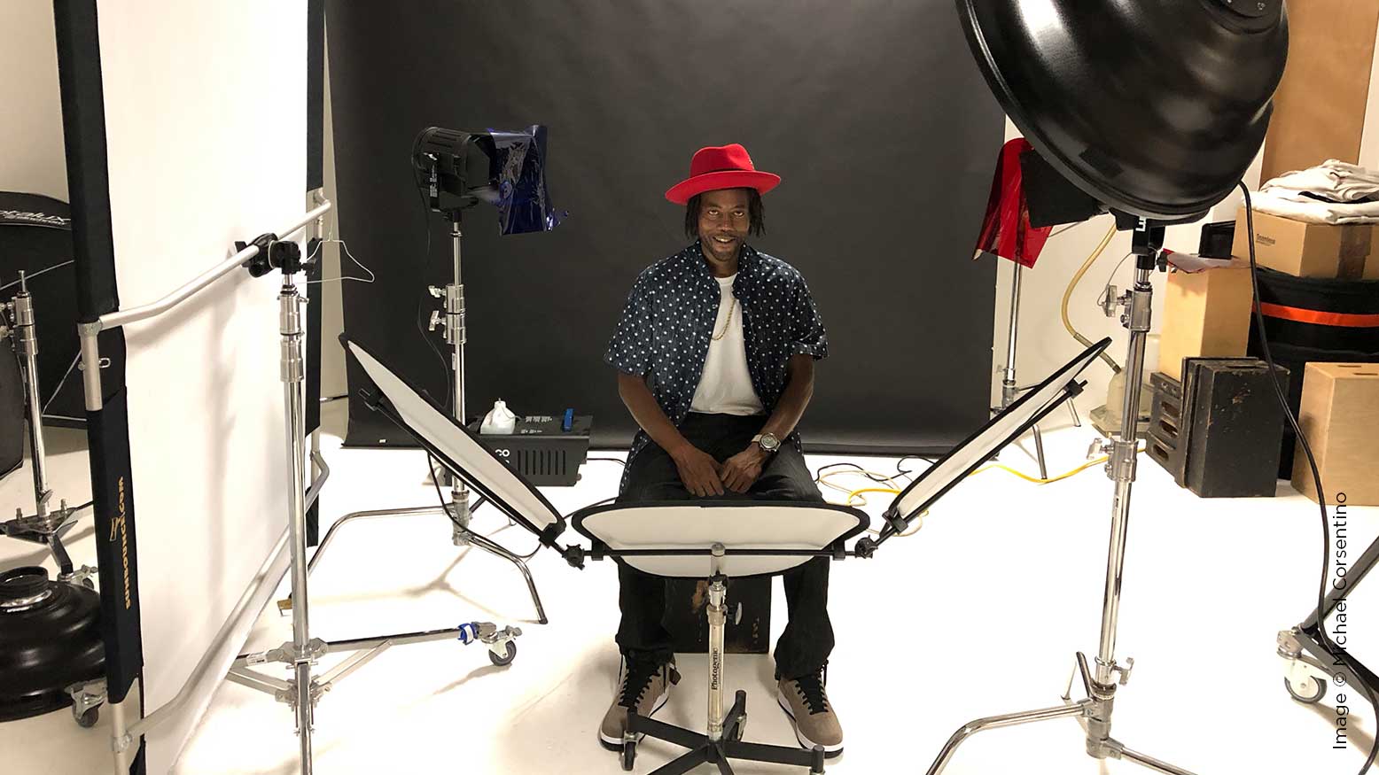
Originally this portrait shoot was supposed to with Vlad, a guy I know who could easily be mistaken for a rap star or hip hop mogul if you didn’t know otherwise. His dark black skin, long distinctive beard, thin cigars and signature cool sunglasses are all the props I was prepared to use to design his portrait around. Due to family commitments, he had to reschedule, so we’ll catch Vlad in another tutorial. But Travis, who I also wanted to shoot, was available and stepped in. These are two very different people, so their portrait lighting and the props that help define them would be different too.
Travis loves music as much I do. We’ve spent hours spinning records together. When he showed at the studio wearing an awesome red hat, gold chain and white T-shirt, he looked like he was channeling a New Orleans blues musician. I decided to follow that lead and design the lighting around that vibe. I wanted it to look like it was shot in a club or on a stage. I used red and blue gels—red from the front, camera right, and blue from the back, camera left.
Gels are tricky business. I’m continually reminded they are a less-is-more proposition. The less light you put through them, the more saturated the color they create. Too much light quickly washes them out. So I used two 600-watt daylight Fresnels, one for each of the two colored gels.
I also set up a Mola Demi Beauty Dish with a silver interior to serve as a crisp, contrasty keylight. This highly polished reflector works wonderfully with dark-skinned subjects. I set my aperture at f16, ISO 100, shutter speed 100, metered the strobe to match f16 and made a few test exposures. It was clear right away that the white light from the strobe, while properly exposed, was too strong with respect to the gels. Nearly all of their color was being washed out by the strobe’s white light.
Lighting and photography in general is an evolving problem-solving process where you start with an idea, see what happens and make adjustments as you go. In this case, I liked the color I was getting from the gels but it wasn’t strong enough to compete with the strobe I was using for the keylight. Time to rethink my strategy.
First, I needed to do whatever I could to get as much color out of the gels as possible. To do this, I first changed my camera settings to ISO 800, opened my aperture to f5.6 and dialed in a 1/50 shutter speed. Next, I focused each Fresnel’s beam into a tight spotlight that helped increase the color intensity from the gels. I turned off the strobe being used as the keylight and tried using only the two lights with gels on them. I liked what I was seeing but it still wasn’t what I wanted. The lighting lacked the crispness you get with a strobe, especially one modified with a silver reflector.
I cut the power of the strobe to its lowest possible setting and made a test exposure. Still too much light. I put a 20-degree grid spot in front of the beauty dish to confine the beam of light from the key to a tight circle and cut some of its light. Still too bright. I added two layers of neutral-density gel inside the beauty dish covering the flash and a diffusion sock on the front of the beauty dish. That did the trick. The amount of light being contributed by the flash ended up being very small, but added just enough white light and crispness to make the lighting pop.
By changing my ISO to 800, I increased the camera’s sensitivity to light and made it much easier to get highly saturated colors from the gels and constant lights. Using a 1/50 of a second shutter speed was necessary since I needed a slower speed to capture the ambient light. In the end, it was a subtle balancing act between flash and constant light. The slower shutter speed had the added benefit of giving the exposures a natural-looking softness via the resulting motion blur. Between the two sources, strobe, constant light and the camera settings, I ended up with the best of both worlds, tons of color, a hint of crispness from the keylight and a softening motion blur.
Color grading also plays an important role in all my work. I create or choose a color grading style at the beginning of each session. Styles are just like Lightroom presets. Even though I do this at the beginning of sessions, I think of color grading as the finishing touch for my images. For this set of images, I used a color grading style from Capture One’s new Editorial Style Pack.