
Shooting for Black and White with Craig LaMere
Dual Mindsets: Color vs. Black and White
About 90 percent of the time I create a black-and-white image, I specifically design it that way. The other 10 percent of the time, I shoot for color and decide later it would be cooler in black and white. Shooting for color and shooting for black and white have some obvious commonalities, as well as very different ideologies and approaches.
Basic approaches
If you have ever looked at my color images, the one thing that I hope stands out is how easy my images are to look at. I don’t mean that they are simply good, pretty or creative. I mean there is a cohesion, or theme, in the hues in the entire image.
When I’m shooting for color, one of my goals is to stay in a single color palette. This makes it easy for my viewer to get the point of interest is in my images. This is evident in my studio work, as I can totally control the backgrounds, clothes and temperature. It’s a little harder to do on location, but I still try to do it as much as I can. I feel if I have colors fighting for the attention of my viewer, then I’m unnecessarily making work for them and doing a disservice to my subject. So my main goal is to make the image harmonious for the viewer.
When I’m shooting black and white, my head is in a whole different place. In many ways, shooting color is easier because in black and white, you face a lot more choices and factors that go into making an image really rock. When shooting color, I really have only a few creative choices beyond lens, f-stop and modifier. When I’m in my black-and-white mindset, I see the world in terms of light and dark, contrast and fill, and workable hues.
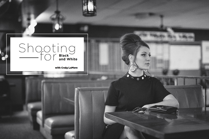
Black-and-White Survival Mode
When I first started shooting, I pretty much pointed the camera at my subject and, as they say, “sprayed and prayed.” By the law of averages, I wound up with a few good images. One of the many problems with that method is the waste and the overabundance of crappy images.
Back then, I had a solution for when an image was messed up tonally or the white balance was not good: I would go into black-and-white survival mode. I would grab the not-so-hot images, take all the color out of them by opening saturation in Photoshop, move the slider all the way to the left to desaturate the image and then call it black and white.
Yes, you can technically call an image processed this way a black-and-white because all the color information has been removed, but to me, that’s like putting the body of a Ferrari on the chassis of a VW Bug.
Studio Shooting for Black and White
When I shoot for black and white in my studio, my approach is very minimal. Most of the time, I don’t use drops or color backgrounds. I keep it simple. I either shoot on my white walls or a black drop, or I use a textured gray hand-painted muslin. I want high contrast, so I use directional and contained light sources.
I use strip lights for modifiers, beauty dishes and small dish reflectors, and all of them have either grids or egg crates. The only standalone modifiers I use are barn doors. The studio is a controlled environment where I can choose exactly every property of the image. If I want a blown rim highlight, if I want to clip part of the image so it blends into the darkness of the drop or if I want to shoot against my white wall and create a killer shadow, I can do it all and more.
If you are going to shoot contrasty images indoors, use a light meter. One of the pitfalls of shooting like this is the highlight and shadows are usually on separate ends of the spectrum and your tones are all over the place. It’s too much of a pain to keep chimping the histogram, and it is not accurate in the least to just look at the back of your LCD. With a light meter, in two clicks you will know what f-stop your highlight is exposed at and what your f-stop is in the shadows. This is vital in the creative process because you automatically know if you are producing the image you want or if you are off and need to readjust.
Location Shooting for Black and White
Control outdoors is minimized. The factors involved are totally different because of the array of hues, textures and type of light you have to account for. You never know for sure what Mother Nature or man will throw at you on location shoots. I’m managing the factors of the shoot rather than dictating them like I do in studio.
Colors, Light and Post-Production
A lot of planning goes into black-and-white location shoots. Here are a few of the things I consider.
- Time of day is huge. If you wait till later in the day, you get more diffused light and produce more of a soft, even glamour image. If you shoot in the midafternoon, you get a far more directional, specular, Old Hollywood-style light.
- Time of day also has a huge impact on the type of lighting patterns you will be able to produce if you are using only natural light. Think of the position of the sun in the same way you think of the position of a strobe in studio to help you plan for the right look.
- The seasons impact your images because of their unique colors. When you shoot in the summer, when everything is at its most green, you get a lot of tonal contrast because your subject is in one color range and your environment is in another. Shooting in the fall gives you an entirely different look.
- I always try to dress my subject in the opposite colors of the environment. This comes into play in post. If you are shooting in summer when everything is super green and you put your subject in green or blue or something else that blends in, then you will have a harder time making the subject stand out. But if you dress your subject in reds, you will be able to easily make those colors pop. This is very helpful if your location has a lot of texture.
I hope this helps you look at black-and-white shooting a little differently. Just keep in mind that there’s way more to it than just sliding the saturation to the left in Photoshop.


