Adding Cool Effects to Your Senior Portraits with Kristina Sherk
Senior portraits can provide one of the most lucrative and reliable forms of income. It’s also helpful that every year there’s a new crop that need their photos done. Thus, setting your images apart from the rest of the photographers in your market is essential. The more creative and unique your images are, the more sought after you’ll be.
While I do most of my facial retouching using my Lightroom portrait retouching brush MegaPack, there are a few other Lightroom tools to help you make your images stand out from the crowd.
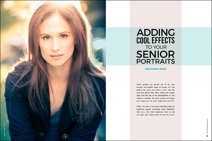
Check out this senior portrait I did a few years ago. I want to pump it up and give it a cross-processed look.
Before we get started adding our effect, let’s decrease the image’s original color saturation, just slightly. This helps the effect that we add to shine out and not get muddied by the original colors in the image. I decreased my image’s saturation by –35.
One of the easiest ways to add an awesome look to your images is to use the split-toning window in Lightroom, one of the program’s most underused features.
As you can see from the screen grab below, I added a hue of 40 and a saturation of 59 to the highlights. Then I tweaked the balance between the highlights and shadows by dragging the balance slider to +22. This ensures that only the top 40% of the highlighted tones in the image receive the warmer color treatment.
The darkest 60% of the image will receive the bluish tint that I am adding to the shadow areas. I added a hue of 222 and brought the saturation up to 55.
I’m sure you’re thinking, “Yes, this looks nice, but I’ve seen that before.” But fear not, young Jedi. It’s a good thing I’m not finished yet. Let’s move on to our next step.
I want to add even more of a rad, color-toned look to this image, so we’re going to call on my next favorite tool, the gradient slider. But I’m not going to use it in the typical way you’ve seen this tool used in the past.
Let’s use it to add two color washes. The two gradients that we’re going to add will meet in the middle of the image to split it. So let’s get started adding a warm color overlay to the top portion of the image, and a cool color overlay to the bottom.
Our first step is to activate the gradient tool by clicking this button within your tools area (or simply tap the “M” key).
We need to change just two things. Increase the exposure to 0.40, and add a slight yellow tinge to the entire gradient using the color swatch box at the bottom of your gradient tool window.
To add a color overlay to your gradient, come down to the white box with the X in it at the bottom right of your gradient tool window and click on it.
You will be greeted with a lovely fly-out window with the color spectrum, a hue value in the lower left corner and a saturation slider in the lower right corner. Find a hue of 41 and increase the saturation to 14%.
Use the X in the upper left corner to close the box. Here’s what your overall settings should look like for your first gradient tool. See how the color box now has a slight yellow tinge to it?
Now it’s time to add this gradient to your image. Start at the top left corner of your image, and click and drag it down diagonally. Unclick in the absolute center of your shot. Your first gradient should look something like this.
Now, let’s create our second gradient. At the top of your gradient window, you have the option to create a new mask. Click the word New to create a second gradient.
Now, the only change we are going to make to this second gradient is to add another color overlay to it. Scroll down to the color box again and click on it. This time, we’ll add a hue of 211 and a saturation a 56%. Minimize the box just like before, and we’re ready to add our second gradient.
Next, just as we dragged the first gradient from the upper left-hand corner of the image into the middle, we’ll do the opposite for this gradient. Start by clicking in the bottom right-hand corner of the frame and dragging until we reach the absolute middle of the frame, once again. Here’s what this gradient should look like.
There’s one last step I’d like to add to make this image even snazzier. I’m going to add the illusion of lens flare. (You may have seen my YouTube video on this.)
Start by clicking on the adjustment brush icon (or simply hit the “K” key). The adjustment brush icon is located two tools to the right of the gradient tool in Lightroom.
Before we start with the actual adjustments, scroll down to the brush attributes and make sure your brush is extremely large. For this image, my brush size was 64 pixels. My feather, flow and density were all at 100. Oh, and make sure auto-mask is unchecked for this step.
Now, let’s scroll back up to change the effects of the brush. Take a look at the brush settings in the screen grab below and copy those same settings for your brush.
Lastly, I’ll take my big soft brush and paint the upper left corner of my frame. This will make the image look like there’s lens flare in it.
I’d be remiss if I didn’t remind you to save anything cool that you create in Lightroom as a preset. It’s an easy way to be able to recreate the awesome effects you make and apply them to new work down the line. One small warning, though: Presets do not record brush strokes, so if you want to create the lens flare look and add it to a preset, you can easily create the same look and feel you got using the adjustment brush by replacing it with a radial filter. You just use the same settings that I added to my Adjustment brush tool, but add them to the Radial Filter tool (Shift + M) instead.
I’m sitting here cooped up inside during the Blizzard of 2016, trying out my new Senior Portrait Cool Effect preset. I tried it out on another image from my recent Mermaid Portfolio Workshop trip to the Bahamas (shout-out to mermaid Ashley Soltis for her awesome underwater modeling/mermaid-ing). Here’s what I created with just one click using the preset I created of this effect.