
Creating Black-and-White Landscapes in Adobe Lightroom with Kristina Sherk
I’ve always loved black-and-white photography. It’s such a beautiful medium, ranging from bold and full of contrast to quiet and soft. Most things look good in black and white, especially landscapes. I love the calm I feel when looking at a black-and-white image. This month, I share with you how to create stunning B&W landscapes in Adobe Lightroom.
Creating a black-and-white landscape lets you get artistic with all the control you have over every facet of the photograph. That’s why we have all chosen this profession—the artistic fun side. It’s always good to take a step out of our routines and photograph things we love. It’s a great reboot for the creative eye. I love to travel and photograph landscapes, urban and rural. The world has so much to offer, and every environment is unique.
A lot of vibrant colors can be distracting in an image. Have you ever found yourself photographing the landscape in front of you because you absolutely love the texture of the rocks and movement of the water, but when you look at the image on your monitor, they feel like afterthoughts to all of the color in the shot? Convert your image to black and white and make a few minor tweaks, and suddenly the most important part of your image isn’t the colors in it, but the shapes and textures.
Here is an image where, in the color version, your eyes are drawn to the blue sky and water in the background, then to the moss on the rocks. Then, when you look at the B&W version, your eyes are drawn to the water’s movement between the rocks, the texture of the rocks and shapes of the mountains against the dark of the sky. The photo has become about the texture, shapes and forms, and not about the colors at all.
When you are creating a black-and-white image in Lightroom, it’s important to make the transition using the Black & White color mode and not just drag the Saturation slider to –100. You can do this in the Basic Tab by choosing Black & White as the Treatment, or you can use the HSL/Color/B&W Tab and choose B&W. The reason behind this is that you want to have control of how light or dark a specific color in your image is after you turn it black and white. When you convert to black and white using the Treatment or Black & White Mix, you still have complete control over the luminance of each of the colors within the original file.
Once you are familiar with converting the image to B&W, you can start to play around with the luminance sliders. Here is where it gets fun. The possibilities are never-ending. You can create limitless versions of one image, and each one will look different. You can adjust the luminosity of the colors within the image and take it to a light and bright place or give it a dark and moody appearance. Below, you’ll see the original shot plus the two black-and-white versions with their different luminance color value settings.
The versatility of B&W and B&W-toned images is wonderful. What do we mean by toned? Those are images that have colored overlay, such as sepia and cyanotype. Sometimes I find that I love an image that I have taken, but the colors are too distracting.
I know what you’re thinking: Convert the image to B&W to remove the distraction of the colors. That usually gets me started in the right direction. But sometimes you come across an image that, even after being converted to B&W, still doesn’t have that certain flavor. The colors are no longer distracting, but the image is missing that pizzazz I’m looking for. In that case, I might use a color overlay to get the image to sing.
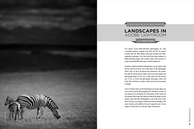
In this image of the adult zebra and foal, the colors were a bit distracting, so I turned it black and white. It was still missing the right mood, so I added some warmth to the shot, and that’s when the image began to shine. I created the warming effect by adding the same color to both the highlights and the shadows in the Split Toning tab, and used the settings below.
Not every image will look good in black and white. An image that is monochromatic or doesn’t have a lot of contrast may not look as good as an image with a lot of different colors, especially complementary colors (colors on opposing sides of the color wheel, like blue and orange or red and green).
If you find yourself in a predicament with a monochromatic image that you really love, there are tools you can use in Lightroom to spruce it up. Say you have a photograph with a bright sky—using a graduated filter, you can darken the sky and add contrast to bring out details in the clouds.
Split toning is a great tool. Some images look marvelous with a bit of subtle color added to create color contrast between the image’s brighter and darker tones. In your Split Toning tab, you can quickly add two colors over your image to “colorize” it. You choose a color to add to the highlights, and another color to add to the shadows. Split toning usually uses two complementary colors, but you should play around with it and see what you can come up with. This is why split toning works well for black-and-white photography.
This shot of a lone giraffe has great potential for black and white, but the sky is a little bright. My solution was to use one of my Sharkpixel Globe Trotter Presets (www.sharkpixel.com/store). The nice thing about these travel presets is they incorporate graduated filters that can take your landscape imagery to incredible new places.
I went through the presets and applied them to the color version of the image until I found one with the right look, then switched it from color to B&W. The split toning from my preset stayed on the shot, giving it just the right amount of color. The last thing I did was go to my HSL/Color/B&W tab to tweak the luminance, and customize the preset to the shot. I decreased the red and yellow values to darken the sky, and increased the orange values to lighten the grass. Then I was left with a great shot that showed off the stark contrast between the sky and earth.
As you can see, B&W landscapes are extremely versatile. You can have fun playing with the settings to tweak the image and get the look you are going for.
The masters of B&W photography, like Ansel Adams, have taught us that B&W photography is all about tone, contrast and shape. It’s important to think in those terms when photographing a landscape, whether or not you are thinking about converting to B&W.
“You don’t take a photograph, you make it,” Adams once said. That was true in his day, and will continue to be true as long as photographers are photographing.
There is beauty to be captured everywhere in the world, and B&W photography is making its comeback as photographers remember the value and artistic side of B&W imagery. I hope next time you’re looking at a landscape in your Lightroom Catalog, you convert to B&W. You never know what you might come up with. The possibilities are endless.


This Post Has One Comment
That’s all well and good, and I understand the mechanics and the art side of it very well. What I was hoping you would address, and you did not, was the issue of stepping and banding when you convert from a color original to black and white. Black and white is my media of choice. I have done black and white for over 30 years now. As nice as it would be to switch to a digital work space, if you will, from my cumbersome large cameras, I have not seen anything from a digital presentation that matches a truly beautifully printed silver print. I have worked with high resolution, full sensor DSLR cameras as well as the very high end Credo 60 back on my Hasselblad cameras. In each and every case, if I have for instance, an open blue sky, as we often get out here in the desert the result is a horrible blotchy sky that lacks even gradation. I have never ever seen that when making a silver print from a real negative. I am coming to the conclusion that there is not a solution, at least in the present state of affairs with digital sensors. Am I missing something?