Creating Black & White Images with Rich Tones with Angela Marklew
“Color is descriptive. Black & white is interpretive.” —Elliott Erwitt
Since I’m primarily a beauty photographer, I know it might seem antithetical to create a black & white beauty image. Black & white lends itself to a more editorial concept, highlighting texture and shape to convey mood. I love shooting in black & white when I’m photographing anything hair-focused or more emotion-driven, and when I’m asked for straight-up portraiture.
The number one thing to remember: not all images will look good in black & white.Although you can simply take any color image and convert it to grayscale, I get the best results if I walk into a shoot knowing the final outcome will be black & white. I allow this to dictate my lighting and color choices, which translate into shades of gray and tonality. It’s crucial to understand what would work better in black & white or color, and this is something that can be mastered with practice.
A good exercise to help you begin to visualize in black & white is to ask yourself, “Why do I want to eliminate color from this composition?”
Tips for Shooting Black & White
- Forget about color temperature. You’re not shooting in color, so don’t worry about the color temperature of your light source(s). Use this as a reason to mix sources you might not otherwise use.
- Focus on light quality. “Hard” and “soft” light are the key concepts here. Think about your source and how it affects and interacts with your subject and the background.
- Think about contrast. Most simply, this is the difference in brightness between two objects when they appear side by side. Contrast will work hand-in-hand with light quality. When choosing your lighting style, think about what kind of image you want to make. Photos with high contrast are typically more dynamic and intense while low-contrast photos appear softer and more muted.
- Use shadows to create visual interest. Since there isn’t color to break up the visuals and make things look interesting in your shot, shadows can become a major compositional element. Use shadows to add texture and depth.
- Preview the shot in black & white. You’re going to capture the image in color (because you’re shooting RAW) and fine-tune your black & white during editing, but by previewing the images in black & white during capture, you can make lighting adjustments so you’ll have minimal work to do in post. It’s also extremely helpful to see how makeup, background and wardrobe colors will translate into grayscale.
- Tonality is important. Be aware of how all the colors in the frame will translate into grayscale, and tweak or change them when necessary. This will help you create rich images—another reason why previewing your capture in black & white is helpful.
I’m going to share with you how I use four different lighting scenarios: direct sunlight, open shade, soft studio lighting and hard studio lighting to create dynamic images that work perfectly in black & white. I’ll also talk a bit about the best method to use for your conversion in post.
Direct Sunlight
The sun is a hard, small light source. Direct sunlight is ideal for creating images with a lot of contrast, which I find naturally translate well into black & white. It allows for a ton of experimentation when it comes to using shadows as compositional elements.
Open Shade
On the opposite end of the lighting spectrum, open shade will act as a large, soft source, producing beautiful lower-contrast images. This will give you very smooth shadow gradation, so tonality becomes an important aspect when creating contrast within the image. Keep in mind that when working in open shade, you will often need a reflector to bounce some light back and fill in the shadows, as they can quickly get muddy-looking.
Pro Tip: It is possible to “mix” these two types of available light. When the sun is at a low angle, face the sun and place your subject between you and the sun so the subject’s back is to the sunlight. The direct sunlight will kiss the side of your subject’s face/body and illuminate the background, while keeping an even shadow over the majority of the face.
Soft Studio Lighting
For this look, you’ll want to create the biggest, softest light you can. My go-to method for doing this is using a big scrim to diffuse the light from a single strobe bounced into an umbrella. I typically set the light and scrim on the camera’s right side, facing my subject at an approximate 45-degree angle. On the subject’s shadow side, you can set up a reflector to fill in the shadows. For maximum fill, I typically use a 60-inch round silver reflector placed just out of frame. If I want a little more drama, I’ll use a white reflector placed a few feet away from the subject.
Hard Studio Lighting
For hard lighting, I almost always opt for a single source. This is when I will utilize modifiers like snoots, grids, a small beauty dish or strip softbox. With each modifier, experiment with the distance your light is from your subject and how that affects the shadow placement and fall-off.
Now that you’ve visualized your shot in black & white and captured the image, it’s time to actually create the black & white version. These conversions can be done in either Lightroom or Photoshop. I typically do my black & white conversion after skin retouching, so I use Photoshop.
There are two common tools you have when converting to black & white, and the second is definitely superior to the first.
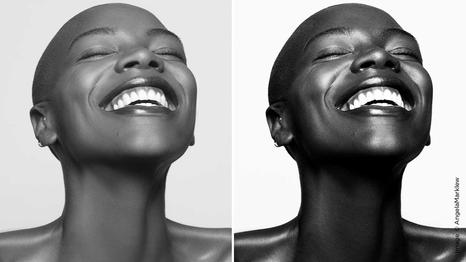
First, you can simply desaturate the image by creating a Hue/Saturation adjustment layer and pulling the Saturation slider all the way to the left (0). (In Lightroom, you would pull the Saturation slider to –100.) This removes all the color from an image, but it doesn’t give you any control over how it is converted, thus disregarding the tonality of the image. This method typically creates very washed-out looking, monochrome images.
The better way to convert an image is to use a black & white adjustment layer. In the Properties dialog box you will see sliders for red, yellow, green, cyan, blue and magenta. You can use these to control how the specific colors in the photo are rendered into grayscale. (In Lightroom, you would choose “Treatment: Black & White” in the Basic adjustment panel and then scroll down to the HSL panel [now labeled “Black & White”] to find the sliders.) Drag a color slider to the left to darken areas of that tone in the image and drag to the right to lighten them. This gives you control over howsimilar valued colors are converted into grayscale.
In the examples below you’ll see an image converted into black & white using each of the methods mentioned above (with no other adjustments made). The image on the left was converted using a Hue/Saturation adjustment layer and the image on the right used a Black & White adjustment layer.
There are also a number of plugins that emulate different film stocks, one of the more popular being Nik Silver Efex Pro. The Nik software gives you a starting point for different black & white film stocks and provides options for adjusting the tonality (by using the color sliders and color filter presets), and adjusting the amount of grain.
Remember:
- When you remove color, shapes will play a more important compositional role. To visualize in black & white, only pay attention to lines, shadows and shapes.
- Shooting in black & white may cause the important elements in your photo to change. For example, if shooting a color portrait, your subject may have a vivid eye color or hair color that is integral to your composition. When shooting this same subject in black & white, you may need to compose differently as you no longer have the color to act as a focal point.
- Use lighting to sculpt the shape of your subject’s face or draw attention to certain features. Black & white also helps distill down the emotion of your subject, helping the viewer focus on things like facial expressions and gestures.
- Contrast is your friend! Don’t be afraid to experiment with both high contrast and low contrast situations. One is not superior to the other. Your subject and what you want to convey will dictate which you should use.
- Most importantly, converting an image to black & white will not make a weak image stronger. Don’t use black & white as a way to “save” an unsuccessful image. Practice visualizing and previewing your image in black & white to ensure that you start with a strong photograph.