Creative Subjectivity: Rules to Follow Before You Break Them with Vanessa Joy
“Art is subjective” is one of the most irritating cliché’s I know. It doesn’t help anyone. It doesn’t help beginner artists grow. It can be an excuse for artists refusing to take creative criticism. Art is a finely tuned combination of rules and broken rules that come together in a perfect harmony to create something beautiful. In order to break the rules, you need to know them first.
Rules of Composition
The rule of thirds is often the first composition rule a photographer learns. It comes out when a teacher or mentor is trying to get the student to stop putting the subject in the middle of the frame on every frame. The rule of thirds tells us that placing the subject of our photo in one of the thirds (right, left, upper or lower) of the picture is more pleasing to the eye than having it go straight through the middle. The picture below follows the rule of thirds because the rings are place in the lower right third of the image.
Sometimes you can break this rule, like in the photo below, and place the subject in the center. This usually works nicely with square images, which we see so much of now thanks to Instagram.
When you do this, it helps to have leading lines that tell viewers’ eyes where they should travel. In this case, the pews make for a good leading line up into the chuppah.
Rules of Exposure
Understanding exposure is another concept we learn early on, and we often learn it by looking at a histogram. A histogram shows us, on a graph, what our exposure looks like with the lights all the way to the right and the darks to the left.
Ideally, you’ll want to make sure that nothing is completely black and nothing is completely white, especially a sky or a bride’s dress, for example. An image like the one below would be considered to have correct exposure.
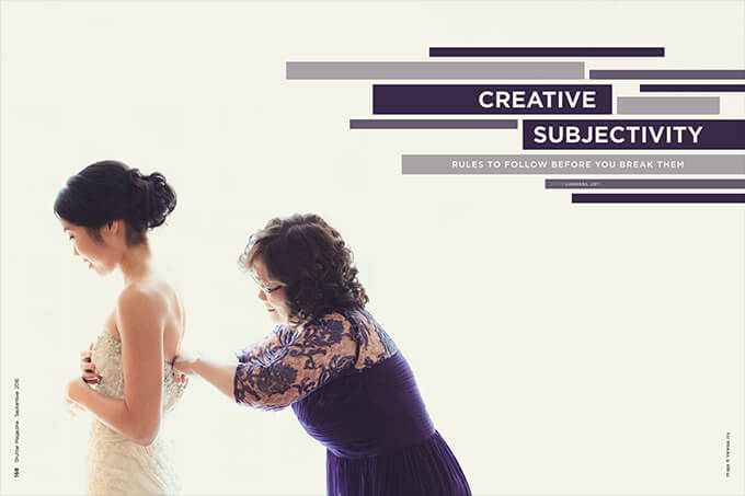
Sometimes you’ll want to break this rule to hide ugly backgrounds or just for aesthetic purposes, like in the picture below. I wanted a lot of negative space and a high key look, so I put the bride and her mother in front of the window and blew out the background by upping my exposure.
Rules of Color
One of the most difficult things to master is consistent color. If you’re a wedding photographer, especially, you’re taking pictures in every lighting scenario possible and somehow are expected to pull them all together to sit cohesively in a wedding album.
The first part of color you’ll probably want to tackle is white balance. White balance is ideally not too cold (blue, like the picture on the left), or too warm (yellow, like the picture on the right). It should be in the Goldilocks Zone of “just right” in the middle, like in the center picture below.
I wish I could tell you that blue and yellow are the only colors you have to worry about, but we have the rest of the rainbow to contend with. I’ll summarize this section by saying this: If you’re going to break this rule by straying from the “just right” true-to-color middle ground, do so by giving all of your pictures the same color shift “error” so they’re consistent. I’ve seen photography brands do this very well, and, even though it’s “incorrect” from a photography standpoint, it does a heck of a good job attracting clientele.
Rules of Focus
This may seem like a no-brainer: Pictures should be in focus and not blurry. However, there are varying degrees of just how much should be in focus, if anything at all. Some people like to shoot wide open because they like a very fine point of focus. Some say that everything should be in focus. I tend to fall between the two, and believe it depends on the situation.
When I’m photographing groups or landscapes, I want a larger plane of focus, so I often shoot above 4.0, as in the image below.
If I’m photographing a single subject, I have a little more creative freedom in my focus, and typically set my aperture to 3.2 or lower. In the picture below, I’m focusing solely on the bride’s eyelashes, and shot at f/2.
And then, of course, you can take creative license from there and decide if you want anything to be in focus at all. One of my favorite pictures is one that has absolutely nothing in focus, as you can see below.
If I’m going to apply any rule to focusing, I would say that all of your subjects that are looking at the camera should be in focus (unless they are intentionally background for your true subjects). And when you blow up a picture for print, it had better be in focus.
Rules of Posing
There are endless rules to posing. I could write a whole book on it. If we’re going to stick to one of the basics, let’s go with group posing (which I’ll be teaching extensively at Lunacy in November). One of the basic rules is to pose “eyes to mouth” with a couple, and in triangle formations with three or more subjects.
In this picture, you can see that the groom’s mouth is almost lined up with the bride’s eyes, fulfilling the “eyes to mouth” rule.
In this image, I’ve placed the bridesmaids so that their heights vary, going up and down, and their heads make triangles. The three girls on the left make a sort of triangle, as do the three on the right, and the bride with each girl on either side of her as well.
Depending on people’s height, this may be difficult, but I’ll talk more about how to overcome that at Lunacy.
Breaking this rule can be done awkwardly, like when you have a group of people placed with all the tall people on one side and all the short people on the other—almost like they’re falling down a hill, as in the picture below.
This rule is harder to break artistically, but is sometimes broken for logistics. In the picture above, the bride needed to be in the middle of her parents, so there was no way around the slanted pose.
Once you know the rules and can recognize photos that keep or break them, you’ll break them with intention and the outcome will hopefully be creative and unique. If you break them without knowing them first, the outcome will tend to be sloppy and look more like a mistake (especially if combined!) than creativity.
Art can be subjective in many ways, but the best artists know the rules and break them with an objective for doing so.