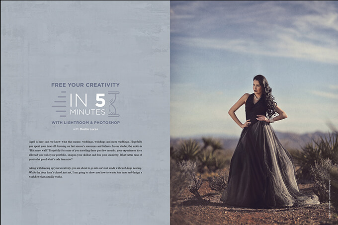
Free Your Creativity in Five Minutes with Lightroom & Photoshop with Dustin Lucas
Want more information on this article? Get access to video content and additional supporting images. Launch the April issue of the magazine by logging in or signing up for a free account by clicking here. Shutter Magazine is the industry’s leading professional photography magazine.
April is here, and we know what that means: weddings, weddings and more weddings. Hopefully you spent your time off focusing on last season’s successes and failures. In our studio, the motto is “Hit a new wall.” Hopefully for some of you traveling these past few months, your experiences have allowed you build your portfolio, sharpen your skillset and free your creativity. What better time of year to let go of what’s safe then now?
Along with freeing up your creativity, you are about to go into survival mode with weddings nearing. While the door hasn’t closed just yet, I am going to show you how to waste less time and design a workflow that actually works.
Plan Ahead: Presets, Actions, Droplets
Planning is the first step to editing, and it’s all about efficiency. And don’t forget creativity and quality—those are a given. Lightroom is where we will import, organize, select, color-correct and send right to Photoshop for more hands-on editing. Refer to my previous articles for extensive import and culling workflows. We need to start building presets for color correction.
Making a preset is simple in Develop mode: Hold Shift and Command while striking the “N” key. (1) Determining what settings get applied is the task at hand. You need to think a few steps ahead. When your instinct is to do as much as possible in Lightroom, remember that you will be processing in Photoshop later. Be easy with tonal adjustments and recovery tools. Photoshop is the wheelhouse for tonal applications. Let’s keep things simple to start.
Our next task is to make an export preset once we have completed our basic color correction. Select the image(s) and hold Shift and Command while striking the “E” key. First we need to set standardized settings like Export Location, File Settings, Image Sizing, Output Sharpening and Post-Processing. If we are going into Photoshop, we do not want to change the file size and we must rasterize the Raw file into a PSD. Choose Adobe 1998 for the color space since we are still editing, and set the DPI to 300 so the image is sized into standard dimensions. (2)
Post-processing is an option that allows you to export from Lightroom and quickly open images into Photoshop while applying an action to them all in one fell swoop. First we need to open Photoshop to create our editing Actions, and then save a Droplet for Lightroom to run during export.
In the Actions panel, we can create new sets like workflow, favorites and retouching to organize our actions based on their function. To do so, click the folder icon in the bottom of the palette. Once you create Actions, highlight one of the sets and click the icon to the right of the folder you previously selected. (3) You are now recording and ready to start adding adjustment layers, duplicating your base layer, adding masks or anything you want to apply to multiple images. Think of this in steps: What do you typically do first? For me, it’s applying skin softening with a mask turned off and separate dodge and burn layers. I would name this action “Step 1 Edit” so I know to apply it to all my images. This leads us to creating a Droplet for Lightroom to use. (4)
To create a Droplet, navigate to the menu bar, click on File, hover over Automate and click Create Droplet. (5) You can choose where this file will save first; make sure it’s in a folder you would not accidentally delete. Then choose the Action set and the Step 1 Process action. The last setting that is important is Destination. The default setting “None” opens the image immediately into Photoshop after applying the action. This is useful only if you are opening 10 or fewer files. I recommend the “Save and Close” option here so your computer doesn’t freeze mid-process when you accidentally export 50 PSDs from Lightroom. (6)
Now we can finish our Lightroom Export preset with this Droplet file saved. With our images selected for export, hold Shift and Command while striking the “E” key. After you have chosen all the previously mentioned settings, drop down to the Post-Processing menu. Click in the box to the right of After Export and choose “Open in Another Application…” Click Choose Below and select the recently saved Droplet title Step 1 Process. Now we are ready to see all the work in action. (7)
Color-Correct for a Creative Edit: Lightroom Only
In Develop mode, the Basic panel will handle 90% of my adjustments for what I need out of Lightroom. I leave white balance, exposure and contrast all set to default values as shot. These are dependent on the lighting, and it would be foolish to adjust these blindly. As for the contrast slider, it’s just not that versatile. Moving down to highlights and shadows, I land somewhere around 25 to 30 for each. Here, I have dropped highlights automatically to a value of –30 and shadows lifted to +30. Instead of contrast, I add white point and drop the black point. This gives me a more controllable contrast boost, and for Lightroom, my goal is to have clean density, meaning my histogram hugs the edges. Like I said, this is a starting point, and is not set in stone. (8)
Presence section is a give and take. For my preset, I leave these zeroed out. These sorts of settings can be globally applied in Library mode as needed.
I skip past all the localized color adjustments to the Details panel. We need some sharpening, and this is important for processing your Raw files. We’ve lost some sharpening along the way, so let’s get it back. Placing the details to 75 is a moderate amount to add in some crispness. I also add a slight bit of noise reduction here and there. This was shot outdoors at a really low ISO, so it shouldn’t have much noise if any at all. I like this subtle softening effect for skin tones coupled with the edge detail of the sharpening setting added. I typically land between 5 and 20 for Luminance in the Noise Reduction section. (9)
Lens Correction is next and almost always applied. I’m generally happy with Adobe’s use of this tool and the range of lenses available at the click of a mouse. Chromatic aberration is a little more tricky to just globalize; I would still apply a subtle amount. (10)
Last but certainly not least, changing the Camera Profile in the Camera Calibration panel is a must. The “before” preview is our Raw file shown in Adobe Standard, and it’s a deceiving preview. We have this muddy lack of true-to-life color image from an amazing camera. Something doesn’t add up here. The default profiles are a huge step in the wrong direction when it comes to skin tones. Steer clear of those altogether. (11ab) We have a choice to make: Spend more money or live with Adobe Standard. I do not accept mediocrity.
X-Rite’s ColorChecker Classic is a totally custom long-term solution. I show you how to use it in my previous article “Color Space Part 2: Getting Control With Your Color.” Another highly recommended option is to check out https://www.colorfidelity.com. You can purchase camera-model-specific profiles as an alternative to the Adobe Standard one. I have applied the Standard version for my edit, and you can really see the results. (12)
All these settings are built into my preset. It gets me most of the way there in terms of color correction. All I need to do is adjust some minor color and exposure issues. Her skin is slightly red and underexposed. I can neutralize the tint down to +10 and the exposure needs lifted a quarter stop. That’s it. We’re ready to export. (13)
Masking and Brushwork: Photoshop Only
The first thing I do when editing in Photoshop is to close my eyes, open them and see what’s pulling my attention away from the subject. Typically it starts with the bright areas needing toning down. Burn, baby, burn. Use a semisoft-edged brush and burn that sky and overbearing highlights. (14ab) Remember that we got rid of that pesky lens vignette in Lightroom, which makes burning down the image less artificial. (15ab) My next step is to isolate the highlights to burn down the hot spots even further. The reason is that when you burn, you burn it all, making the image darker. We still get stuck with the distracting hot spots and clipped black tones. (16ab)
After toning down the image, we have to focus on the skin tones. Before we soften, let’s dodge the shadowy tones to even out the subject. Not only do we want to brighten the skin, but we need to bring some definition into the dress. It needs to have shape and not just fall back with other darker areas of the image. (17) Softening the skin here is a great touch to the portrait. Remember to not go too soft; since we have output sharpening to add, we don’t have to be too lenient. Notice how it evens out the highlights on her skin and makes the lighting look even better. (18)
With the local exposure and skin softening adjustments out of the way, we can start our toning application. I have grown very fond of the free Nik Collection. Silver Efex Pro 2 still hails as one of my favorite plugins (19), along with some Color Fill layers and stylized Curves for the matted look. I did not want to strip all the color out of this image, but it is necessary to tone it back. It’s hard not to get lost in the landscape and sky surrounding the subject. Proper editing allows the subject and surroundings to blend well. (20)
Attention to Details: Final touches
It’s all about the details. We have some final work to do that will get this image ready for print. Start with some texture to get the smooth blue sky to blend with the landscape. This is a killer image. I like to add this effect for subtle grit in the image. (21)
During the color correction process in Lightroom, I already added input sharpening to regain some of the sharpness I lost when processing the Raw. Now I need to consider where this image is going and how to prepare output sharpening. For me, it’s High Pass all the way. The only question is how much to account for. For screen, I am content right around 50%. Just know that when I export it, it will look sharper on screen. (22)
I have cropped this image a few ways, trying to push the rule of thirds versus the symmetrical composition it was captured in. I think this looks best with a symmetrical composition. (23ab)
Output Those Files: You’re Done!
We’re done, and in just five minutes. Once I am set up with presets, actions and droplets, it comes down to the brushwork and selecting a toning application. Take this tutorial with a grain of salt in that I didn’t retouch the image.
Creative edits can be simple and executed with efficiency. Stop wasting your time and use the shortcuts here. It’s gonna be a long season ahead if you don’t plan a solid workflow.
Want more information on this article? Get access to video content and additional supporting images. Launch the April issue of the magazine by logging in or signing up for a free account by clicking here. Shutter Magazine is the industry’s leading professional photography magazine.