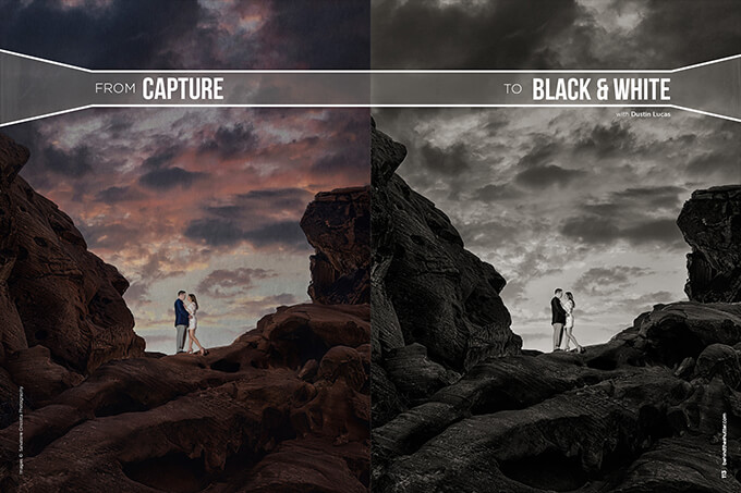
From Capture to Black and White with Dustin Lucas
When I began doing photography in school, I was using a manual 35mm camera with black-and-white film. Nothing out of the ordinary for most students taking their first photography class: You are fixed focus with a 50mm lens and have to process your own film.
Over the past decade, the transition from analog to digital has made a significant impact. It made perfect sense to buy a digital SLR, and I did not resist the change. I loved shooting black-and-white film, and have always been interested in recreating that grainy, rich-toned print in my digital images. With Lightroom CC and the Nik Silver Efex Pro 2 plugin, I can get back some of that analog black and white.
Making a great black-and-white image isn’t always about post-processing. You need to shoot for it. Most DSLR cameras allow users to shoot in Raw + JPEG mode, and you can set the JPEG file to record in black and white so you can review in camera how the tonality compares.
If you have a spare DSLR lying around, you can always send it off to get the image sensor converted to infrared. IR conversions are popular with low-end backup cameras. It allows you to get in-camera monochromatic or hyper-stylized color imagery. Otherwise, you can always wish for a Leica monochromatic camera, though most of us don’t have 7K to blow. For now, we can stick with a color Raw file and import it into Lightroom CC to see what Adobe has to offer.
Converting to Black and White
After opening the image in the Develop module, we can convert to black and white a few different ways. My first instinct is to strike the “V” key to instantly convert the image and start working in the Basic Panel for exposure, contrast and recovery.
When converting your image, you can use the black-and-white mixing adjustments in the HSL panel. (Image 1) You are basically narrowing down this panel to Luminance or Black and White Mix. This tool gives you a lot of flexibility in customizing the color tones in the image and adjusting the light and darkness for these values. (Image 2) It’s a much better option than dropping your Saturation slider to –100; you can see the difference. (Image 3) It also allows you to choose parts of the image to affect with the target adjustment tool. It is as easy as clicking on a specific area and dragging your cursor up or down to adjust. (Image 4)
Another quick way to convert your images to black and white is to change your camera profile to Camera Monochrome. (Image 5) Typically, this is set to Adobe Standard, and changing it can alter the appearance of your image. For color portraits, I use Camera Neutral and build up my contrast. Applying Camera Monochrome turns off the Black and White Mix panel, so if you are interested in a quicker global option to convert your images, this is a great option. This profile mimics how your camera would photograph in monochrome in camera. As you can see, this is camera-manufacturer specific. Canon does not offer this profile, so we will stick with the other methods.
To make converting even more efficient, and to develop settings custom-adjusted per image, we can build a preset to apply before we even start editing this image. When saving a Develop Preset, check the Auto Black and White Mix option and Auto Tone to convert; this gets the image already looking pretty good. (Image 6) In order to view these options in the New Develop Preset dialog box, you must be working on an image that was already converted to black and white. Once the preset is saved, you can apply it globally to any color or black-and-white images. (Image 7)
Black-and-White Density and Toning
In black-and-white photography, it’s all about the toning. As we have seen with just simply converting our digital color images to monochrome, they are in need of some work. Let’s start by talking about density of your images’ tonal range. This relates to film in that the more density in your negative the better, meaning good contrast from the blackest point to the dark and light midtones as well as clean whites. The term flat negative means a more limited range of density, requiring a lot of additional work in the darkroom with contrast filters.
So what does this have to do with Lightroom and making black-and-white images? Well, the wider range of contrast is directly related to your histogram and applies the same way. (Image 8) Density can be measured by where the edges of your histogram end. The left side is absolute black and the right is for white tones. You can quickly adjust this by holding Shift while double-clicking “whites” and “blacks” in the Basic panel. (Image 9) Remember that when making this adjustment, it accounts for the total image, not just your subject’s skin tones. The best practice for using these sliders in determining your tonal range is to first adjust exposure for your subject, then apply the black-and-white point slider for density. That is pretty simple. (Image 10)
Lightroom has other great settings to choose from. Clarity is a fantastic tool to add contrast to your midtones. (Image 11) This is huge for black-and-white photography. Take into account the effect it will have on your subject; adding this may make your landscape look epic, but it will darken the contours on the face and can look unflattering for the skin. A good rule of thumb is to leave the black-and-white point sliders at zero while adjusting things like clarity, contrast and tone curve. (Image 12)
The Contrast slider is a simple tool but is not very flexible in how it adjusts the image tonally. What I mean by tonally is that you have four areas of tone in Lightroom: highlights, lights, darks and shadows. These can all be adjusted in the Tone Curve panel—take advantage of this. (Image 13) You have the ability to apply the default S-curve contrast effect in two forms: mediums and strong. Click on Point Curve, and the dropdown options appear. (Image 14) Custom Point Curve is an option that’s quite popular with film presets, allowing black-and-white point adjustments to be combined with the tonal sliders mentioned above. (Image 15)
A great process to start with is desaturating your image by pulling the Saturation slider to –100 and applying the Strong Contrast Point Curve in the Tone Curves panel. (Image 16ab) Adding some grain in the Effects panel can start to make the image look more like a conventional black-and-white image. (Image 17) To go further in this direction, use the Nik plugin Silver Efex Pro 2 to take a great shot to the next level.
Silver Efex Pro 2 Plugin
For those of you who have not ventured into Lightroom CC plugins, I highly recommend doing so. This integration of Lightroom and the Nik software is a great option for users, especially now that Nik offers its full suite completely free. (Image 18)
Let’s open our edited image in Silver EP2. Select you image in Develop mode, navigate to the menu bar and choose Photo < Edit in < Silver EP2. You immediately get a dialog box asking you to save a copy. Keep the image at default settings, but change Resolution to 300. If you plan to edit this image further in Photoshop, you can choose Color Space: Adobe 1998, but it’s just as easy to edit entirely in Photoshop if you want to go that route. Bit Depth can be changed to 8 bits if your computer is lacking in hardware to speed up the process. (Image 19)
Click Edit. Immediately your image is converted to black and white and looks pretty neutral. (Image 20) In my March 2016 article, “Google That Sh*t – Working With Nik Collection in Photoshop,” I go more in depth into how this program is laid out. Check it out to get a better understanding of how to use Silver EP2. For now, I am going to use my custom preset Dustin B&W I to quickly show off the abilities of this software. (Image 21)
I spend the majority of my time fine-tuning in the Global Adjustments panel with Brightness, Contrast and Structure. Brightness allows you to adjust for highlights, midtones and shadows. It helps to have the histogram preset for adjusting this and contrast. As you can see, there is a gap between the right edge showing the white point is not to the edge of the clipping, meaning the image is slightly dull in the whites. Take some time to dial in these adjustments, and then let’s move on to Structure. (Image 22)
Similar to Clarity in Lightroom, Structure can have a negative impact on your subject’s skin. Zoom in to review before saving your image. Unfortunately, this is a destructive edit, so no going back after it’s done. As we slide the Structure slider into the positives, you can see the sharpening and midtone contrast boost, similar to Clarity. The contours of the couple become well-defined, and removing this effect makes our image softer. (Image 22ab) This adjustment can add a crisp look to your overall midtones and provide some tonal definition to your subject. Just be aware of the grittiness of your subject’s skin—brides don’t enjoy looking at the highly defined flaws in their skin.
For the rest of the adjustments, I tend not to add any film emulation or color filters. On occasion, I add some lens fall-off to create a quick vignette effect. This is for quick proofing, and for when I am not custom dodging and burning later. (Image 23)
The Results
We have converted our color image to black and white, and now have numerous options to dial in our toning and overall style. It all starts with a great shot, preferably one with high contrast. Then we can convert the image, and it won’t need as much work tonally. However, density is key, and dialing this in can make your black-and-white images pop.
Remember that a lot of these tools look great for the scene, but don’t always favor the subject. It’s all about their skin. Whether you are using automated presets or editing each image in Silver EP2, play around with the tools and develop your own style.