How to Build Your Photography Website With WordPress in 2020 with Alicia Simpson
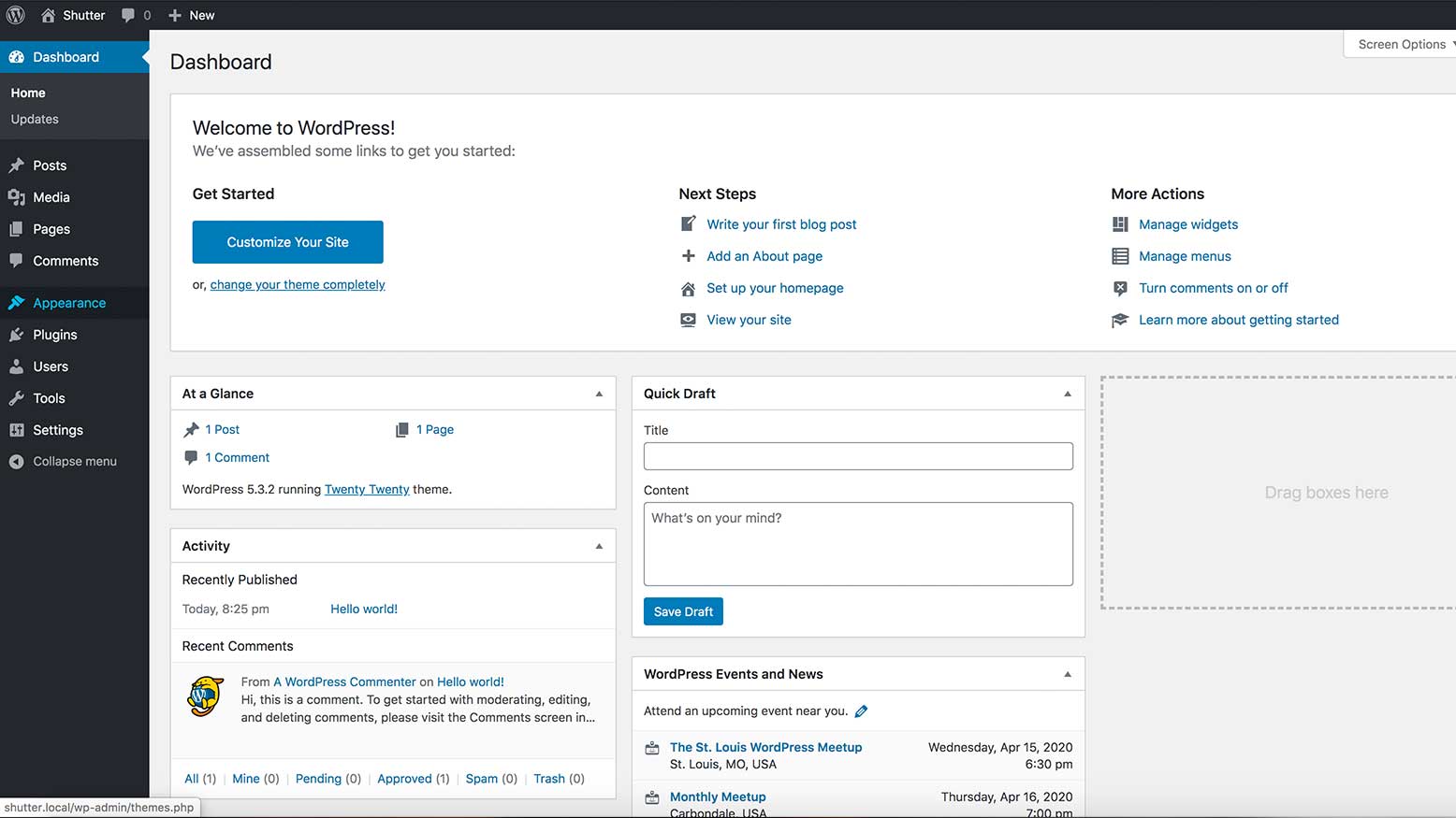
There are tons of platforms out there that photographers can use to build a website. At one point or another, you probably heard that WordPress is the “best” for SEO. Maybe you tried to get started on a site and promptly began to pull your hair out from frustration. What theme should you pick? Why doesn’t it look like the screenshots you saw? How do you get a decent looking gallery? How do you make it load faster? Shit, you activated a new plugin to help and it broke everything.
WordPress is a platform with the power to build almost anything you want, but all that freedom makes it really tricky to navigate. Until I found the right tools through a lot of trial and error and crashed sites, I found it frustrating as well (in fact, as I write this, we’re dealing with the headache of switching the ShutterFest site to a new server). In this series, I want to save you all those headaches and show you the entire process of building a WordPress site for your photography business, from beginning to end.
In this article, I’ll touch on hosting, and we’ll get our theme and basic styles set up.
Choosing the right hosting
If you take one thing away from this section, it should be this: don’t cheap out on hosting. Choosing a decent host is key to making sure your website is as fast as possible. You can optimize your site all day long, but if you have a slow host, you can only get so far.
We use Liquid Web for our hosting. I’m no server expert, so I don’t want to get too into this, but here are some things to look for:
- Can you get a dedicated server? Basically, this means that the only website on your server is yours, and your site won’t get bogged down just because other websites are experiencing high traffic.
- Does the host have a “managed WordPress” option? This will make things way easier on you and is well worth the money. Often, managed WordPress includes services like routine backups, SSL certificates, and automatic updates. Sometimes they can even help you migrate your website to their system.
- How is their support? Do they have phone and live chat, or just email? Are they available at any time?
Picking a theme
Okay, you’ve got a good host and WordPress is installed. The next thing to do is install a theme! I’m going to take a different approach than most people and tell you not to mess around with finding the coolest “photography theme” on Envato. Don’t even go look. What you really need out of a theme is something minimal and fast that has a full-width layout option, a good looking header, footer, and blog. Our page builder is going to handle everything else. Yes, even the galleries.
My two favorite themes are OceanWP and GeneratePress. I think OceanWP is the prettiest out of the box, so I’m going to go with that. On your WordPress dashboard, go to Appearance > Themes, click the Add New button at the top and search OceanWP in the search box. When it comes up, hover over the thumbnail and click Install, then Activate.
Next, we’re going to install a plugin called Ocean Extra that adds some, well, extra functions to our theme. Go to Plugins > Add New, then search for and install Ocean Extra.
At this point, you’re probably seeing a lot of notices cluttering the top of your screen. Go ahead and dismiss all of them.
Now, it’s time to get started!
Customizing the theme
Go to Appearance > Customize. This opens up the theme customizer, and we are ready to get going. On the left-hand side of the screen, there will be a list of sections on the site you can control. I like to go straight down the list to make sure I hit everything.
Site Identity
First up is Site Identity. This is important for SEO and social media—it shows up at the end of every page and link shared. For Sal’s site, we made the site title the keyword that matters most to us—St. Louis Wedding Photographer—and set the business name as the tagline. In this section, you can upload a 512×512 site icon as well. This is also called a favicon. It’s the teeny tiny icon that shows up next to your site name in a browser tab, so keep it simple.
Pro Tip: Hit the Publish button at the top after you’re done with each section to push your changes live.
Menu
Now let’s make our menu. In the Menu section, click Create New Menu. Give it a name, like Main Nav, and check Main so that it displays at the top of your page. Click Next, and a button called Add Items will show up. When you click it, you’ll be able to start making new pages and adding existing pages by clicking the plus button to the left of the page you want to add.
I’m going to add Home, and create pages called About, Weddings, Seniors, Blog, and Contact. Now we’ve got a good menu with a search feature, too.
Homepage
I know I said I go straight down the page, but as it turns out, I lied. I’m going to skip the Widgets section and go to Homepage Settings. This is an easy one. Set your homepage to display a static page (set it to Sample Page) and set your posts page to Blog.
General Options
Under General Options > General Styling, set your brand colors. Pick something darker for your primary color, and a lighter (but still visible) color for the hover and border colors. Leave the background color as white, and set your link colors to something that will stand out from the text. Don’t worry if you’re a little unsure of what it’s all going to look like—we can always change these later.
In General Options > General Settings, we’ll set our layout styles. I like to keep the main container at 1200px, and keep the content and sidebar widths as-is too. For Page layout, I select 100% full width, so that any backgrounds we make in our page builder can stretch as far as possible. Leave everything else as-is.
In General Options > Page Title, set the visibility to Hide on Tablet & Mobile, leave the heading tag as H1, and set the style to Hidden.
In the Scroll to Top section, I’m going to uncheck the scroll up button. It’s nice for sites with lots of information, but I don’t think we need it here. If you do want one, this is where you would customize the icon and color of the button.
Skip Pagination for now, and we’ll come back to it when we set up our blog. Next is Typography.
Typography
I won’t go into detail on all these settings—but you will need to hit Body, All Headings, Heading 1-Heading 4, Main Menu, and Mobile Menu for now.
My advice is to find a Google font (fonts.google.com) that matches your brand, has upper and lowercase letters, and has at least 3 weights. That way you can have headings that are bold and light for contrast, and an in-between weight for regular text.
Set the font family you chose in the Body section. By setting the font in this section, it will carry through to all the other typography settings, and you won’t have to waste time selecting it in each section. I’ll also set the font color here, matching it to my primary color from the General Options section.
A good size for body and main menu text is 16px. For headings, I like to start with Heading 1’s at 40px, and go down from there for headings 2-4. Again, we can override or come back and adjust these sizes when we start building the pages. If you want all your headings to be uppercase, you can set that in the All Headings section.
Pro Tip: Use the device buttons at the bottom of the page to preview your site and see how your mobile menu settings look.
Top Bar
Next, go in to the Top Bar section. This is a great spot for social media links and a phone number. In Top Bar > General, you can customize the colors and change which side the social media links are on. I’m going to leave all that alone and go to content. I want to add a phone number here. If you want to make it clickable (so people can tap to call on their phones), you will have to add a tiny bit of HTML code: <a href=”tel:800-555-5555″>800-555-5555</a>
In Top Bar > Social, add links to your social media pages and set the colors of the icons.
Header
Now, jump back to the Header section, and go to Logo. Click Select Logo and upload a high-res logo. The dimensions of it don’t matter, but the file size should be under 200KB. If you upload one that’s at least 500px wide like I did, you can safely skip the Retina logo option. After you upload, it will give you the option to crop or skip cropping. Then you can set the Max Width of your logo. Scale it until you’re happy with the way it looks.
SEO Tip: Name your image according to the top keyword you want to rank for, and add alt text to the image when you upload.
Go to Header > General to pick a header style. Minimal is the default, but you can go transparent, stacked, full screen, or even vertical! Keep in mind, you might have to adjust your colors.
The only other thing you might have to edit is in Header > Mobile Menu. If you have a lot of pages or long page names that can’t be shortened, you can adjust the point where your normal header becomes your mobile header (a hamburger icon people click to see all the items). You can also edit all the colors of your mobile menu here.
Blog
Next, navigate to the Blog settings section, and click Blog on your menu in the website preview so you can see how your changes look. On the left side of the screen, go to Blog > Blog Entries. You’ll see options for the layout of the page. You can have a sidebar on the left, right, both, or no sidebar. I don’t recommend 100% full width, because it leaves no breathing room on the page. I’m going to leave the right sidebar layout selected.
You can reorder how the content shows up on mobile. I am going to select Sidebar/Content so that the search bar can be at the top on mobile. Leave the heading tag as H2. H1 is an option, but best practice is to only have one H1 per page.
Next, you can set the style of each blog post. I’ll go with Large Image and set the length of the excerpt to 150. Then you can set the visibility and order of the elements in each blog post. As you can see in the image, I placed my title and meta (a fancy word for the date and category) above the featured image, followed by the content (a fancy word for the excerpt) and Read More button. I also turned off the visibility of the author and comments, because there’s only one author and comments are disabled.
Now, click in to the sample blog post on the right, and go to Blog > Single Post on the left. This is where you could design the layout of your posts, but we’re going to have some fun later and use our page builder for that instead.
Footer Widgets, Footer Bottom, & Sidebar
We’ve finally reached the last two sections. (If you’ve stuck with me this far, you are truly a majestic unicorn.)
In Footer Widgets, un-check the checkbox next to Enable Footer Widgets to get rid of that section. Now, go to Footer Bottom and in the Copyright box, enter your NAP: name, address, and phone number. This is incredibly important for SEO if you want to show up in local search results like “Photography in [Your City].” It’s also good to include a contact email here. This is another section you’ll have to include a little bit of HTML code in order to create links, but don’t worry, I got you. To create a telephone link, type <a href=”tel:800-851-0520″>800-851-0520</a> (replace the two phone numbers with your own). To create a link that opens up a new email, type <a href=”mailto:team@cincottaemail.com”>TEAM@CINCOTTAEMAIL.COM</a> (replace the two email addresses with your own). Set your padding and colors, and you’re good to go!
The last thing we need to do is set up our blog sidebar, in the Widgets section we skipped over way back at the beginning. Go to Widgets > Default Sidebar and remove the Recent Comments widget. I like to add Categories so people can browse by wedding, engagement, etc. If you’re a Mailchimp user, OceanWP also includes a MailChimp widget you can use to collect emails—you’ll just have to follow the directions to set it up.
Click Publish one last time, and you’re done!
Achievement unlocked: WordPress Themes 101
Well, friends, we did it! It’s not the most exciting thing out there (yet), but it’s got a fast theme, a nice header and footer, and a blank canvas for us to start designing on. I hope this helped you navigate the basics of setting up a WordPress site and saved you some headaches. Be sure to check out my next article, where we’ll get into the fun stuff and start designing pages and galleries!