How to Edit Color for the Season in Lightroom Classic with Dustin Lucas
When winter hits, being a photographer can bring a lot of challenges. Not just the obvious cold weather and clients who want to spend as little time outside as possible, but everything is dead except the pine trees. Especially in the Midwest where beautiful mountainous backdrops are rare. Not to worry. Sometimes we have to get creative when ideal lighting doesn’t show up—not only with our photography, but our editing too. In this article, I show you how to edit color for the season.
You can recreate this in camera with off-camera flash, gels and a lot of time on the shoot. But when it’s freezing and you get only 50 frames, you don’t have time for lights and setup. You have to compose, track your subjects and shoot. So on those overcast days, you are happy because the colors pop but you’ll have to crop out the sky because it’s empty. In Lightroom, we can dial in color for a neutral base, target specific tones and even create sunlight quickly.
Once I have a few images picked, I can start to develop these images for a more seasonal look and feel.
Cover Your Bases With Basic Corrections
As soon as I get set up to apply basic corrections, the first image is darker and warmer than I want. I always start with exposure to get the brightness corrected, then the white balance. When you want to apply creative adjustments later, it is best to edit for a neutral and simpler base. We will focus on the skin tones for this section. What I mean by that is leaving the contrast, whites and blacks sliders alone for now to utilize them in the Tone Curve panel. You want to correct blown-out highlights and blocked-up shadows.
Jumping down into the Tone Curves panel, I can use one of the prebuilt film-style point curves. You can quickly see the shifts in the different curves here; if we go with something heavier in contrast, dial it back with the region sliders or, better, in the basics panel. Now play with the whites and blacks to correct any clipping. This is all relative to your taste and is the easiest part of the edit because now I have to deal with targeting color and tones.
Other adjustments like lens correction, sharpening and noise reduction are good corrections to make as well. Let’s move into HSL to tone down the greens and pump up the blues.
Targeting Color With HSL and Split Toning
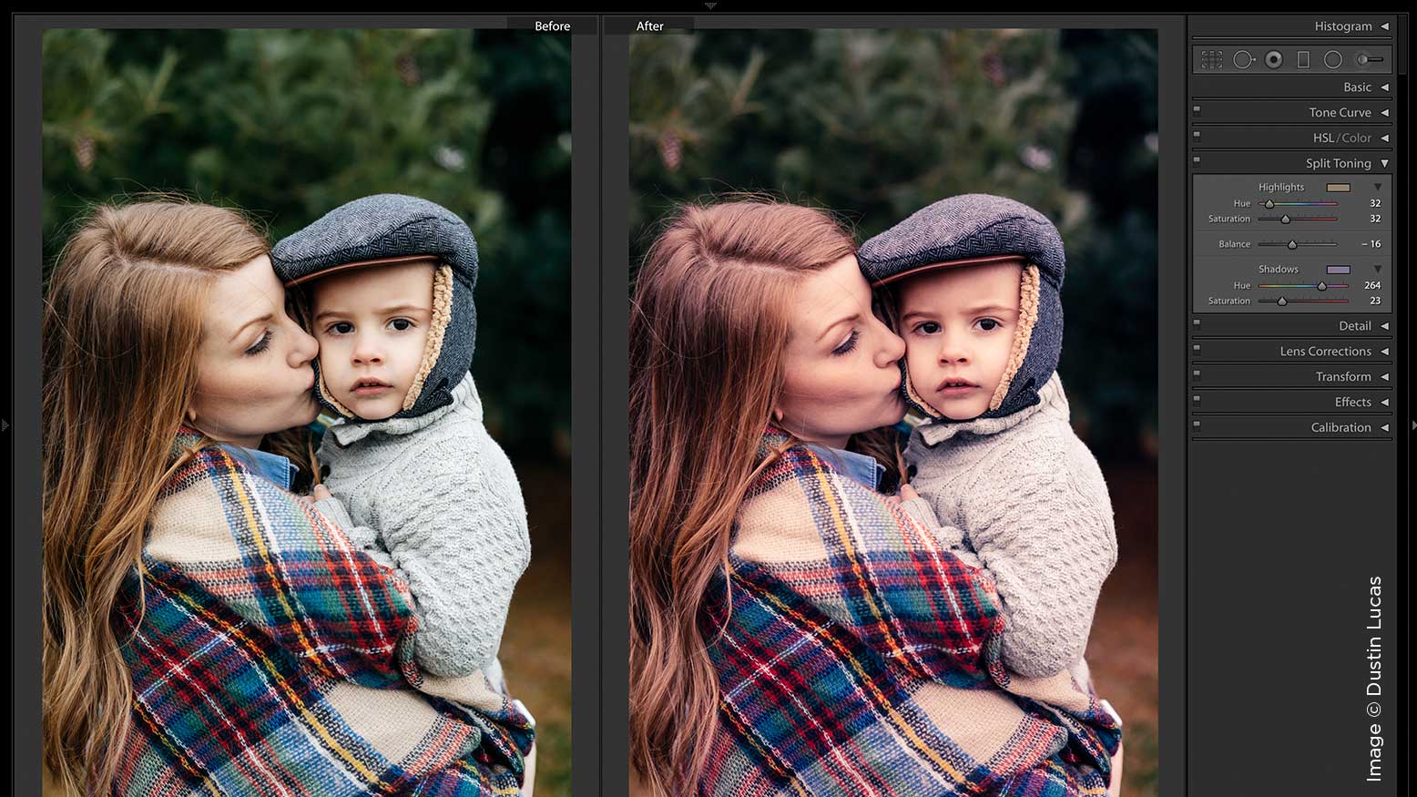
HSL is simple to use. Grab the target adjustment tool for saturation to click and drag down to reduce the richness of a specific range of colors. I desaturate the green tones, lower the saturation and brighten for skin tones. In this shoot, I also want to enhance the blue tones in their clothing, which I can do quickly. Once I correct the color and tonal range for the image, I can start to add some creative effects like split toning. We can add some tones to match a warmer mood and add some purple tones to the shadows.
Under Split Toning highlights, I like to drag the hue slider between red and yellow to dial in a nice orangish tone. Moving saturation to the right acts like an amount slider. The same goes for shadows: We can adjust the hue slider between the blue and red for a purple tone. This creates a warm to cool look that’s great for these winter portraits.
Before we go into Local Adjustments, we want to create virtual copies to preserve the creative edits we’ve already made. Then we can remove the split toning and any other creative effects to keep things closer to a more natural look.
Create Your Own Color With Brushes
Beyond just a dodge and burn with exposure, highlights and shadows, we can start to paint in sunlight in the background. This is what I was missing on this shoot. It actually made it easier for me to control light since it was overcast. This is exactly why we edited for a neutral base: so we could push warmer tones and brighten the areas behind the subjects. This is opposite of what we normally do, since you normally want to darken and tone down the background to let your subject pop. Let’s jump into Adjustment brushes.
Make a subtle sun flair effect and build it up by lowering the Flow brush setting. Start by setting your brush feather slider to 100 and flow at 30. Then, from top to bottom, create the sun flare under the effect section. Move the Temp to 50, Exposure to 1, Contrast to –50, Highlights to 100, Shadows to –50, Clarity to –25 and Saturation to –20. Add a colorized sun flare by adding a specific color tone. Once you have these settings entered, click on Custom next to Effect. Choose the option at the bottom of the drop-down menu. Save Current Settings as a New Preset to keep these settings for later use. For a stronger sun flare, set the Flow to 100 and increase the Exposure to 4.
For a close-up image, I would only apply the base settings and build it up to add a subtle sun haze from the top and side. I can erase the effect with the flow set to 30 for more subtle brushwork or 100 when I want it completely removed. This adds quite a different look than the earlier split-toned image with the warm and cool edit. With a wider shot, I would need to start with a heavier flair and then paint in a subtle build-up of light spilling into the scene. Here is how we can keep the empty sky and add some creative lighting.
Start by adjusting the Sun Flare preset to Exposure 1.50 and set the Flow to 20. I would start painting the edges on the trees where I want the sun flare to spill from. As I build this up, I want the farthest details to fade out and apply this to the tops and sides on the trees to the right. Then I would make a new brush with the Exposure set to .25, Temp to 30 and Flow to 20. That way, we can paint in the middle and foreground as well as the subject running. It is important to tone the image in the golden light to ensure it looks cohesive with this created light source. Once I am happy with the edit, I export both versions to provide multiple creative options to a client. That’s it. Here are the results.
The Results
Editing color doesn’t have to be that heavy-handed, and you don’t need to add sun flares to photos. This is just a quick example of how you can save yourself going into Photoshop with the tools in Lightroom. Push yourself to branch out and try new things. Editing to enhance or create a specific mood can deliver images your clients want during the season. You don’t have to wait for perfect weather. I like to shoot when it’s overcast because I have more control to manipulate color later.