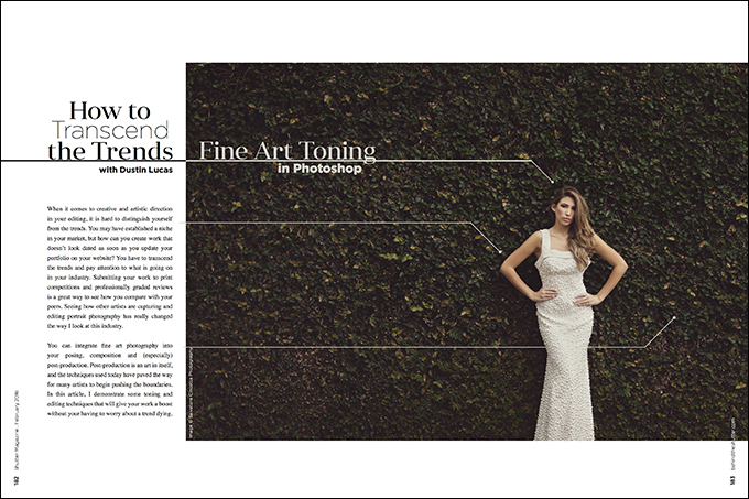
How to Transcend the Trends: Fine-Art Toning in Photoshop with Dustin Lucas
When it comes to creative and artistic direction in your editing, it is hard to distinguish yourself from the trends. You may have established a niche in your market, but how can you create work that doesn’t look dated as soon as you update your portfolio on your website? You have to transcend the trends and pay attention to what is going on in your industry. Submitting your work to print competitions and professionally graded reviews is a great way to see how you compare with your peers. Seeing how other artists are capturing and editing portrait photography has really changed the way I look at this industry.
You can integrate fine art photography into your posing, composition and (especially) post-production. Post-production is an art in itself, and the techniques used today have paved the way for many artists to begin pushing the boundaries. In this article, I demonstrate some toning and editing techniques that will give your work a boost without your having to worry about a trend dying.
Preparing Your Image
Before proceeding with toning, we need to color-correct the image. I have processed the image through Lightroom CC and exported it as a Photoshop Document (psd). This file type is great for working files, but it is quite large and causes the computer to work harder when you make changes.
A few hard and fast tips: I tend to do less tonal work with the contrast and tone curve; I reset sharpening to 0; I use lens correction; and I always use an appropriate camera profile. (1) Adobe Standard can worsen your image color and toning, so set this to a different profile—I chose Camera Neutral, and changed the red values. (2) To learn more about this, check out my July 2014 article, “Color Space Part 2: Getting Control With Your Color.”
With the image opened in Photoshop, we now need to fix some of these dark and bright spots with a technique called dodge and burn. This is a vital step in fixing specific exposure issues in an image. Create two curves adjustment layers and rename one Dodge and the other Burn. On the Dodge curves layer, click the layer thumbnail to open the properties panel. Click in the middle of the diagonal line and drag your cursor up two cells. Click on your layer mask and invert it by holding Command (Mac) or Control (PC) and striking “I.” Follow the same instructions for the Burn curves layer, but drag the diagonal line downward. I group these adjustment layers together.
You can now use the layer mask to paint in the effect. Lower the opacity and edge hardness of the brush to subtly dodge and burn areas of the image. (3)
Toning With Curves
Now that we have a cleaned up images, we are ready to start adding some creative toning. Curves can provide a variety of effects and should be used to their fullest extent. Add a curves adjustment layer and create a matte-like look. Simply click the point in the bottom left corner and drag upward and drag the upper right point downward. When using smaller grid cells, I am able to more accurately drag the curve line where I need to. To toggle between different cell sizes, hold Option and click in the curves window. You can make this a little extreme for now, and we can dial this back with the opacity of the layer. (4)
It looks like the contrast was pulled out of the image, but it looks different from just dropping contrast. Dropping contrast makes the skin look flat and unflattering. (5a, 5b) This curves adjustment is very basic and needs to be further manipulated. We need more definition and contrast. Drag the back point slider to the right till it meets the diagonal line. This gives some definition to those black tones that we flattened. (6)
Taking this technique a step further, we need to reset our curves adjustments and begin to tone the image with even more definition. Add two points on the curve line, each about three rows from the ends. (7) Click and drag the third point down to the next cell row. Lift the bottom point upward to the second row. (8) Make an additional curves layer and drag the black point slider to about the second cell. (9) You can see the difference between the first curves layer and these two. We are beginning to define our own look. (10a, 10b)
Using Gradient Maps and Color Fill Layers
Gradient maps can really add some nice color tone to your image. Applying this gives it a grayscale range of toning, and you can select specific colors to use as well. This can give you some unique looks; I have used Selenium I. (11) This gives my highlights and midtones a more neutral contrast with some desaturation to those green tones. This setting gives the midtones a warmer neutral gray as well; to change the effect, select different blending modes in the layers palette.
A few good choices are Multiply, Soft Light and Luminosity. (12a, 12b, 12c) Remember, you can lower the effect by dropping the opacity and masking out the subject. My settings for this effect are layer opacity at 40% and blending mode set to Multiply, and I have masked out my subject to allow about 20% of the effect. This gives the image a dark and dramatic look. (13)
Color fill layers can add a nice hazy effect to the image. I want to make a slight warming effect in the highlights and shift a little cooler in the shadows. To do this, I create a new fill layer with a solid color. I select a warm color like orange, set the blending mode to Soft Light and drop the layer opacity to 10%. Next, add another fill layer with a magenta color selected, set the blending mode to Multiply and drop the layer opacity to 10%. (14)
Finally, to cool down the image, we create a blue color fill layer. Set the blending mode to Exclusion and adjust the opacity to 10%. You can lower this effect as needed to reduce the blue cast. (15) These three fill layers work together to reduce any white balance tint cast issues, while still providing an attractive matte finish. Group these three layers together so that you can mask out all three effects at once if needed. This is extremely helpful in removing the color effects from the subject’s skin. (16)
Sharpening and Cropping
These final steps can transform your image. They rely heavily on your output method. Sharpening can be a very in-depth process. Read my previous article from the November 2014 issue, “Attention to Detail: Better Results With Sharpening.” In terms of sharpening, this image needs input and output adjustments made. For this article, I have applied my action set to automatically create these two sharpening layers. Take a look at the difference in the details with the Presharpen layer made—with the Output layer added as well, you can determine how much sharpness to use when saving output versions, like web or print, out of Photoshop. (17)
Another technique I like to use to fine-tune the tonal range is to create a black-and-white layer. I usually adjust the sliders by selecting the auto button and set the blending mode to Luminosity. You can adjust these accordingly afterward. This dulls the highlights and gives definition to these hot areas in the image. Use this effect sparingly, and check the image at a 100% view to make sure pixel degradation and/or banding does not occur. This is a quick and easy technique. (18a, 18b)
Lastly, I like to crop the image to a more nontraditional photographic scale. Recently I have come to really like the 2:1 ratio for landscape-oriented images. I cropped this image to remove some of the headroom and grounded the bride right below the knees to achieve a stylistic composition. Be bold with your cropping and try something less safe compositionally. (19) Always crop last and save alternate versions of this so you do not carelessly throw away pixels from the working file.
Nik Software
I like to automate as much work as I can with actions and plugins. The Nik software suite has become a huge component of my workflow, replacing some hands-on work. My go-to tools are Silver Efex Pro 2, Sharpener Pro 3: Raw Presharpener and Sharpener Pro 3: Output Sharpener. (20)
Silver Efex Pro 2 has a huge selection of preapplied effects that can be custom-adjusted and saved as new presets. (I’ll discuss them in depth in a later article.) Let’s use the 019 Fine Art Process preset and add some settings in the finishing adjustments by adding a vignette and some sepia tones. (21) Once I am finished, the program automatically creates a new image layer; I will adjust it later by lowering layer opacity and masking techniques. As you can see, the gradient map as well as the black-and-white layer techniques have been given a run for their money with the Nik Silver Efex Pro layer. (22a, 22b)
The Results
When it comes to trending effects and editing techniques, you need to develop your own style. The ability to distinguish yourself from the bad trends requires you to constantly see what is out there. You have to see the bad to understand what I am talking about.
Googling is helpful, but you need to look at the print competitions in your industry. Seeing high-scoring fine-art prints up close gave me the drive to push the limits in my own work. Constantly push yourself to remain relevant and transcend the trends.