Laurin Thienes – Post-Production In Wedding Photography: Identifying Trends
I shot my first wedding on Kodak Porta 400VC. I went through about nine rolls of film totaling about 300 frames. I didn’t even bring an entire brick with me to the event. I’ve been in or overheard countless conversations between photographers, yearning for the days when you had to make every shot count. It seems funny that the more technical knowledge requirements where actually a simpler time. There was only one main look – the look of what got printed from your chromes or negatives. Then along came the affordable dSLR a decade ago, and everything we knew started to evolve. With that constant change came the explosion of Photoshop actions, wild post-production styles, and some horrific processing I’m sad to admit I fell for. You might be thinking – “So what if styles change? Why is this important?” The answer is simple. If you want to create lasting images for your clients – images that have the longevity of an art gallery piece, identifying and defining your style is increasingly important.
I remember using the first set of Kubota actions. They were revolutionary at the time. The ability to click a button and give your images a super saturated glow or to over sharpen every image: it was something so anti film that it actually looked good to people at the time. But that was acceptable at that time due to the overwhelming acceptance that just because it was digital meant that every image had to be processed. I wonder what some of those couples think of their pictures now. To even the untrained eye, images like this have a specific era of post-production to them.
So why do some of these trends flame out? The same thing that drove their acceptance is now behind their shunning and rejection by an entire industry: Tastes change. Look around. When did the last sets of unique Photoshop actions or Lightroom presets come out? “Years ago”. The companies that used to frequently release revolutionary action sets seemingly have stopped producing anything new. The presets that are available are minor iterations from the previous versions. Trends tend to stabilize, and so you do not see bold new introductions anymore.
RIP the following trends:
BW Colorization: Those high contrast BW images, with the bright red flowers popping off the print. It became commonplace and easy to make these images. Clients loved them, but soon that faded because it was no longer unique. It has become the laughingstock of the entire photographic community.
Hyper Saturation: When the entire wedding day looks like this, you know you have a problem. There might be a time and place to take an image to this level today, but to brand this as a specific style is not something any seasoned pro would do.
Super Glow: Gaussian blur at it’s best. The ethereal glow that was done tactfully by using filters on one’s Hasselblad, made it’s debut in processing between 2005 and 2008. It’s hard to find even novice photographers displaying this look today.
History must not repeat itself. With these trends long gone, it is time, once again, to focus on making good images that we’ll be proud of in years to come. So what trends have lasted the test of time? Well made images that are processed in a way that helps drive the viewer directly to the subject; post-production that adds to the images and enhances what is right and not covering up what is wrong.
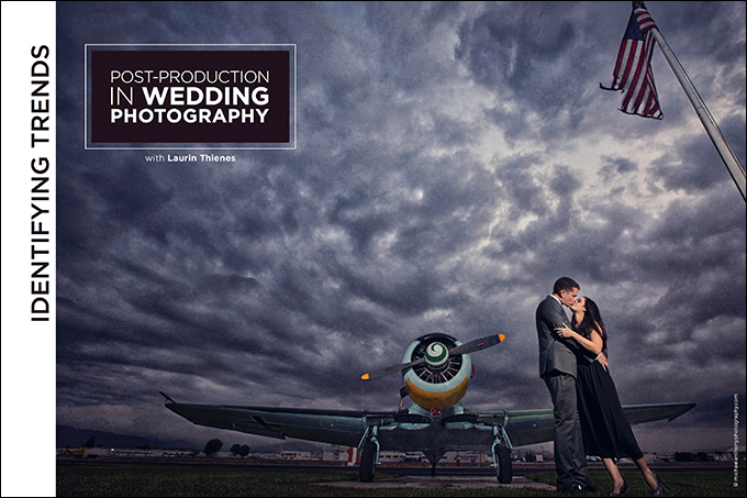
This image takes a subtle use of texture and some light dodging and burning to drive the viewer directly to the subject. The sky, while not the original sky, is still believable and not overpowering in the image.
When art directing the original straight-out-of-camera image, we did not want to stray too far from the reality of the scene that the couple was in. However, we had to take it further to create the fine art piece we envisioned. The addition of texture this time was used to help even out the tonalities between the two train cars in order to not distract from the couple. The grungy tonality across the image fits the railroad track location helps bring the viewer directly to the couple’s kiss.
Black and white images always will hold their own when it comes to trends fizzling out over time. The decision to make this image monochromatic was really to keep it as a timeless piece; taking into account the historic location in central park. The removal of the people takes most of the distractions within the image away, isolating the silhouette of the couple. This couple should enjoying a final image such as this years later.
Do you risk misidentifying a fading trend? Absolutely. In the same breath, an argument could be made that “cutting edge” could be code-speak for “will fade soon”. However, I believe cutting edge today is a result of incremental adjustments in style and not going off the reservation chasing new looks every time they present themselves. Being cutting edge is perfecting your craft, your look, and always knowing that your goal should be to produce heirloom images for your clients. So study history. Study the true masters of photography. Study what sells for you and what doesn’t. Study fashion magazines. Simply put, educate yourself.
But what’s next and where do we go from here? Even though I truly believe the majority of trails have been blazed, there will always be minor variations from year to year. In the future – the trends that will present themselves will be more specific to how you capture the image you want to capture. Trends will be defined by what is in the RAW file. The way you work with backlighting, off-camera flash, reflections, and composition will help define the next trend is.
This is not meant to instill fear, but to help guide you in defining your style in a lasting way. As you move forward in your career, it is important to recognize trends that will flame out and more importantly, to maintain the look of your brand.

