Post-Production That Packs a Punch with Dustin Lucas
When I’m shooting and editing Raw files, I am constantly comparing the back-of-camera preview to what I can produce in post. Post-production techniques become very important to me when I want to push past a corrective edit and pack a punch. Lightroom Classic allows me to do just that with its intuitive and very user-friendly tools. If you already use Lightroom, what more is there to learn? Or maybe you just don’t care for punchier images because it’s not in your wheelhouse.
As creatives, it is in our blood to break out of the box and try something new. If you are not pushing yourself and developing your photography, where’s your growth as an artist? In this article, I give you the tools to try something new and pack a punch with your images. We will dive into corrective adjustments and how to direct your viewer. These are the basics you may already be doing today, but we are going to mix things up a bit. You are going to hear about color profiles a lot in Lightroom Classic, which are vital when mixed with color grading techniques.
From Capture to Corrective Changes
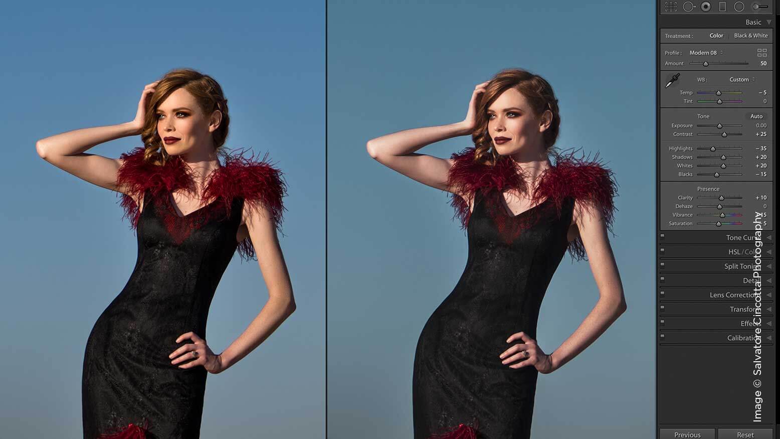
As soon as I import, build previews and cull out the bad shots, I have my final set of images. These are all getting a standardized edit to keep as proofs, something I would not necessarily share or post in a portfolio. I would choose my top 20 images to correct for this creative, punchier look I had envisioned at the shoot. The corrective adjustments for lens distortion, straightening the horizon, noise reduction, sharpening, white balance and brightness would be left as I would take the image directly in Photoshop to finish up. Instead, I want to keep everything in Lightroom and make changes across multiple images quickly. (1)
Let’s start by correcting for the landscape and pulling in some dynamic range. Keep in mind that we have brushwork to do after that, and we do not want to create more work when we do so. In my corrective edit, I lifted the exposure for the skin tones. Now I want to go back to my initial exposure half a stop lower. You can see the difference with this simple change. (2) Next, I need to remove the Lens Corrections Vignetting that I like on the 85mm. This already gives us a slight advantage as it burn the edges of the frame right to the main subject if it’s centered in the frame. (3)
Finally, I may add some Dehaze to bring back some of the lost background due to overexposing it initially. This is always something we can adjust later if it’s too much, but I like using this along with black point to add density to the image. (4) For the moment, I will leave the white point setting at 0 because it doesn’t really help the main subject. Even though we have a gap on the right side of the histogram, I can rely on my dodging to brighten her. (5) Now we can start to use a layered dodge and burn technique to brighten the subject and bring the attention back to her.
Direct Your Audience With Local Adjustments
For Local Adjustments, I like to build up my effects for a natural and subtle look. To add punch, there is nothing subtle about it—we need some drama to move our attention to the model. I start by accessing the Adjustment Brush by striking the K key. We can choose prebuilt settings under the Effects section or apply custom settings.
Before we start, we need to figure out how many layers we want and the right increments of exposure we want to add. We used +0.50 exposure during our corrective, so we don’t need to go much brighter than this. As we add a new mask, it’s going to add the effect to her face each time, so if we want to do three layers, we need to divide +0.50 evenly. I recommend small increments of exposure since we can always add more masks, and this will look more natural even as a creative edit.
Let’s use +0.15 exposure and choose a large brush size, around 20.0, to paint around the subject for our first mask. Feathering is important here because we do not want a hard line or obvious haloing around her. I tend to let half the brush apply outside the edges of the subject. (6) Next, we add another layer and paint more precisely on her body and dress so she subtly sticks out from the background. Choose a brush size that fits right around her head and paint on her exclusively. (7) Now we accentuate her face by increasing the exposure setting to +0.50 and only brightening this in our final dodge mask. I brighten her left arm as well to better balance with her right. (8)
Now we start to nitpick details. Add another mask to her face and warm up her arms. I am really digging this image so far. We have done only a handful of corrections, but they make all the difference. (9)
Get Creative with Color Profiles & Color Grading
One of my favorite features of Lightroom Classic 7.3.1 is the new Profile Browser. You can apply standard Lightroom profiles, third-party profiles and the new creative ones. I like to use the Modern profiles because they add different options of a matte style tonality. Modern 08 allows me to keep this matted look without losing too much punch. (10) If I need to turn this down, I can do it with the amount slider, an awesome way to dial back the creative profiles. (11) Next, we work on the color grading and fine-tune the look we want to achieve.
Starting in the Basic Panel, we add clarity and vibrance while lowering the saturation to reduce the orange and red tones. (12) One subtle but very effective color shift I like to do when the background has the same warmth as my subject is to work with Tone Curve. By editing the Point Curve, I break up the RGB channels and start to affect the color balance of my shadows, midtones and highlights. In the blue channel, I lift the curve of the shadows and midtones to add some cool tones in the background. This gives me a creative separation between my main subject and background. (13)
Next, I would naturally want to pump up the dress a bit in the HSL panel. With the target adjustment brush, I can zero in on these colors. When using this panel, we have to remember it affects the entire image, not just the area clicked in. By boosting the red and orange saturation and luminance for the dress and skin, and darkening the cool tones in the background, our image gets a subtle boost. It’s like a dodge for the client and a burn for the background. (14) Once we add some sharpening, our image is about done. (15)
Some final changes would be to darken around the model a bit more and try to burn down the hot spot in the upper right corner. (16) It helps to close your eyes and open them to see where your eyes go naturally. We zone into the hot spots or brightest area of the image, and the goal is to get you to the model. (17)
The Results
To achieve the best results, you have to dial in the shot up front and shoot for the landscape. This doesn’t mean you should completely underexpose your subject and stop down to f16. I find that wider apertures lend themselves to this sort of processing. It’s okay if you aren’t off-camera lighting your subject. You may have to add more layers of dodging. The most important thing is to build up effects and be subtle with your develop settings. You can always add adjustments, which is much faster than starting over.
Take a few images from a recent shoot and apply these techniques to them. Even if you are not a fan of this type of creative edit, it’s healthy to step out of your shell.