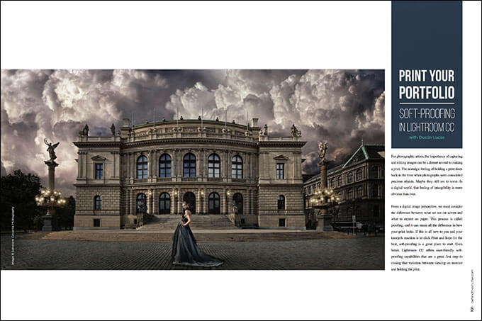
Print your Portfolio: Soft Proofing in Lightroom CC with Dustin Lucas
For photographic artists, the importance of capturing and editing images can be a distant second to making a print. The nostalgic feeling of holding a print dates back to the time when photographs were considered precious objects. Maybe they still are to some. In a digital world, that feeling of intangibility is more obvious than ever.
From a digital image perspective, we must consider the difference between what we see on screen and what to expect on paper. This process is called proofing, and it can mean all the difference in how your print looks. If this is all new to you and your kneejerk reaction is to click Print and hope for the best, soft-proofing is a great place to start. Even better, Lightroom CC offers user-friendly soft-proofing capabilities that are a great first step to closing that variation between viewing on monitor and holding the print.
Color Management
There are a few things to consider when making prints. First, you need to refer to your lab or personal printer settings. This is crucial. No need to waste time and energy creating settings out of thin air if your lab has them posted on its website.
Calibrate your monitor at the very least—this is vital. If you are printing yourself, look into a calibration system for your monitor and printer. If you are venturing in this direction, do some research on color spectrometers. These devices can lessen the gap between what is on screen versus what is printed. If you are looking for an entry-level system, check out the X-Rite ColorMunki Photo device. It’s fast and user-friendly.
Color management can be daunting. This term refers to the collaboration between your camera, monitor and printer. Aren’t they all supposed to be in sRGB? What’s the big deal? SRGB refers to the color space. This is the most widely accepted color gamut, and it’s all about output. Like I said earlier, start by figuring out where you want to print. For a more in-depth look at color space, check out my article “Color Space and Your Photography” from the June 2014 issue of Shutter.
From capture, this image had a native color space, meaning it hadn’t been converted yet. After the Raw was processed and exported as an image file, color space was assigned. Knowing that I was going to further edit the image, I converted it to Adobe 1998. I processed it in Photoshop and saved it as a JPEG. (Image 1) This is my normal workflow. Normally I’d print in Photoshop since I was already there, but I want to keep everything in my Lightroom Catalog for organization purposes.
ICC Profiles
I have imported my JPEG image into Lightroom and am ready to begin soft-proofing. Soft-proofing can be used in the Develop Module by striking the “S” key. (Image 2) As you see, the default settings are set to Profile: sRGB and Intent: Perceptual. From here, we need to make a virtual copy by holding Command and striking the apostrophe key; or just click Create Proof Copy. This allows us to edit the image for the paper media we want to print onto. We need to install some paper profiles. (Image 3)
If you own a photo printer, go to your paper media’s website and download the ICC profiles according to the printer model. I went to Hahnemühle’s website and downloaded a few of my favorites. Once they are downloaded and unpackaged, we need to install them. Mac users need to navigate to Library > ColorSync > Profiles and save all the ICC profiles here. Then close and reopen your Lightroom catalog. (Image 4)
When you click on the current sRGB profile, a list will appear; choose Other. From here, you can select all the profiles you want to use while proofing. Now we can jump into soft-proofing. (Image 5)
Lightroom Soft-Proofing
After changing the profile to Photo Rag, you can see a real difference in the tonality of the image. Remember, we are looking at a soft proof on a calibrated monitor; this is not an actual representation of what will be seen in print. This should give you an idea of the flatter tones, and you can adjust accordingly. Fortunately for this image, the fine-art toning lends itself to the matte finish. (Image 6)
Gamut Warning is a common tool for proofing an image. With it, we can review what colors are out of range, so to speak. To view the Destination Gamut Warning, hold Shift and strike the “S” key. The problematic areas will highlight in red. (Image 7) As you can see in this image, we have very few areas to be concerned about. I can drop the exposure a touch and lift the white point. (Image 8)
We can adjust the HSL, Tone Curve and Exposure to reduce the out-of-gamut colors. You can quickly fix these issues using the Target Adjustment tool for saturation, but remember that this affects the entire image. (Image 9) This is where the Local Adjustment Brushes help to lower the saturation in specific areas. (Image 10) For this image, I am not too concerned with these issues. I can drop the exposure a touch and lift the white point to reduce the gamut warning.
When reviewing the image in Proof Preview, I like to reveal only the right panel. (Image 11) Viewing the Proof Matte Color as Paper White along with checking the option Simulate Paper & Ink gives you an idea of how the print will look. (Image 12) If you are viewing on a noncalibrated monitor, your print will usually be much darker because the screen brightness is hiked up. Photo paper is also a lot less luminous than your backlit screen. To compare the Master and Proof Preview, strike the “D” key. (Image 13)
Lightroom Print Module
The Print Module is also user-friendly. I start in the lower left panel with Page Setup to adjust the orientation of the paper and image. Then you can select the specific printer settings for quality and paper type. On the right-hand panel, the category Print Job allows you to fine-tune your image with Print Resolution, Sharpening and Color Management. (Image 14)
I usually resize my images at 300ppi and leave the print resolution the same. Print sharpening is a preset-driven version of output sharpening with options for amount and media type. I usually turn this off because I work with input and output sharpening in Photoshop. Under Color Management, you can select the profile used for soft-proofing. This ICC profile controls the color gamut for your print and paper. Select this instead of allowing the printer to manage color. That’s it—you’re ready to print! (Image 15)
Labs: Bay Photo
When working with photo labs, it’s best to review their recommended settings before sending off your images. Most labs are hesitant to offer downloadable ICC profiles for their printers and paper media because of the massive variation and combinations of papers and printers they use. So how can you soft-proof with a lab?
Some labs, like Bay Photo, offer a soft-proof ICC profile. You can access this on their site and install it just the same as the Hahnemühle profiles. Take this profile with a grain of salt. It’s a vague profile, and does not reflect what your print will look like. Hahnemühle offers a Pro version of its ROES software that allows the lab to color-correct your images based on its equipment. It’s always worth having some proofs made to see how far off your monitor is from theirs. (Image 16)
Conclusion
The most important thing is to get your monitor calibrated. If you aren’t investing in a photo printer, you won’t need the X-Rite ColorMunki Photo, but pick up something comparable. Once your screen is a little more tamed in terms of color and brightness, you can begin soft-proofing. Soft-proofing is a great starting point for getting your monitor and prints in sync.
If you have been editing and printing, reediting and reprinting, it may save you some headache in the long run. Sending some proof prints to the photo lab helps you see where you land. Don’t waste your money hoping they get it right.