
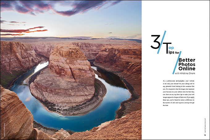
Top 3 Tips for Better Photos Online with Kristina Sherk
As a professional photographer, your website is not only your résumé but your calling card to any potential client looking to hire someone like you. It is imperative that the images that represent your business on your website look the best they can. Here are my top three tips to make your web images appear in a league of their own. If you apply these tips, you’re bound to notice a difference in the number of calls and inquiries coming through the door.
Tip 1
It’s quite a turbulent time in the world of computer screen resolution. Since the debut of the Apple Retina screen and the more recent 4K monitors, the race to more pixels is well on its way. That’s why it’s important for you as a photographer to be well-versed in your website provider’s default image settings when uploading your images to your website. Make sure that you are manually sizing and cropping your images to your website’s specifications and not checking the box, which resizes your images automatically upon upload.
After sizing your images in Adobe Photoshop or Lightroom to the correct dimensions and dpi (dots per inch), it’s time to sharpen. Here’s your dinner party factoid: The Unsharp Mask tool in Photoshop has not been updated since Photoshop version one! Needless to say, while I do use Photoshop to selectively sharpen certain areas of my images, for your overall web image sharpening, I’d rely on the much newer algorithm behind Lightroom’s sharpen sliders in the Detail dialog box.
Since your images have already been resized to web dimensions, I would tap your “Z” key to zoom your entire image into 100% zoom, rather than using your detail preview box located in the detail side panel. Make sure your zoom setting is set to 1-1, which ensures you’re looking at a true 100% zoom.
The first slider in the details box is the amount slider. This is the overall sharpening slider. Use this slider to find a point of sharpening that looks best for your image. The radius slider determines how far away Lightroom should look for a contrasting pixel to decide whether or not to add more sharpening to that area. My suggestion would be to leave the slider at 1.0 for the majority of your images.
Think of the details slider as the protection mechanism shielding you from oversharpening. As you increase the amount to the slider, you should also increase the details slider to protect your image against sharpening artifacting and the dreaded halo effect.
Here are two images side by side. Image A is unsharpened, and image B is sharpened.
These images definitely show you how sharpening, when done right, can really make your image pop off the page!
Tip 2
This tip is applied to every single image in my photography and retouching businesses. You have to sort of think of your viewer as an ADD child. Put yourself in their shoes for a moment; they’re frantically looking for a photographer while trying to juggle everything else that comes along with real life—kids, groceries, jobs, projects, etc. So it’s important that the moment your viewer looks at your image, their eye takes them immediately to the section of the image that you’ve chosen as the most important spot. Because if you don’t lock in their interest, you’ll lose them and they’ll move on to the next photographer. I achieve this by toning my images. Another term for this is dodge and burn. (This skill has so many uses and is not just for skin retouching!)
Take a look at this image. The first version is untoned. It’s straight out of camera—and, even though the little girl is in focus, you pass over her because the lightness of the bride’s dress takes your eye away. In the second image, I brightened the girl and toned down the bride’s dress, which immediately leads the viewer’s eye to the intended subject of the image.
Here’s one more example from the same wedding. In the untoned image, your eye bounces around from the white column on the right side of the frame to the white veil to the bridesmaid in the background, and then finally sees the sharp, in-focus face in the middle. By toning down those three things and brightening and adding contrast to the face in the mirror, you’ve created a stunning image in which the viewer’s eye goes immediately to the place of intended interest.
Tip 3
The last tip here is definitely the most important but also the most elusive to understand. I’m going to divide it into two parts since it’s so complicated.
Part A: Understanding Gamma and White Point:
You can think of gamma as your computer screen’s black-and-white clipping points. There are two widely used gamma settings: 1.8 (more contrasty and what Macs used prior to 2009) and 2.2 (less contrasty and what PCs use). In 2009, Mac computers switched their default gamma from 1.8 to 2.2 in order for all images to look similar whether viewing them on Macs or PCs. This is good news for photographers because it means your clients will see images closer to what you wanted them to see on your website, whether they’re looking at your site on a Mac or a PC.
So when you’re calibrating your computer screen, it’s best to use a gamma of 2.2 so that the images you retouch and put on your website look as similar as possible to what your viewers are seeing on their screens. If you don’t calibrate your screen and want to know how to make your images look more appealing to the general public who are viewing your website images through their crappy computer screens, make your web images a tad more contrasty than you might think looks good. This will counterbalance the less contrasty gamma setting that most computer screens are set to.
White point is a little bit easier to understand. If you’ve ever used Kelvin as your white balance on your camera, you’re already somewhat familiar with the fact that different light sources have different colorcasts. Computer screens have two different color temperatures that they can be set to:
D50: This translates to a Kelvin color temperature of 5000. This white balance has a yellow tinge and is used by people who do primarily print photography.
D65: This translates to a Kelvin color temperature of 6500. This white balance has a blue tinge. Most computer screens are set to this color balance.
Check out this picture that I found in a really wonderful article in Scientific American called “Gamma and White Point Explained” by Jim Perkins. He is a medical illustration professor at RIT who uses layman’s terms that can help anyone understand these quite advanced concepts. I highly, highly recommend reading this article if you calibrate your monitor (which all of you should be doing on a regular basis).
Here you can see the difference between the two gamma values and also the difference between the two color balance settings.
So what does all this mean to you? If some of this went over your head, that’s perfectly fine, but just remember these two things: Make the images that you put on your website a little bit more contrasty, and also a little bit warmer than you would normally. These two tips will help your images look really nice on the mass-market computer screens that most people own.
So is your brain mush yet? Sorry. I know this stuff isn’t the most exhilarating, but it’s super important that you understand these things to make sure your images look the best they possibly can.
Part B: Understanding Color Profiles
There are three main color profiles used in photography. The biggest is ProPhoto. The second biggest is AdobeRGB (Adobe1998), and the smallest is sRGB. When it comes to showing your images on a screen, you want your image to have the color profile that is specifically created to keep the truest version of the colors in your image—and for any images being viewed on a screen, that’s sRGB.
Have you ever been working on an image in Photoshop that looks absolutely beautiful, but the moment you upload it to your website, it looks muddy and the colors look muted and wacked out? That’s probably because the image color profile applied to the image is not meant for a computer screen, and more likely meant for printing the file.
As an example, I uploaded the same image with three different color profiles to my website. Which one matches the colors best to the image I have up in my Photoshop window?
I hope you chose B, and if you did, then bravo! The exact same image with three different color profiles applied to it looks like three different images once uploaded to a website. Crazy, right?
Your color profiles can be found in your Photoshop Edit menu. Choose the option Convert to Profile.
With your Convert to Profile box open, change the color profile to sRGB.
While I know this topic isn’t the most enthralling, this information is paramount to presenting yourself as a professional photographer. If you show your images on your website using the tips above, you’re bound to get an uptick in photography inquiries.


This Post Has 9 Comments
When you start talking about “dpi” (dots per inch) in conjunction with uploading digital imagery, I automatically assume you do not know what you are talking about. DPI has nothing to do with digital images; it’s a measurement of how many dots of ink a printer lays down per inch. You may be thinking about the PPI setting (Pixels Per Inch), which directs printers how many pixels in your image should fit in an inch. Again, this value is absolutely meaningless in a digital upload context, since Web browsers and other digital display programs only care how many pixels are in the image, and not how many are in an inch.
Not sure some of the posters here are going to get much benefit from this article – you have to be able to read. The first thing it says is…
“Want more information on this article? Get access to video content and additional supporting images. Launch the December issue of the magazine by logging in or signing up for a free account by clicking here.”
Sign up for a FREE account and sign in to read the article in Behind the Shutter. The images will magically appear right before your eyes!
No need to get snarky. I tried accessing the December issue by signing up yesterday and the links for signing up weren’t working properly. Eventually, it all worked and I have read the article.
NO IMAGES seem here either; I look and look for LINKS that ACTUALLY WORK and most of the time they do NOT exist. Either I am unusually thick-headed or the “links” are simply ‘NO GOOD”! I should NOT gripe, however, wasting time trying to find the “WUNNEREFUL INFO: about which I READ is a crock! WHY WASTE OUR TIME?? I am NOT the only one who in te end says. “WTF GOOD IS THIS CRAP? IT DOES NOT WORK?” —————-> Gimme a break! When I as a new photo-guy see title suchas 99 MISTAKE YOU TWITS MAKE – but should NOT” I actually do NOT give a flying screw about looking at crap I DO NOT UNDERSTAND! I AM A NEW PHOTO-PICTURE-TAKING GUY! QUIT SCREWING ME AROUND!
I don’t see the images either.
The “key” is in the BUCKS they want to scam us out of; AGAIN!
Hmmm, also don’t see the images mentioned in the text.
AND we never will SEE THE DAMN IMAGES! It’s a scam to get $$$$ out of our pockets! I AM DONE WITH these so-called “PROS”! They pick pockets and CONFUSE more than they freaking HELP!
Don’t see any of the images mentioned except the one at the top of Horseshoe Bend