3 Quick Ways to Creatively Tone Your Images With Adjustment Layers with Payton Hediger
Between all the tools, filters, layers, and even 3D capabilities, Photoshop can be an intimidating program to approach for those new to photo editing. However, Photoshop offers plenty of powerful tools that can transform your images quickly and effectively. Here, we will focus on three different methods for utilizing adjustment layers to create fun and beautiful toning for your images.
Adjustment layers are a great place to start when experimenting with toning. They offer you a ton of flexibility, and they’re non-destructive. Simply put, these layers can be added, deleted, modified and shuffled around without damaging or losing any information in your image. All the adjustments made to these layers can be modified on the fly without having to erase or delete and re-create the layer. Adjustment layers exist in two separate locations. In the top left of your screen, under the “Layer” dropdown menu, you will find the “New Adjustment Layer” options. Note, this location is missing several adjustment layers that we’ll be using, such as “Solid Color” and “Gradient.” This menu option is not to be confused with the similarly named “Adjustments” menu under the “Image” dropdown menu. The “Adjustments” menu offers many of the same options, but these are applied destructively and cannot be adjusted on the fly without your layer having been converted to a smart object first. This makes them a bit more of a hassle and a little less versatile compared to an actual adjustment layer. The second, and in my opinion more efficient, location is actually in your Layers Panel. It’s the middle, half-grey, half-white circle at the bottom of your the panel. This location has the “Solid Color” and “Gradient” options, which we will be using later. More than just providing you with three great toning options, I hope to be able to provide you with the tools to create your own toning styles that will help to bring your vision to life.
For the Light and Airy toning style, I would like to create a bright, somewhat milky look while trying to avoid unnecessarily blowing out any highlights. To start, we really need to pump up the brightness. Now, there are several different ways to do this within your adjustment layer options, such as Curves, Levels and Exposure, but we’re going to use Brightness/Contrast to kick this off. This is by far one of the simplest adjustment layers, with only two sliders. And as the name implies, those two sliders are Brightness and Contrast. To get that bright, milky look, we need to reduce the contrast as well as boost the brightness. So, in your Properties panel, adjust the contrast to -10 and the brightness to 50. I would recommend getting all the adjustment layers in place before experimenting, as each individual layer may not make visual sense on its own, but they should come together at the end. Also, keep in mind that the order you apply these layers in will make a difference.
Next up will be a Gradient adjustment layer. We’ll be using this layer to create a bright vignette around the edges of the frame. Of course, this can also be used to make a dark or even a color vignette around your frame instead. In your Properties panel, set the “Style” to “Radial.” This will automatically apply the center of the radial gradient to the center of the image. So, if your subject is off center, go ahead and adjust the position of the center of this radial gradient. You can only adjust the position of your “Style” gradient while in the Properties panel, be it Linear, Radial or something else. In this case, I’ll also need to select the “Reverse” option, so that the opaque portion of the gradient is to the outside of the frame. You can also adjust the scale of the gradient in this menu if that’s necessary for your image.
Now, we’ll need to pick the color of the vignette. While still in the Properties panel, click the Gradient Editor. There should be two keys already applied for the beginning and end colors. Directly above the color keys are opacity keys. You should notice that the left side has full color at 100% opacity, while the right side has no color and zero opacity. The key locations can be adjusted freely for both opacity and color. You can also add additional color and opacity keys by simply clicking on the top or bottom of the gradient. In this case, we’re just going to change the colors. If you click on a color key, the “Color” option in the bottom left of the Gradient panel will become visible. Click on it to change the color. In this case, I wanted a bright, warm color (#daba95). Once confirmed, you can do the same thing for the right-side key color, which I’ll make a dark blue (#405f86). Confirm the color, the Gradient Editor, and the Properties panel by clicking “OK” on all three panels. There’s no need to adjust the blending mode here, as we want to brighten and push back the detail around the edges of the frame, so Normal will work fine. So, the only remaining step is to bring the opacity of the Gradient Adjustment Layer down to 20%. You can find this option in the top right of the Layers panel.
Next, we need to add some fun color to this image through Solid Color adjustment layers. While we’ll be using three of the same type of adjustment layer, each will add its own unique flavor via blending modes. Go ahead and apply your first Solid Color adjustment layer, which only has a Color Picker option. For this, I’ve chosen (#002c5a). In the top left of the Layers panel, change the blending mode from Normal to Exclusion. Exclusion is a unique blending mode that, in this instance, will add a matte finish and apply a cool tone to the image’s shadows. In the top right of the Layers panel, changes the Opacity to 30%. Apply a second Solid Color adjustment layer. This time, we’ll use a warm color (#a25849). We will be applying warmth primarily to the midtones via the Soft Light blending mode at 25% opacity. We’ll need one last Solid Color adjustment layer to finish out the Light and Airy toning style. Once applied, select (#9871d3) as your color. You will want to change the blending mode to Screen with an opacity of 5%. This may not seem like a lot, but we really just want to add a hint of color here to balance out the image and add a bit more brightness and milkiness to this toning style. Overall, the Solid Color adjustment layers are simple but super powerful, because there are so many combinations of colors, blending modes and opacities. You can quite literally create a whole new toning style by just stacking different Solid Color adjustment layers on top of one another.
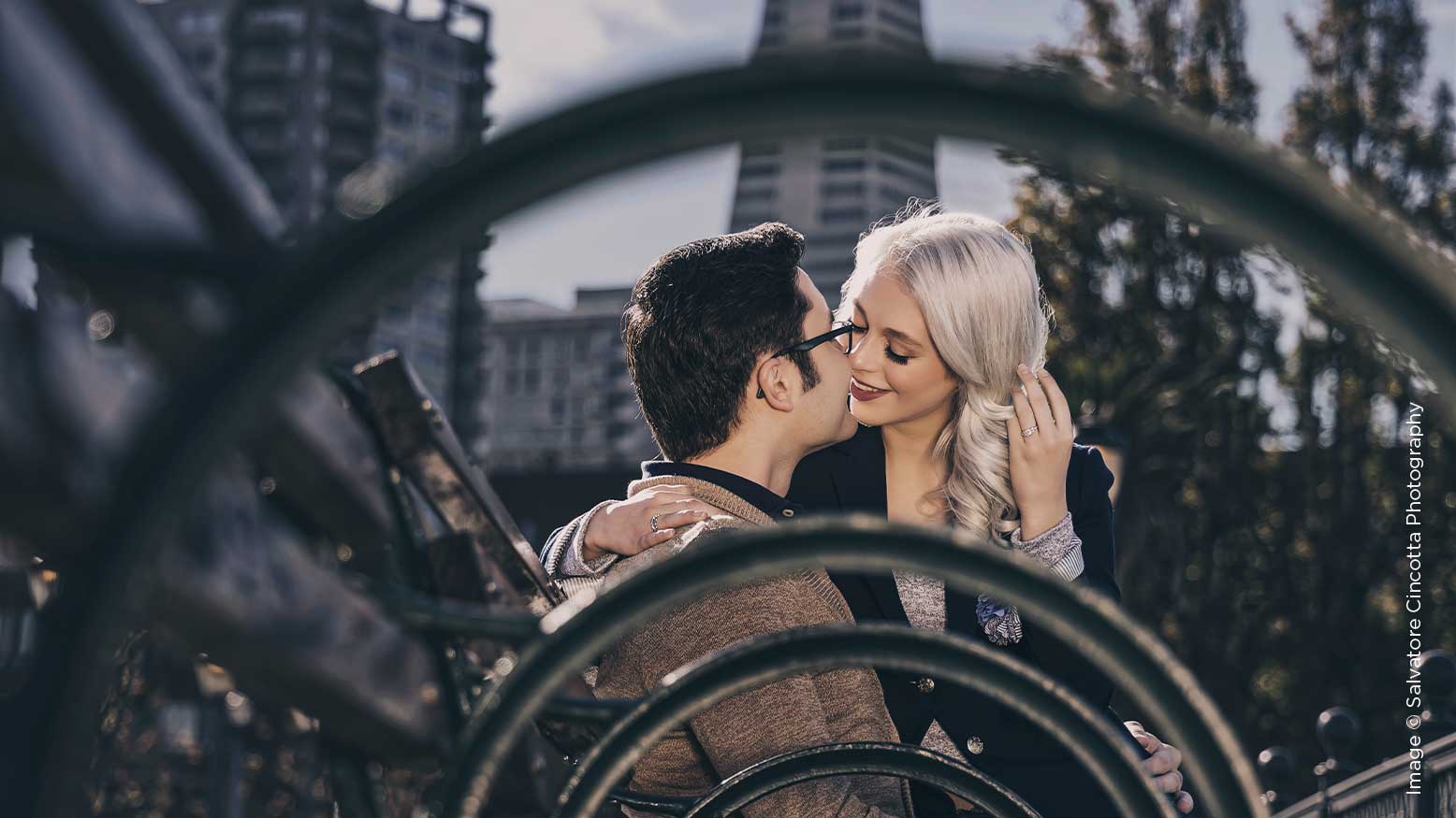
For those of you who would rather see all the details pop in your image, the Colorful and Contrasty toning style should be right up your alley. The goal here is to really get the highlight details to stand out from the shadow details, while still making sure that the shadows don’t block up and the highlights don’t blow out. For contrasty toning, this is always a bit of a challenge. But I have a little trick that might help you out, starting with the first adjustment layer: Levels. Levels and Curves are very similar in the results that they produce. More or less, they’re the same tool shown two different ways. If you’re more familiar with Curves, you can use them instead of Levels, and vice versa. On the surface, these look like they just control contrast, but both Levels and Curves provide you the option to adjust color as well via channels. However, I would recommend Solid Color and altering the blending modes to get the color toning you’re after, as the color adjustments through Levels and Curves can get a bit complicated. For now, we’re just going to stick with contrast adjustments here in RGB mode. In the Layers Properties panel, you should see a histogram, and just below that three numbers. From left to right, those three numbers represent shadows, midtones and highlights. I’m using 10, 1.25 and 235. While these three numbers offer the ability to add contrast, the two output values below them offer the ability to reduce it. Adding a subtle amount of output can be a great trick to help reduce any blocked-up blacks or blown-out highlights without killing the contrast you’ve just added. I’m using 5 and 250 for my back and white point values, respectively.
Next, add a Vibrancy Adjustment Layer. This offers two sliders—a vibrancy slider and a saturation slider. Simply put, vibrancy tries to stay away from skin tones so that you can boost the color in an image without making skin orange. Saturation, on the other hand, adjusts all the colors equivalently. With the added contrast from the Levels layer, the couple’s skin tones have become a little too warm. I’m going to use this adjustment layer to reduce the saturation to -10 and then raise the Vibrancy to 50. Effectively, this diminishes the warm tones of the couple’s skin while boosting the color throughout the rest of the image.
This image was taken during the middle of the day, so I’d like to see it made a little warmer. For this, we will be using the Photo Filter adjustment layer. Within this adjustment layer, you have several pre-built filters you can use as well as a custom color option, a density slider, and an option to preserve luminosity. The first pre-made Photo Filter option was alright, but I wanted a bit more magenta in the color. So, I’ve decided to go with a custom color for this (#cb854c). The Density slider is kind of like a cross between the Soft Light and Color Blending modes. You won’t be able to get entirely monochromatic with this like you can with the Color Blending mode on a Solid Color adjustment layer, but it will add more of the selected color to your image in comparison to the Soft Light blending mode. This can be really helpful—Density isn’t a blending mode option, so if you need an in-between option, Photo Filter can fill the gap. The Preserve Luminosity option just makes sure that the brightness goes unaffected no matter how dark or bright of a color you have chosen.
When it comes to contrasty toning, you really want to be able to control which parts of your image are affected to make sure that the intended areas are standing out. The Black and White adjustment layer offers that ability. When set to the Luminosity blending mode, you end up with similar luminosity sliders to what you might see in Lightroom as part of the HSL panel. This allows you to control the luminosity via a specific color range. This is going to be more of a unique setting per image, but this adjustment layer also offers an Auto feature to help get you started. For this image, lifting the colors associated with skin tones (red and yellow) while lowering the other values helped make the couple pop.In all, we’ve created a very contrasty toning style that allows us to control specific ranges of the histogram so that we can still maintain detail from the black point all the way to the white point.
One of my personal favorite styles is the very moody, dark matte toning style. For this, we’ll start off with a Curves adjustment layer. When it’s created, you will have two points and a straight line between them. Where Levels separates the Input and Output values, Curves combines them. But otherwise, they’re very similar, as I previously mentioned. The black point is the bottom left key on the histogram in the Curves Properties panel. Keep in mind that input will add contrast, while output will reduce it. So, for this black point, we want to leave the input at 0 and adjust the output to 30. For the White point in the top right, we’ll adjust the output to 230 and leave the input at 255. Now, this is really what makes the matte look. But, you can still make adjustments between these two points to add midtone contrast or adjust the overall exposure. In this case, we’re going to add two points. Click on the line that goes between the black and white points, and this will create a new key. For the first of the two points, enter 70 for the input and 75 for the output. For the second new point, enter 150 for the input and 160 for the output. You should end up with four keys that look like this.
Personally, I think desaturation and matte go hand in hand, so the next step is to slightly desaturate the image by adding a Hue/Saturation adjustment layer. This is a great tool that has a lot of versatility. Beyond the Master Hue/Sat/Lightness options, you also have the ability to change these same values for specific color ranges. Though we’re going to use this a little differently. I want to add color to this for a bit of a sepia tone. To do this, select the Colorize option. This look can also be achieved similarly with a Solid Color adjustment layer set to the Color Blending mode. I’ve chosen values of Hue: 20, Saturation: 15 and Lightness: 0. I generally shy away from the Lightness setting within Hue/Saturation, as it moves the entire histogram one direction or the other, and I find that this is generally a negative impact to the image. There are a lot of other, better ways of adjusting exposure/brightness, such as the Brightness/Contrast adjustment layer. From here, adjust the opacity of the Hue/Saturation layer in the top right of the Layers panel to 30%.
Next up, we have a Gradient Map adjustment layer to do some slight split toning by adding some cooler tones to the shadows and warmer tones to the highlights. The Gradient Map maps out the color values to the histogram, so that the far left point represents your black point and the far right point represents the white point. To achieve the look we’re after, we need to add blue to the shadow side and orange to the white side. In the Gradient Map Properties panel, click on the Gradient itself. This will take you to the Gradient Editor. This is the same kind of Gradient Editor as the Gradient adjustment layer uses. Your color and opacity points all work the same.
Let’s start by making the left point (#335980) and the right point (#b2896b). Once you confirm your colors, go back to the Layers panel and change the blending mode to Soft Light and the opacity to 50%. Given that I’m using Soft Light here, you have to keep in mind that this blending mode affects color and contrast. To avoid contrast adjustments, make sure to pick colors that are close to the 50% black value in the Color Picker, as highlighted here. Lastly, let’s alter the color a bit in this image for a more overall neutral white balance. Add a Color Balance adjustment layer. This adjustment layer allows you to change the color balance for three specific ranges of the histogram: shadows, midtones and highlights. This is something that is likely to be a little more image-specific, and you can fine tune the values to your taste. I’ve altered the midtones here to values of -5 (cyan/red), -5 (magenta/green) and -10 (yellow/blue), with the Preserve Luminosity option checked.
I’m sure that through creating these three toning styles or variations of them, you’ve discovered just how versatile and powerful the Adjustment Layers are. I encourage you to play around and experiment with the options that each Adjustment Layer provides and combine them with different blending modes and different opacities. Beyond what we’ve covered here, each Adjustment layer also contains a layer mask, which can be useful for localized adjustments. But that’s for another time. In the meantime, I hope this has inspired you to want to create even more fun and beautiful toning styles that fit your brand or your mood.