4 Steps to Use the Color Grade Tool in Lightroom Classic v10 with Dustin Lucas
With Adobe’s recent October 2020 release of Lightroom Classic v10 comes the replacement of Split Toning with a new Color Grading tool. This is the tool many of us have been waiting for in Lightroom, and now we no longer have to go into Photoshop to utilize it. Of course, Split Tone and Tone Curve have the ability to color grade, but not like this new tool. Adding a cinematic or simply a unique look to your images is faster than ever. Let’s jump into the four steps to color grade your images in Lightroom Classic v10.
Step 1 starts with using the individual panels to make detailed shifts in the color range for shadows, midtones and highlights. Step 2 is using the Luminance slider to adjust the brightness in each color range. Step 3 is choosing the Blending and Balance sliders to help dial in the look you need. Step 4 is creating presets so you can work fast when you are ready to finalize your best work. Let’s jump into Lightroom and get started!
1. Get Detailed Using Individual Panels
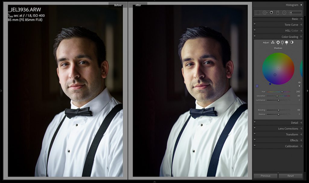
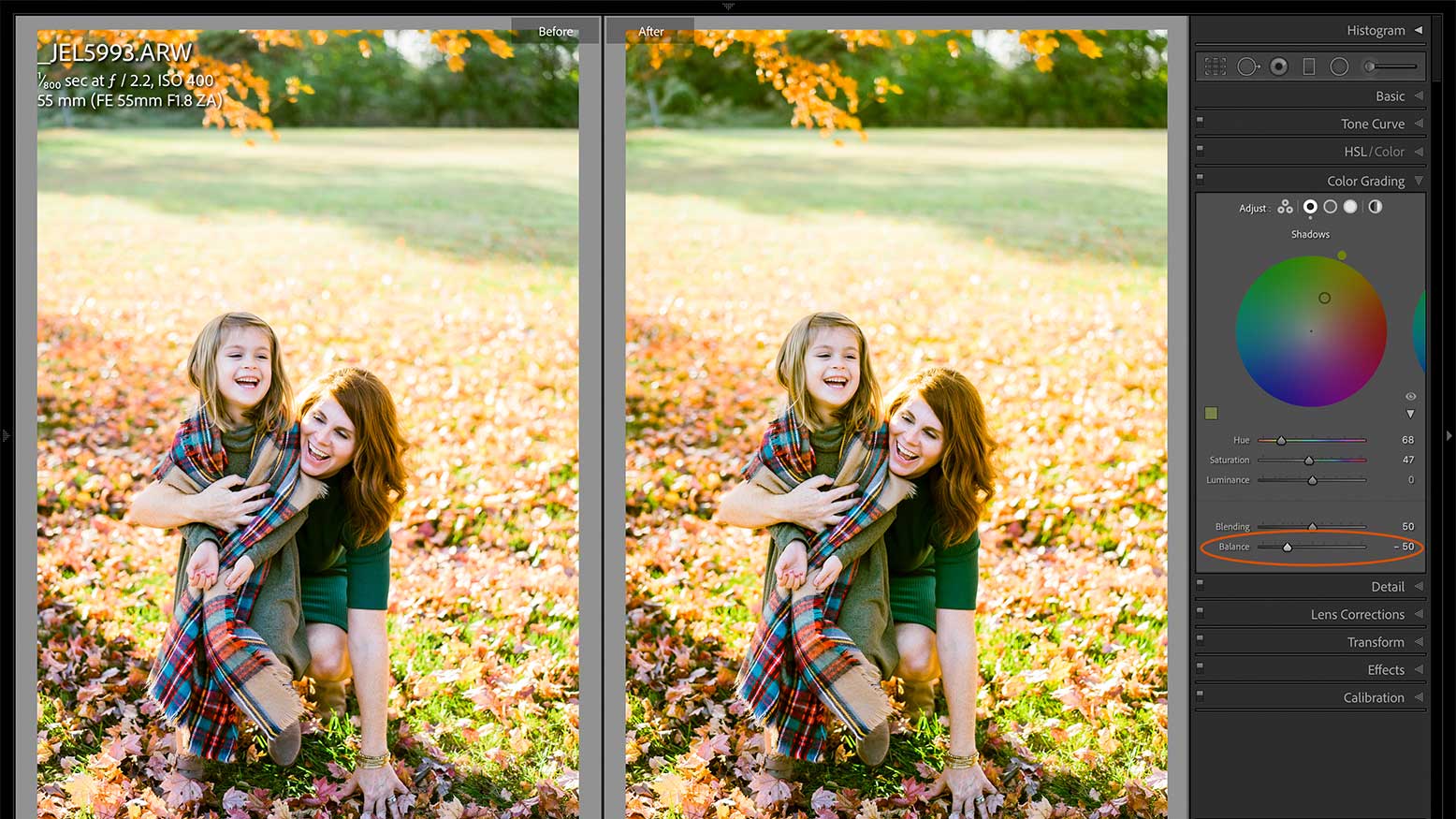
In the new Color Grading tool in the Develop module there are three color range wheels to adjust your image. I find this view to be a bit clunky and would rather adjust my image per range. Clicking on the second option in the Adjust section, we have the ability to adjust shadows separately from the other ranges. My standard go-to is adding blues to the shadows while adding yellow to the highlights to create a split tone effect. In this panel I can experiment and see in real time what the best results are. Then we can shift into the midtones and highlights and do the same thing.