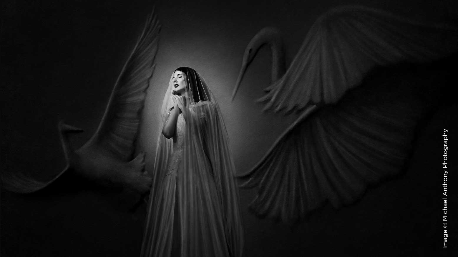
6 Editing Tips for Black & White Photography with Michael Anthony
Black & white photography can be beautiful. You can use black & white imagery to direct a viewer’s attention to the most important parts of an image. We often use black & white photography as a method for focusing on the emotion in an image. In fact, there are only two reasons that we will convert an image to black & white. Both have to do with eliminating distractions.
First, we will convert an image to black & white when the emotion in the photograph is conflicting with the color. You see, when the main “subject” of an image is the emotion, then a black & white conversion will often help to eliminate any distractions that can prevent a viewer from getting lost in the emotion.
The second time we will remove color from an image is when the color of the tones in the image conflict with each other. This most often happens when shooting in strong mixed lighting. We see this most when photographing the beginning of wedding receptions when there is still strong daylight coming through the windows, but you have overhead lights on above.
In this case you have two options: either use lighting to overpower one of the sources of light or convert to black & white. While the former is ideal, it’s not always practical, so in those cases a black & white conversion is necessary.
When you decide to convert to black & white, there are some steps you can take to make sure you get the best outcome. Converting to black & white should never be done simply by reducing the saturation of a photograph. Instead, there are some tools built into Adobe Lightroom that will help you get the perfect conversion every time.
Here are 6 editing tips for black & white photography.
1. Use the Adobe monochrome profile.
Adobe’s built-in monochrome profile allows you to do a simple black & white conversion while still maintaining the ability to adjust the luminance levels of each color channel. You can do this by either selecting the monochrome camera profile in Lightroom or by pressing the keyboard shortcut “V.”
Once you do this, you can scroll down to where the HSL tab normally is, and you will see luminance sliders for each of the colors that were originally in the photograph. Here you can do things like brighten up the orange channel, which will brighten up skin tones, and darken the blue channel, which will typically darken things like skies.
Doing it this way allows you to save more time dodging and burning by quickly making the adjustments you need.
You can also utilize the ability of Lightroom to create presets from often used settings. Many photographers that have used our Elevate Preset system have seen massive benefits to their ability to cut time off their editing.
When I was doing a Facebook Live a few weeks back to show how our presets worked, a member asked me, “What is the biggest benefit to using presets?”
My answer was twofold. By utilizing presets, you gain both time and efficiency, and both of those things will help to make you more money.
2. When converting in Lightroom, add toning using curves.
While true monochrome images are absent of all color, for stylistic edits we can add toning to our black & white images. I usually utilize cooler tones in my black & white photos, however, you can utilize slightly warmer tones as well. Just be incredibly careful not to overdo these effects because it can come off as cheesy very easily.Double-check that you applied any curves adjustments at all to have done this right.
When I first started in image competition, a term I heard a judge use to describe how post-production should go was “invisible editing.” In other words, you should never know that editing was done to a photo if it was done correctly.
3. Adjust your black & white points.
This tip is not exclusively for black & white edits, however, I do tend to be a lot more careful about my black & white points when editing an image in monochrome.
At the end of an edit I will typically adjust my black & white output to give an image a slight matte finish on both ends of the toning spectrum. This ensures that when I print this image I will have consistent tones on the paper.
You can do this in a number of ways, but I typically drag the left end of the tone curve slightly upward and drag the right end of the tone curve slightly downward. If you are utilizing Lightroom to do this, then you would want your output to be adjusted by only one or two points (between 1-5 for blacks, and 250-254 for whites).
Doing this will not affect the overall aesthetic of an image much, but it will add depth to the photo while removing all blotchiness from the actual print.
4. Add more contrast than usual.
With black & white images, you can add more contrast than you would in a similar color photo. The reason for this is because when you add contrast to a color photo, you are increasing saturation. However, because there are no colors in a black & white photo, you don’t have to worry about your color tones.
I tend to like my images to be a bit punchier, so by adding more contrast than I typically would, I usually have better results.
There is a way to do this correctly, and that is not to use the contrast slider. In fact, if you are looking for better black & white pictures, adjust your contrast by utilizing the black & white sliders or the tone curve in Lightroom. This will give you a much better overall outcome than by adjusting the contrast slider alone.
5. Make use of luminosity masking in Lightroom.
One of the best features in the newest version of Lightroom is the ability to utilize luminosity masking to do selective editing. This allows Lightroom to seek out areas of an image that are bright or dark depending on what you want, and it will allow you to mask those areas much easier with the brush tool.
To do this, grab your brush tool and paint over an area that you want to adjust. Then select the mask button and select luminosity mask. Grab the eyedropper and select an area that is close to the luminance levels that you are trying to target, and then adjust the sliders to dial it in perfectly. You can press “o” to use your mask overlay and see what you are doing.
6. Use points of contrast to draw your viewer to your subject.
The last tip I have for you is to emphasize contrast in areas where your subject is in the image. This works because our eyes are typically drawn to either interrupted lighting or color patterns, or the strongest points of contrast in an image. In last year’s Black & White Edition , I told you to look for dark or light backgrounds to photograph your subject on. This will create contrast with your subject’s face and potentially draw a viewer into it.
Remember, black & white photography should be used when the situation calls for it. If you are converting any portraits to black & white, then I highly recommend including a color version for your client as well to save you the trouble of having to create it when the client inevitably asks for it. That is one time-saving tip that I can promise you will use often.
For more information about this article, make sure to check out the accompanying video on Behind the Shutter’s YouTube channel.