7-Part Series to Step up Your Lightroom Game: Part 3 Cull & Sort Your Files with Dustin Lucas
After the shoot is done, after the files are stored and backed up, and the catalog and previews are rendered, it’s finally time to process all those files. Put your headphones on and get ready to cull. Lightroom has made life easier with its intuitive hotkeys, ease of cycling between images, and syncing adjustments. I have to be honest, though: No matter how fast you are at culling and editing in Lightroom, getting over 4,500 images down to 1,000 is rough. As you’ve seen in the seven-part series thus far, prepping your catalog is half the battle.
Over the next five articles, I will show you first how to cull and sort your images in the most efficient way. Then, you will learn to color correct, from the basics to the advanced stuff, leading you to a solid creative edit workflow with Photoshop. Once you dial in your editing, you’ll be ready to export and finalize your images. After exporting from Lightroom, you may want to take them into Photoshop, and I will show you how to keep things organized between the programs.
For today, let’s jump into Library and get familiar with this module.
Library Module
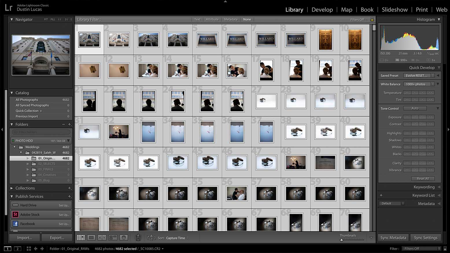
The Library Module can be accessed by striking the “G” key. I refer to it as the grid mode, because I usually have the images displayed this way. In this view mode, you have the ability to filter the previews by text, attributes and metadata. If these filters aren’t visible, strike the backslash key. These options become more useful for culling and editing your images once we get to that point. From the menu bar, choose View > View Options, or hit CMD + J to adjust the details for each preview cell. I prefer to see the file name, attributes and badges. To quickly toggle between grid views, strike the “J” key.
The more useful view mode for selection is loupe mode. These view options can be adjusted in the next tab within the View Options dialog box. I prefer to keep the camera info visible. For viewing individual images, I find that leaving the side panels and film strip visible is very distracting; plus, the image needs to be larger. To drop the side panels, hit the Tab key; to remove all three panels, hit Shift + Tab. You will notice when your cursor scrolls over these panels that they automatically appear. To keep this from happening, right-click next to the arrow and choose Manual. You have total control over the panels with the Shift and Tab keys.
Once in loupe mode, I use the arrow pad to cycle through images quickly. The images load quickly because the 1:1 previews have already been rendered. Now, I prefer working in Lights Out mode. To do this, you can strike the L key twice to darken your screen. This allows us to focus on the best-of-the-best shots. Along with this tip, I recommend using the Auto Advance option—just press Caps Lock to initiate it. What this does is, when you apply an attribute like a flag, a star rating, a color label, etc., it advances to the next image automatically. This is a massive time saver when you have to go through over 4,500 images, because very second counts. Let’s review how to apply attributes when selecting images.
Apply the Right Attributes
Using attributes is essential when selecting images. These attributes include flags, color labels and star ratings. Hotkeys bring a new level of efficiency for going through thousands of images. Add a flag to an image by selecting the “P” key. Reject images by selecting the “X” key. To unflag an image, strike the “U” key to reset it. You can also toggle between flag and unflag by striking the “~” key. Even easier: To apply a flag, strike Command + Up Arrow; to remove it, hit Command + Down Arrow. To reject it as an unusable image, strike Command + Down Arrow again. I recommend using the least complicated method, so you can reduce time spent thinking about how to select and just hit the correct key. Flags are very simple, but so is hitting the “6” key to add or remove the red label.
If you are using the auto-advance feature, I highly recommend only adding the pick flag. The reason why is that you can refine your images once you are down to apply rejected photos immediately to all unflagged images and unflag the picked one. This can be done by holding Option, Command + “R” key. This immediately sets all unflagged images as rejected and all flagged images as unflagged. This is a perfect option for choosing useable images and quickly rejecting bad shots.
Color labels are simple to add—just use number keys 6 through 9. The color tags ascend by striking 6 for red, 7 for yellow, 8 for green and 9 for blue. Hitting these same keys again removes the attribute. Lightroom even allows you to customize this feature: From the menu bar, select Metadata > Color Label Set > Edit. You can rename what keyword the color labels are referred to as. For example, I changed the green label to Samples, yellow to Revised, green to Deluxe edit, blue to Premium edit and purple to Signature edit. Then, click in the presets drop-down menu to save the current settings as a new preset. In order to see these keywords, make sure labels are a column for metadata filters.
Star ratings are a great tool for adding levels of importance when selecting. Number keys 1 through 5 add stars, and 0 removes ratings. You can also use the “[” key to increase and ”]” key to decrease ratings. My normal process is to set images worth delivering to the client at 3 stars, then select impact images to edit with 5 stars. This averages a total delivery of 1,600 digital negatives, with 800 of those as color-corrected proofs.
Tips for Culling
When it comes to culling out images, I first remove shots with soft focus, and subjects with eyes closed and unflattering expressions. From there, I work to reduce duplicate moments to refine my final selection. As stated with the rating review process, if it’s a deliverable duplicate, I’ll 3-star it, and I’ll 5-star the best image form the sequence. I find that when shooting through the moment, you may find three or four great shots of the same moment, keep in the mind when selecting for the IPS preview you want impact met with getting through the moments.
Selecting should be simple, right? Choose the images you would show your clients and dump the rest. This should be the quickest way to remove the just-plain-bad shots. Either apply a pick flag, star or color label, and most importantly, turn on Caps Lock.
Before you get started, it really helps to cull with your RAWs attached and 1:1 previews built, as I mentioned in the previous article. Build these at import and go get some coffee. Trust me, it’s worth not waiting two seconds for each image to load.
Wrap-Up
I do not have a simple formula to help you cut down your final selection and cull in 30 minutes. Instead, follow the objective way to keep an image, by asking yourself these questions: 1) Is this image sharp? 2) Are the eyes closed unintentionally? 3) Is their expression flattering? 4) Do you have three or more of this same shot/moment? 5) Would you want to sit through a slideshow of getting ready for 10 minutes? Keep it simple and cull out the non-essential shots from the preview. Deliver those duplicates later.
Now that we’ve prepped and culled this wedding, the fun stuff begins: color correction. Tweaking each image to perfection is not what I am talking about when it comes to color correction, either. More to follow on that in Part 4 of this series. Getting back to culling, this step can be the most defeating part of getting started if it takes you days to complete. Whether you are getting hung up on the time it takes or just choosing shots to keep, you have to plan and prep files. Above all, take the time to import—build 1:1 previews at import and wait a day!