
// Online Photography Training

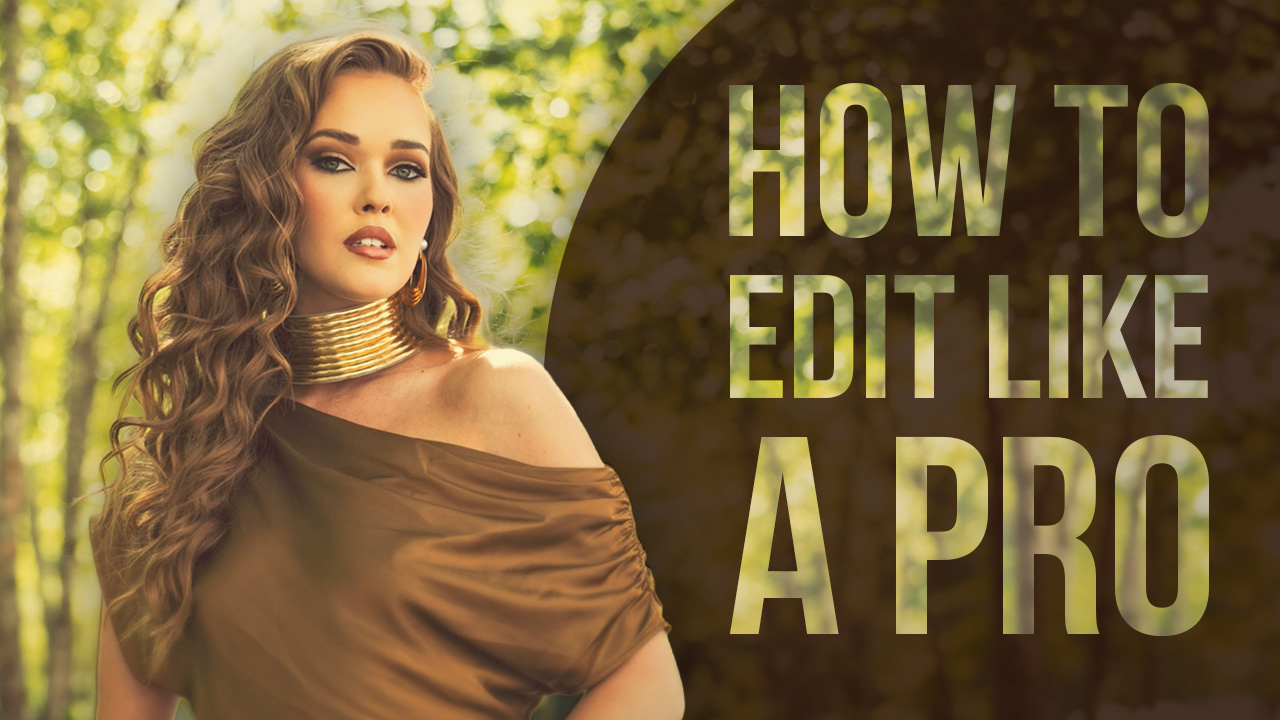
Its official! We have a new logo for the Allure by Salvatore line of photography. As many of you know and weighed in on, we are starting a new glamor line inspired by the movement Sue Bryce has created. Our clients are excited about it, our staff is excited about it, and we believe this is the perfect time to launch a new business line.
The decision on the final logo and subsequent tweaks was based on our overall branding and where we want to go with the company. Of course, we want to ensure the branding blends into the overall Salvatore Cincotta family of companies, but still exudes that sexy, feminine, strong, message. Well, I think we nailed it, I hope you do too. The final logo has been tweaked a little – we moved by salvatore over the right, created a solo A, and adjusted the slant of the font to make the A look stronger and less fantasy. All the things you would never think about when you create a logo and just use standard fonts. It helps to have a creative designer that knows how to tweak fonts to allow your logo and brand to be unique. The last thing I would want is for someone to just copy my font and create confusion for my brand.
Also, coloring. Very important from a branding perspective. We wanted something creative and less corporate. We went with a brown earthy tone. Initial feedback has been very positive.
Next steps? Well, if you are a fan on facebook, you have seen the casting call we launched to all our properties. So, photographers and clients alike all responded. And boy, did they respond. Over 200 emails with people interested in 24hrs. We filled 15 slots in about 20 min. People are flying in from Portland and Las Vegas to shoot for this. An incredible response. We are shooting past and present clients along with some photographers who want to model for this. Next week, the shoots begin and we will leak some pictures to the blog of course. 🙂
Love or hate the new logo?


This Post Has 11 Comments
LOVE it !!! Can’t wait to follow along the growth of this side of your success ! Sue’s work has inspired me as well to start shooting glamour photography. I LOVE how I’ve been able to transform and literally see the rise in my models self esteem just from the shoot alone !
L.O.V.E.
Hi Sal,
You have made your selection – but since you asked, I don’t love it.
The rhyme feels dated and I don’t get the essence that you seem to of “sexy, feminine, strong”
This feels to me like a Macy’s brand logo (which may be what you were going for) not an upscale boutique brand.
I am sure you and Taylor will make a success of the brand, but I predict a new logo to be unveiled in less than 3 years.
Happy Thanksgiving.
Good point Sal. And I suppose Allure by Sal is too ‘blue collar’, it is richer with Salvatore. While I understand ‘wordy’, I think maybe using your full name would have been too ‘syllablely’. Great feedback tho Sal, thanks for being so engaged with your fan base. Happy Thanksgiving to you and Taylor.
I had tried to leave a comment on your previous post with the different logos you were considering but my internet wasn’t working. this was by far my favorite of the options. This appeals to me as woman…makes me feel like you will be able to actually make me appear glamorous, beautiful and feminine (something that I know many women don’t believe can really be achieved). Beautiful! Makes me wish I could be one of those women involved in the initial sessions! Thanks for being such an amazing source of inspiration and information for young photographers…you are making a difference all the way over in Kenya!
I think you went overboard with the lines on the A and E. I also think you should use Sal Cincotta and not Salvatore. Love the font and the name. E-
I like it with just the one name. I think that it’s all personal preference and doesn’t really matter if you go by one name or two. My thought, and what I try to do with my road to my own branding is simplicity. The average person will remember something simple in a name or anything else before they will remember something lengthy. Just my thoughts.
Love the logo. Looks classy, clean and appealing. Great job.
I really like it, but….. I think it is a mistake not to include your last name. It’d be different if you were ‘Cher’ or ‘Bono’, but even Ansel Adams and Annie Leibovitz needed to use their last name, regardless of the notoriety. As always and regardless, I’m a huge fan.
David – great feedback for sure. And something we struggled with internally. We went back and forth on this multiple times. Here is how we came to the final decision, 1) we didnt like the way it sounded… 🙂 too wordy. and 2) we are hoping that since we are very established in our local market we will be the bono so to speak. This is not a national brand we are launching… so not sure if we made the right decision, but this was our thought process. i love the discussion! sal
Love it! Love the glyph on the A and E. It certainly looks like your branding, but with an elegant touch.