
Black & White Maternity with Donatella Nicolini
Nothing speaks to me like black & white portraits. Black & white creates a timeless, impactful and elegant look that I can never find in colored pictures.
To me, black & white allows one to get rid of distractions and really focus on lines, shapes, composition, light, contrast, and connection with the subject. It’s like pushing away the noise and having a clear look at what’s really important. It allows you to have your eyes and ears wide open and let the image speak to you, loud and clear. I also feel like I can see light better when shooting black & white, and that allows me to control it more effectively.
This is all amplified when we’re dealing with nudes, and in my case specifically, maternity nudes. Maternity photography is all about curves and shapes and the importance of how they change through this very special stage of a woman’s life. I like to play with those beautiful shapes, showing their true strength and beauty.
If I had to describe what I’d love my work to be, it’d be timeless, sophisticated, and bold—graphic at times, but still elegant and impactful. Black & white is the only way I can think of to express all this, and that is why it is my favorite choice.
So, what makes a great black & white photograph? I’m going to share with you five tips that will help you through the process of creating gorgeous black & white portraits.
#1: THINKING IN BLACK & WHITE
As I create images in my head before actually shooting, I find myself thinking in black & white; I believe this thinking process is very helpful and important in the creation of an image.
When creating a monochromatic portrait, I keep in consideration many specific elements such as composition, styling, editing, and lighting. Everything needs to be considered in such a way that it will work out in black & white.
I wanted to create depth and three-dimensionality, introducing shadows and going from dark to light using three different backdrops.
Now, the backdrops are of colors that make absolutely no sense with each other, nor do the flowers in front of the model. If this image were published in color, it would not be eye-pleasing. One backdrop is green, another is light blue, and the flowers are pink and white.
I knew I wanted this portrait to be black & white from the beginning, so I didn’t waste time finding the exact right shade of flowers or buying new backdrops to make all the colors match nicely. What’s important here is how dark or light these elements are and how they interact in terms of contrast when placed next to each other.
I lit this by balancing a strobe with the ambient light. I used the natural light coming from the windows in my studio as a fill light to make sure all the backdrops and flowers were lit and the shadows filled nicely. Then, I added a directional light (a strobe diffused with a big octa) just for the model, so that I could get a nice shadow on the backdrop, while lighting her face and body with a good contrast between light and shadow.
To use natural light as fill light, I kept the power of the strobe low, and I raised my ISO up to 250. The shutter speed was 1/125, which is the sync speed for the camera I used (Fujifilm GFX50S), and the aperture was f 5.6.
When choosing props and elements that will be present in the scene, don’t waste time finding the right color—focus on how light or dark the object is. You will be surprised to see how much money and time you can save by not having to buy new things specifically for their color.
As I knew I wanted this image to be in black & white, I didn’t worry about the fact that I didn’t have a top that matched the tossed fabric. So I used a brown top (it’s actually a stretchy newborn wrap) and a blue chiffon for the fabric toss, which functioned as a skirt.
In color, it wouldn’t be pretty at all to see brown and blue together like this. In black-and-white, it works out perfectly.
If I’d wanted to shoot this in color, I would’ve had to buy two pieces that would match, either both blue or both black.
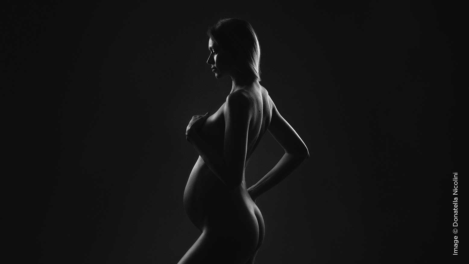
#2: SHAPES AND CONTRAST
This is the time to play with curves, shapes, and lines.
The amazing contrast between white and black allows you to create bold and graphic silhouettes that focus all the attention on the gorgeous pregnancy curves and shapes. I like to create different kinds of contrast and silhouettes. In this specific case, since I wanted to use this gorgeous pose but at the same time didn’t want to show the breast, I chose to go heavy on contrast, positioning the model far away from the lit, white backdrop and enhancing the contrast a bit in Photoshop as well.
I wanted to achieve a graphic look, almost two-dimensional. To make it even more striking, I placed the model on a plexiglass board, so I could capture a nice and real reflection straight in the camera.
#3: CREATE AN ILLUSION
I spent years of my life going to plays, and one thing I learned from theater is that with a black environment and a single light, you can create beautiful illusions that will wow an audience.
In this portrait, I covered the model with black velvet, following her body lines to create a gorgeous and impactful image.
The illusion of her emerging from the dark is what adds interest to the image and makes people stop scrolling through their feed when they see it.
This was created using one light only, a classic butterfly lighting setup.
I wanted high contrast, a strong look on the model, and beautiful, defined curves and shapes, which I created with the black velvet.
To add even more contrast and three-dimensionality, I positioned two black V-Flats, one on each side of the model.
#4: STYLING
When choosing clothes and accessories for your model, remember to think in black & white! Make your life easier by choosing something that will pop against the model’s skin.
In this portrait, the white turban and the white shirt play an important role in the success of the final outcome.
The dark skin of the model is so gorgeous and pops even more against the white fabric.
I recommend shooting in black & white directly in camera, so you can see how all the elements interact with each other and if the contrast between them is effective and strong enough.
As I said earlier, you decide where the attention goes. Styling can help you with that too. For example, here, I wanted the attention to go to the baby first, so I chose a black dress for the mother, which almost fades into the backdrop. This drives all the initial visual attention toward the baby. The second thing you see is the mom’s face (and her gorgeous hair!).
#5: EDITING FOR BLACK & WHITE
Editing also plays a key part in the creation of a black & white image.
It’s not enough to just desaturate the raw file; you need to guide the viewer’s eye where you want it to go, directing their attention precisely how you desire.
Playing with curves and masks is fundamental. Keeping in mind that the eyes go to the brightest parts of the image first, you can highlight what you want to be the focus of the attention.
Basically, you have the power to decide the order in which people will look at the different elements present in the image.
I personally love high contrast, and I like the blacks to be very dark, but there are images where a soft matte look lends a poetic touch. In the end, it’s up to you and what you want to communicate with your image.
There is software that does a pretty good job at black & white conversion, such as Alien Skin and Infinite Black & White. Both these programs give you many options to choose from, and they can be an incredible starting point or just a tool to add that finishing touch. I like to personalize my black & white photographs manually. I might start with one of these pieces of software to create a nice black & white conversion that is close to the final effect I want to achieve, and then I’ll work manually on curves, contrast, and exposure to perfect it.
At the end of my editing for black & white images, I love to add some grain. Grain is amazing—it gives the image a sense of materiality, and it can help you fix different issues such as banding or even lack of skin texture or sharp focus in some cases.
You can add grain directly in Camera Raw—look for “granulosity” and adjust it to your liking, or if you have Infinite Black & White, you can easily just press the button “grain,” which will do it automatically for you.
After some time spent thinking in black & white, the method will become second nature to you, and you’ll be able to enjoy the whole process, having fun and creating amazing portraits to cherish forever.


