Editing Gelled Glamour Photos with David Byrd
WHAT SOFTWARE DO YOU USE?
This article will cover my retouching process exclusively for Adobe Photoshop CC. You can utilize Lightroom or other popular programs like Capture One for some of the retouching, but the major steps will require the use of Photoshop. The current Adobe plan for photographers includes access to Adobe Bridge, Lightroom and Photoshop with constant updates to the programs.
THE BEGINNING: ADOBE CAMERA RAW
To begin the journey of turning this image into a piece of artwork, we’ll start by opening the image directly into Adobe Camera Raw (ACR). The first and most important step to take is to set your workflow preference to 16-bit mode. The program will default all RAW image formats to 8-bit mode, and our amazing cameras capture so much more color than 8-bit can offer. What’s the difference between the two? Imagine a box of 6 crayons, red through purple. That’s 8-bit mode. Now imagine the cool kid in class who had that massive box of 64 crayons (man, I hated that kid). That’s 16-bit mode.
Working with images in 16-bit mode allows for more color to be processed. It does increase the overall file size of your documents, but that’s manageable in most cases. Unfortunately, some of the filters in Photoshop will only work in 8-bit mode, but those extra crayons make it well worth the sacrifice.
To change your preference to 16-bit mode, click the white bar at the bottom of the ACR window and change the Depth dialogue from 8 to 16. Then, click OK to accept the change. That is the last time you will have to do this step, unless you install a new version of Photoshop.
Now, let’s start playing with all of those crayons and see what art we can create.
MY FOUNDATION FOR PHOTOSHOP
My goal when I process an image in Adobe Camera Raw (ACR) is to prepare a foundation that I can build upon in Photoshop. Unlike in Lightroom or Capture One, I do not want to do a lot of artistic work to the image in ACR. I simply want to give the image a subtle boost, adjust some of the challenges from the lighting pattern, and get it ready to work with in Photoshop.
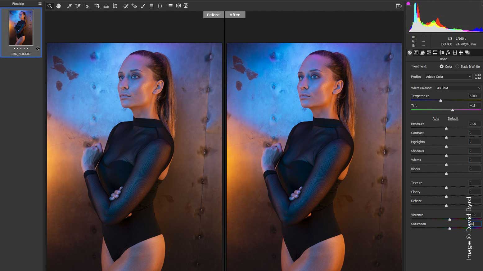
When I open any image into Adobe Camera Raw, I look for three foundational elements to begin processing that image: color, luminosity and detail. Gelled lighting sculpts the subject in every way with light and color—that’s its draw and power. Since I know there is an abundance of color to play with, I can immediately decide that the Vibrance and Saturation sliders could use a push to the right (the positive), thus increasing their power. These two controls can give you a lot really fast, so subtlety is key. Start at a small increment of +10, and see how it resonates with you. To give you a side-by-side comparison of the original image with no adjustments, hit the letter Q to give you a before-and-after view.
Next, let’s look at luminosity and see how we can help boost the image into Photoshop. When I set up the lighting for this image, I wanted to create a lot of shadows and also keep the highlights controlled. We can address these factors by looking at the sliders for Highlights, Shadows, Whites, and Blacks. All of these elements need a boost to the positive—the highlights will increase, the white point of the image will be reevaluated to make it “brighter,” and more details will become visible by decreasing the shadows and reevaluating the black point of the image. I’m going to adjust each slider by +30 and scale it back slightly if necessary. Judging by the side-by-side comparison, I think we have a great foundation going. Now, we just need to look at the details of our image and give them a little boost as well.
The Texture, Clarity and Dehaze sliders will all give a boost to the image in various ways. I’m going to take each slider up to +15 and zoom into the subject’s face and review. We have greatly increased detail in the image now that can be further augmented with sharpness or other techniques later in the retouching process if desired. The highlights have popped, the shadows are showing more detail, and the overall color has been boosted significantly.
There are other tabs in ACR that we could visit that would certainly add to this foundation, but our goal was to look at the image and ask ourselves, “How can I address the color, luminosity and details of this image to create a foundation and take it into Photoshop?” The Basic tab of ACR has accomplished this, and we are now ready to open the image.
LET THE RETOUCHING COMMENCE
Again, let’s return to the three foundational elements of color, luminosity and detail and begin our retouching journey from there. I believe that the two most powerful techniques in the overall retouching process are frequency separation and dodging and burning. Frequency separation allows you to not only adjust the skin texture and remove distractions, but also to paint your subject to blend the colors together and create a visual harmony between them. With dodging and burning, you can use light to give the image three-dimensionality that will bring it to life.
My preference is to always begin with frequency separation and finish the retouching process with dodging and burning. Other retouching steps—like enhancing eyes, whitening teeth, and so forth—I usually save for the end of the process.
WHAT IS FREQUENCY SEPARATION?
It’s dark magic that will get like 1,000 points for Slytherin—seriously. No, I’m just kidding, they don’t have Photoshop at Hogwarts.
Frequency separation simply allows you to separate the details of an image from the color and place them onto two separate layers. Why is that important? Because most tools in Photoshop utilize color and detail simultaneously to produce a desired result, and that result can be hit-or-miss. When you use the healing brush to remove a blemish, Photoshop attempts to use both color and detail to create new skin that wasn’t really there. This sometimes works flawlessly, but far too often errors (called artifacts) will emerge that cause a pattern that resembles a blemish on its own. The bags under a person’s eyes are really just a darker color than the surrounding areas; the details of the skin are usually fine. If you were to paint a color over the bags, it would immediately cover up the details of the skin. If the details are on their own layer, you can paint a new color over the bags of the eyes and preserve the original details.
The use of frequency separation goes beyond just the needs of retouching a human. Wrinkles in clothing, the surrounding walls of your subject, even the landscape itself can all be fine-tuned and adjusted by addressing either the detail or color, separately.
To create the layers that make up the process of frequency separation, we’ll have to go through a few steps. First, we’ll need to duplicate our background layer two times and change the name of the top layer to Details and the middle layer to Color. Your layer stack should now be (from the top): Details, Color, and Background. Next, we’ll need to select the Details layer and make it not visible, by clicking the little eye icon to the left of the layer.
Now we need to apply a Gaussian Blur to the color layer, so we only have color to deal with. Go to Filter in your top menu, then select Blur, and finally Gaussian Blur. We want to set an amount of blur that will remove the details overall, but not turn the colors into a large, blurry hot mess. For this image I chose a blur level of 7, as it gave the image a smooth transition between all of the colors and all of the finer details had been removed.
Now click the Detail layer and reveal it (click the eye to turn it back on), and while this layer is selected, go to Image in your top menu and then click Apply Image. In the new window that pops up, you’ll need to make a few changes. Under the field of Layer, change that to be the Color layer. Next, check the box next to the word Invert. Now, move to the Blending dialogue and change that to Add. Finally, make sure Opacity is set to 100%, Scale is set to 2, and Offset is set to 0. The only thing that should be different on your screen is the top field, Source—this should be the file name of your image and not mine. Please note that this process and the corresponding numbers for Apply Image are for 16-bit images only—there is another set of numbers for 8-bit images, but you’ll have to consult my friend Google to find those out.
You should immediately notice that the image on your screen has become quite bizarre. That’s okay—these are the details of your image on their own layer. We just need to have them interact with the color layer to start looking like a normal picture again. To do that, we’ll need to change the blending mode of the Detail layer to Linear Light.
Congratulations—you are now playing with all the crayons and ready to create!
I usually begin the retouching process by looking at the Detail layer and using the Clone Stamp tool to move texture from a nearby area to the target area that I want to change. As always, it’s best to stay in the same region of the area you are retouching when you’re looking for a source to clone from. This means that if there is a blemish on the forehead of your subject, use texture from the forehead, near to the blemish, as your clone source. That texture has the same depth, lighting, focus, etc. and will blend well. Make sure your Clone Brush is set to a hardness of 0 and that the Opacity and Flow of the brush is set to 100%, so you are cloning a pure form of the source to the target region. This process is not unlike using the Healing Brush or Spot Healing Brush on just a normal, combined layer. However, because you are using Frequency Separation and moving only detail and texture around, you are less likely to get color contamination or artifacts in your retouching work.
The most enjoyable part of Frequency Separation, to me, is working on the color layer and blending the transitions of highlight and shadow within those colors. To accomplish this, I use the Mixer Brush tool, which is located under your main Brush palette window.
Once the brush is activated, we need to set up two very important aspects of it to create the effect we are looking for. First, the icon of a brush with a slash through it needs to be checked. This tells the brush to clean itself after each stroke, so you aren’t building up color as you paint. The Mixer Brush is designed to be like a traditional brush for a painter. The bristles of the brush will either mix the existing paint on the canvas together, or you can load the brush with a new color and mix it into the others on the canvas. In Photoshop, if we tell the brush to clean itself after each stroke, then it’s using the available colors of the image, each time you touch the canvas, to mix with the surrounding colors. This is key to blending the transitions of color across the subject of our image. The other controls of the brush—Wet, Load and Mix—can be left at 100% (the Flow should be changed to 5%, and very rarely will it ever need to be taken any higher than that).
A perfect place to demonstrate this brush and its use is on our model’s right leg. If you look at the reference image below, you’ll see that we have three distinct regions of color, and highlight and shadow that mark the transitions between them. These areas also have minor shifts in color due to the three-dimensional nature of the model’s skin and body. We can use the Mixer Brush with steady, even strokes to blend those transitions together. This will create a smooth flow that follows the leading lines of her leg and creates a pleasing visual aesthetic for the image.
To put the finishing touches on this image and this wonderful color pattern of lighting and glamour, we can turn to Dodging and Burning to bring it all together. I prefer to use the Curves Adjustment Layer method for Dodging and Burning, as I like the control you have over the shifts in luminosity that the curve provides. The before-and-after example below shows how a soft expansion of the highlights and shadows not only helps to sculpt and define the model’s leg, but also makes the colors pop and come alive.
FROM CRAYONS TO ART
Utilizing these two main retouching techniques, I have gone through the entire image looking for textures to clone and transitions in color to blend with the mixer brush, infusing dimension and life into the image, making it a piece of art. And for me, it truly is artwork. Because I am taking control of the canvas and the colors and details that it holds and painting them, I am shaping them into a final vision that began with my camera, my lights, and my imagination to see it through to the end.
Let’s get all Oprah for a moment here: You can become more than just a photographer; you can become an artist. Your vision behind the camera is only the beginning. Photoshop allows you to truly bring your imagery to life and provide not only a piece of art that can bring profit to your business, but a sense of joy to your soul as a creative, artist, and photographer. I know it takes time to learn these steps in Photoshop and even more time to master them, but that is the journey that we must go on; our imagination deserves no less.