How To Build Another World Using Photoshop with David Byrd
Creating a beautiful piece of composite artwork can seem like a monumental task to achieve. All those Photoshop steps and techniques, all the secrets that you don’t know, and the famous phrase, “Oh, I will never be as good as so-and-so.”
Well, today is your lucky day, because I’m going to give you the biggest secret of them all. The most important thing you need to know in order to make a great piece of composite art is one tiny, simple thing that anyone can do. And that little element is:
THE STORY
I’m from the Midwest and have spent most of my adult life in that region of the United States. I am used to the “typical” seasonal change and the temperatures and elements that come with it. Now of course, being in the Midwest means that you can experience snow in the middle of April or barbecue in a 60-degree rain shower on December 24 (that was the year Santa got a freshly grilled steak—and he left me a note with compliments to the chef).
I now live in the Southwest. There is a seasonal change here in Phoenix: It goes from Broil to Convection Bake, and then, for a short time, it resembles the stereotypical autumn of the Midwest. People actually put fake snowflake decals on their windows to celebrate the holiday season, and I laugh as I stroll down the street in a pair of shorts and sandals.
What does this have to do with composite art? Everything.
I miss the snow. I miss the cold. My sense of the transition of time has been altered, because I haven’t had the air attack my face during a single-digit degree day. I haven’t felt that oppressive cold close in on a dark, snowy night. Most importantly, I haven’t listened to the silence—the unique silence that only comes from a world covered in snow and ice.
What are the concepts there that can help us generate feelings for a story? Cold. Oppressive. Dark. Night. Silence.
That was the driving force of emotion within me as an artist, the one that motivated me to begin bringing folks together for this concept.
BRINGING THE CONCEPT TOGETHER
Veronika is a professional model in Phoenix and was just recently a part of the Phoenix Fashion Week, where she prestigiously placed in the top six of the show. While a part of that event, she wore the designs of Christine Adar, a brilliant fashion designer based in Chicago, Illinois. I told Veronika my feelings for the concept of the shoot, and she identified with it, and we began to collaborate. We went through some of Christine’s designs and settled on the dress you’ll see in the forthcoming images. I wanted elegance, beauty, and elements of warmth and gold, but points on the dress in some shape or form that gave me an overt feeling of icicles.
We then moved on to bring a hair-and-makeup stylist into the fold. Victoria has a vast amount of experience working on film and other projects, so I knew we would be in great hands. I sent her a series of spec images that communicated elements of colors, hair designs and textures, and then passed along the feelings I wanted to see in the work. Working with another professional artist like Victoria opens the creative door for continued collaboration. She took inspiration from the spec images (never replicating them directly) and brought elements together to make a unique design for this concept.
Now all we had to do was photograph.
WEAVING IN THE STORY
I had to put the Reality Reimagined spin on the whole thing. It wasn’t enough to just lament the absence of snow, cold, and grilled foods in bizarre weather patterns—we needed a character and a story.
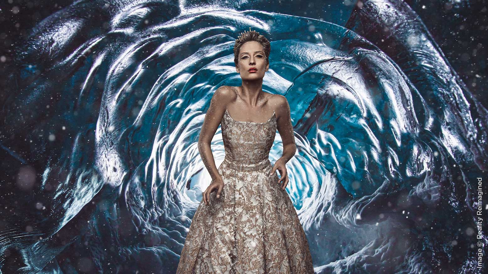
So, as we began photographing, I started playing music, which is a key element of my method for creation. I was playing a piece called “Metamorphosis 1” by Phillip Glass. As those haunting, dark tones of music began to weave, I created a story and character for Veronika to play. She was the last princess of a powerful empire, a proud and honorable kingdom. However, their reign was ending, and her fate was to become the queen to a monarch who was of the darkest lineage and was a cruel master of the people. Her heart didn’t belong to this usurper of her happiness—it belonged to another soul, one who was kind and courageous, and inspired the people. The king sent one of his dark magicians to slay this young prince and force the love of the princess. She defied the will of the king, and as punishment, he cursed her body to never succumb to the powers of the elements. The ice and cold would sustain her and cause her to live forever. The only companions she had left in that cold, oppressive, dark-as-night ice cavern were silence and time.
No joke—that was the story I told her. Why? Because I was listening to music that was sad, dark, and haunting. I missed the snow and cold, but I knew that I would never truly be a part of it again because of my new home state. In a way I, like the princess, was banished from what I yearned for.
We worked through a series of poses that conveyed a range of emotions, from the deepest sadness to the darkest malice for being trapped in the ice for all eternity. The expressions of sadness were the most haunting, and that was how I settled on the image that we will now walk through in Photoshop.
ADOBE CAMERA RAW
Opening the image into ACR, the key elements I wanted to focus on were giving a push to the luminosity and the color saturation of the entire image. Since the dress was predominately white and gold, I wanted it to be the strongest source of juxtaposed color to the inevitable background that would become her prison. As you can see in the side-by-side comparison, I’ve increased elements of light, detail and color, to the point that she looks like the princess of the Oompa Loompas. That’s okay, because I want to reduce the overall saturation of orange and yellow in her skin, to match the feeling of the loneliness of the cold.
To achieve that, I went to the Hue, Saturation and Luminance tab in ACR and reduced the saturation of orange and yellow, while also increasing their luminosity values slightly. This step has been completed on a duplicate of the original layer (the one with the Oompa Loompa skin), so that I can use a layer mask to introduce the reduced orange color to just the skin and not the dress itself.
RETOUCHING WITH FREQUENCY SEPARATION
Once the skin color has been reduced, the image is now ready to be processed through the technique of Frequency Separation. During this phase, I will look for distractions in the skin and use the Clone Stamp tool to remove them. From there, my goal is to blend the transitions of colors throughout the image, so they take on an elegant flow from highlight to shadow. This is accomplished by using the Mixer Brush tool. For a further in-depth guide on this step in Frequency Separation, you can visit my article in the November 2019 issue of Shutter Magazine, which covers retouching of a gelled glamour image. The principals are the same, regardless of the genre of photography.
This process of blending colors and blending highlights with shadows gives a gentle flow to the skin, and it truly is not a difficult step to master, with just a bit of practice.
The last step in the process of retouching is to use the technique of dodging and burning to augment the highlights and shadows in the image and give our princess a sense of three-dimensionality and shape. I follow the light and shadow and enhance each element, paying close attention to the actual flow of the lines of her dress, on her face, and so forth.
WORLDBUILDING
This is the most exciting part of creating a composite and also the most daunting step. Truly, if any element requires practice and “secrets,” it’s this step. However, the acumen you need to master this is not based in Photoshop per se, but a sense of design and understanding flow of light and color. I’ve chosen two pieces of stock that I have purchased from Adobe Stock for this piece of art. The first wonderfully depicts the fabled Cavern of Ice that our princess has been banished to. Paying attention to the design, we can see that the light is flowing in from the center point, which creates a recognizable pattern that dictates the angle of light. However, there isn’t a good piece of ice to place her on at the bottom center, so she will stand bullseye in the middle of the piece. This is where the second piece of stock comes into the art. This stock has the same light pattern, coming from the same source as the first piece of stock. It also has a clear ledge that would make sense for her to be standing on.
BANISHING THE PRINCESS TO OUR NEW WORLD OF STOCK
To bring these two elements of stock together and introduce our subject into this newly created world, we’ll have to go through some challenging steps in Photoshop. But I’ve got your back, and a companion video covering these steps will be available through Behind the Shutter. We’ll be covering the use of the Quick Selection process to extract the princess, how to clean up the mask associated with the extraction, and finally how to ground her in the new environment by creating realistic shadows.
Touching back on the aspects of design, once the subject has been placed into the image, she needs to be unified with it to make it believable. This is where artistic enhancement comes into play. The first method to unify is to introduce a color into the entire scene, one that affects both the subject and the background equally. I’ve chosen a Solid Color Adjustment layer of blue and changed the blending mode of this layer to Soft Light. This introduces a specific shade of blue to everything and begins to unify the elements. I’ve utilized the layer mask on the Solid Color Adjustment layer to take the blue slightly off of our princess’ face.
Next, I’ve introduced a texture of cracked ice, by placing it above all of the layers and changing the blending mode to Soft Light as well. This blends the layer in with those beneath and allows elements to come through. However, I again have utilized a layer mask to remove some of the texture from her face, so we can see that wonderful expression of loneliness. The final step of unifying the piece is to use a vignette to push the audience’s focus toward our subject. To do this, I’ve created another Solid Color Adjustment layer, this time pure black, and have changed the blending mode once again to Soft Light. I have also masked it out on the center of the image. This makes the outer perimeter darker and thus gently pushes our focus toward the lost soul trapped in this prison of ice.
GO AWAY NOW AND COME BACK ANOTHER DAY
Once I get to this point in the work, I generally save a version of it and then put it away for a stretch of time. This allows me to be objective when I return to it and look for successes or challenges to accept. Upon further review, I decided to ditch the ice texture and instead use an overlay of snow. I also did some work to reduce the blue colors on the princess, so we could have a color harmony between the cold blue of the ice and the slight warmth of orange we still see in her skin tones.
FINAL THOUGHTS
I know the steps above can seem daunting, but in all of my education travels, I have heard a version of “How did you come up with the idea?” more than I’ve heard “How did you do that in Photoshop?” It’s the story that gives your imagination the building blocks to bring together a model, a designer, a makeup artist and more. Together, you seal a princess to her eternal fate.