How to Get Consistent Color Between Cameras in Lightroom Classic with Dustin Lucas
When it comes to using multiple camera models and manufacturers, images photographed in the same place and time look different. As photographers, we focus on controlling this variance of brightness and color of light in a multitude of ways. Whether that’s using Auto, Priority Modes, or Manual settings in-camera, we constantly worry how this will look on the computer screen as well as images side by side. Regarding exposure specifically, we have standardized ways to keep this in check in-camera using blown highlight preview mode or showing the histogram on the display screen while shooting. Color consistency between multiple cameras is a whole other monster.
Now, if you have already created a custom profile with a Macbeth chart or the X-Rite Color Checker software, this article would not benefit you, although there are some useful tips to share along the way. While this is the proper method used by professionals, it is difficult to control color to this extreme during a wedding. For the majority of photographers shooting in a multitude of light sources that don’t have time for an assistant to hold a chart in front of your client per lighting change, let’s explore how to get clicked in with color in Lightroom Classic. We can start by choosing the right Camera Profile for accurate colors. Then we can dive into the Camera Calibration panel per camera to adjust RGB Primaries. After each camera is dialed in, we can create Presets and set Lightroom Preferences so these are applied as default settings per camera model.
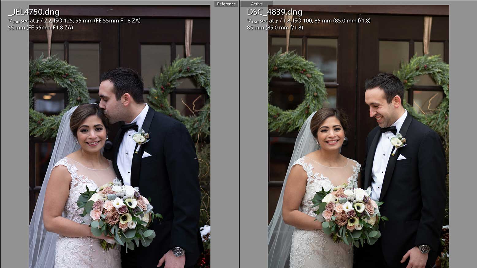
Let’s take a look at the RAW vs. Adobe DNG color rendering.
RAW vs. Adobe DNG & Camera Profiles
Contrary to popular belief, converting RAW files to Adobe DNGs are a thing of the past. Those who are still doing this refuse to upgrade their Lightroom version while buying new cameras that are no longer supported. Adobe recommended this a while back to offer universal profiles between camera models and manufacturers to offer a level of calibrating them faster. You will notice the Adobe Raw profiles listed in the Profile Browser. These are available to use without having to convert to a DNG. Moving on from this dinosaur-old conversation we can move into Profiles to get the camera closer in color and tone.
The first thing I like to do is sync the White Balance between both shots in the same lighting taken within a few seconds of each other. Doing this will provide a standard base for each camera so we can start to select profiles per RAW file to more closely match the true color. Oddly enough the Nikon looks warmer and more red than the Sony after Temp is set to 5500 and Tint to 0. Both RAW files are set to Adode Color, which is the default profile for Lightroom Classic. Moving into the Profile Browser, I would start with the Sony file to apply different options to add some warmth to the skin. Comparing the profiles Adobe Portrait and Camera Portrait, there are huge changes in the skin tones. Adobe’s profiles tend to be quite cool and almost desaturated whereas the Sony Camera profiles are heavy on contrast, warmth, and redness.
I think the one most closely matched for the Sony is the Light profile under Camera Matching and for the Nikon it’s the Camera Portrait. Keep in mind that if you’re having massive discrepancies with Adobe Color or Standard as well as the camera matching profiles, you can go to a third-party profile company to apply a more stylized look. Many photographers prefer these since every camera model has a specific profile made and accommodated for. Here are a few options available to use and you can see they provide relatively matched results. Let’s move onto the Calibration panel in Lightroom to adjust RBG Primaries.
Camera Calibration
The Calibration section was the hub for adjusting camera color and how these were represented in Lightroom. Originally this is where camera profiles were buried until Lightroom Classic began utilizing these further. Now they are the first thing you adjust because they are in plain sight at the top of the Basic panel. This section is still widely used to shift how you see color represented through the Reds, Greens and Blues as well as the tint of your shadows. Adjusting shadows is much more straightforward for shifting the tint more green or magenta. I typically leave this at 0. Adjusting the RGB Primary is a bit more extensive.
This is different than adjusting color in Tone Curve or HSL panel. This is specific to how each color is mixed in the pixels. So, if you are adjusting the blue primary hue you will see the skin tones shift contrary to adjusting the blue hue in HSL. This becomes helpful to reduce the green effect a Nikon camera has or the cast of blue in the suit in the Sony. Hue is a bit more complex than saturation, in that it shifts the color mix from magenta to green. I typically look for warm green tones in the skin and will drop the red primary hue to remove. This works better than desaturating the red primary because I don’t want skin to look dull or grey in any way.
Looking at the Sony camera and seeing blue cast in the suit is a tricky change as well. I can lower blue saturation in HSL or in Calibration. Lowering this in Calibration adjusts more than just the blues and will affect the entire image. It’s important to adjust this as part of a global change. You can target specific colors later in HSL. Now we are ready to build a preset and setup preferences.
Build a Preset & Custom Preferences
Once you dial in the cameras you will want to build a preset for each of them. This is so you can quickly recall these settings in the future and not have to spend the time remembering each one or building a matched style for every job. Of course, you would want to do this per camera model to ensure you are dialed in. Creating a preset is simple: you can hold shift and command while striking the “n” key. I recommend setting up a new group so you can quickly recall this preset from a short list rather than User Presets. Also, you will want to exclude white balance, exposure, graduated filters, radial filters, lens correction (since we used custom vignettes), and transform.
Once the preset is created, we need to go into Lightroom Preferences to setup camera defaults. Once Preferences is open, go to the Presets tab which is new to Lightroom Classic v9 specifically. In this tab you can choose a specific camera model and the preset you wish to apply at default. Once you find the right preset, you have to Create Default. Keep in mind this sets the preset as the default settings so when you import files this will not be applied. Only when you reset an image will it revert back to these settings. If you want to apply the preset at import you can as well. This helps to see the before preview in Develop applied with the preset.
The Results
That’s it. You are ready to fine-tune your images now that the color is clicked in between cameras. The formula is pretty simple: apply a Profile, adjust the Calibration sliders, apply HSL for local color, save a preset, and set camera defaults. Many of us want consistent color between multiple cameras no matter the brand or model. Take the time to get clicked in with color and the results will be proof. Of course, if you want to use a Macbeth chart or X-Rite Color Checker systems you can. On a wedding day, it’s not ideal as you will have to create 15-20 profiles and remember to hold the chart in front of the bride all day.