
// Photography Training

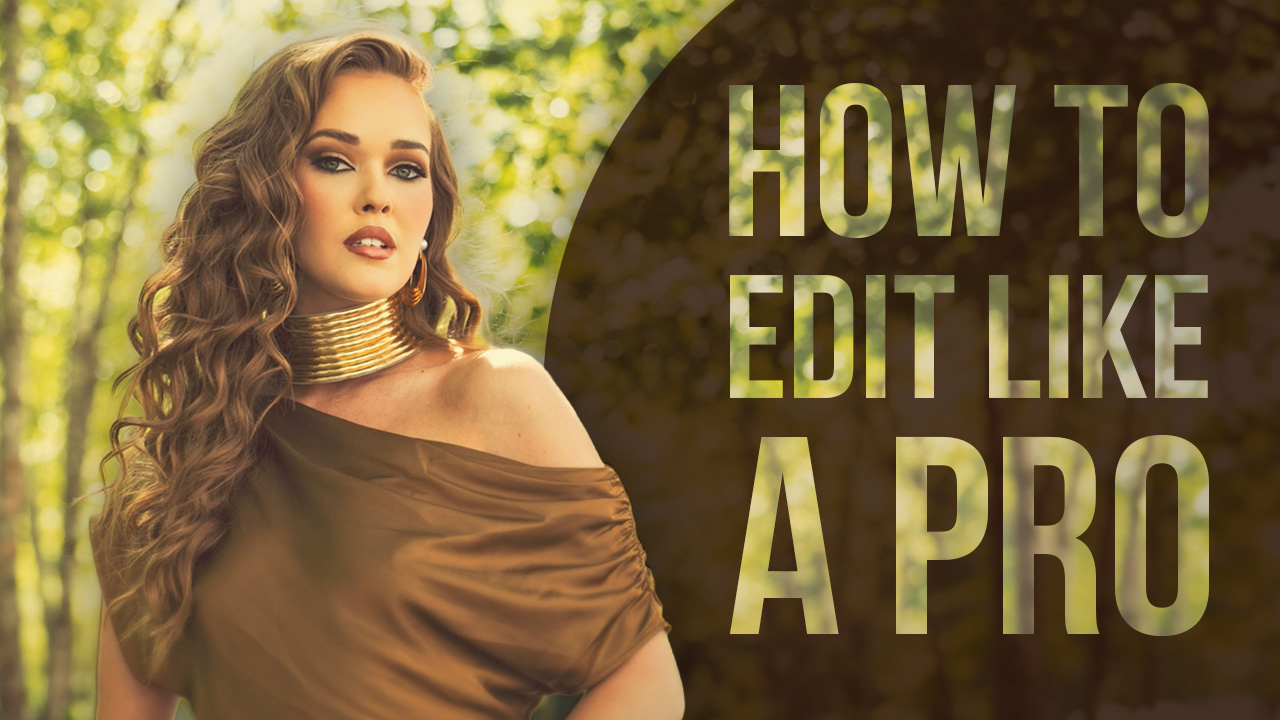
Welcome to my new column! Once a month seems like such a long time to wait for information. I mean, we dont just work on our business once a month. Our businesses are living things that need to be nurtured with information. Nothing beats real-time information for your business. So, with that in mind, we have launched The Grind. Now, it should be no secret to everyone that we have been very inspired by Sue Bryce and her passion for glamor photography. We are looking forward to putting our own spin on this amazing niche. Its hot! And it something so different for us it has Taylor and myself creatively firing on all cylinders.
What I would like to do is take you on a journey with us as we start up our own glamor line from the ground up. Just last week, we had our first planning meeting. What did we want the brand to be called? Would it be part of the main brand or would we launch something completely different. What would the shoots look like? I mean after all, we are known for outdoor photography in the elements. Sure, we know how to use studio lighting, but is that something we want to do here? What kind of props/furniture would we use, etc. See, when you are starting a new business, all these things matter. We are thinking about everything down to the color of the logo and boxes that prints will be delivered in.
Here is where we are today. We have scoured the internet, craigslist, ebay, and local thrift shops for vintage lingerie, old ornate couches, and other props that will lend themself to the brand. Today, the girls rented a truck to go on a scavenger hunt picking up all the new things we have for the studio. They came back with a ton of goodies that I can not wait to photograph. In addition, we have put out a casting call to all our old clients looking for 6-8 women looking to participate. We will give everyone a free 11×16 for participating and in return we can use their before and after images for promotional purposes. Next week, we have 8 shoots scheduled with women aged 25 to 55. We are working concepts and creative ideas with the clients and things are really starting to come together.
How about a name? Well, we wanted to build on the main brand and we came up with Allure by Salvatore. Colors and logo are still pending, we havent quite nailed it yet, but we are heading in the right direction.
How about the logo? I am sharing with you, my community, a mock up of several designs put together by our designer. I am curious what you think, so please weigh in. I know where we are leaning, but curious to hear from you. Sound off and let me know which one you like – there is a number next to each option.
Thank you for sharing this new venture with us. My goal is to teach everyone by sharing our plan and results as we grow and develop our new business. ~Sal


This Post Has 67 Comments
number 3.
If #1 is that whole first row (the “A” and the name) then that is my favorite. It’s simple and clean.
….I like #2 best.
I like 3 best. 4 is definitely too flowery – just can’t see it working for your brand.
Hi Sal & Taylor,
Love the idea. I’m working on something similar for my Seniors for 2013. I would go with 2 or 3. The other are a bit generic and really don’t scream the Sal Cincotta brand. Good Luck with the new venture. If you both are ever in miami again please look me up. I’d be happy to shoot with you both. xo
#2 by far. I also like number one
I like the first one best. I don’t care for the brush stroke to go over the R though. Maybe just the right side of the E and not on the left.
#4
I vote number ONE! It is modern, chic and classy.
#3 – All the way!
I like no. 4. No. 2 would have been my first pick except that I don’t like the way the double L’s look together.
I vote # 2. Also check out this font. I love this font! https://www.behance.net/gallery/Paris-Pro-New-Typeface-for-Fashion-by-Moshik-Nadav/5905467
Love #2! It has the sex appeal and illusion of the name Allure itself. Love y’all and best wishes on this new adventure!
Definitely #2. It’s the only one that’s delicate and pretty and grabs my attention. #4 is very right now. That trend’s already over.
Number 2 definitely has my vote!
# 3 is my first choice. I like the Script “A” as a stand-alone element that can be used on product packaging to compliment the logo.
rb
Wow! They’re all nice, but I like the simplicity of #1 best.
#3
#1 fits best!
Number one really stands out to me! Beautiful and alluring!! 😉
Love the A logo in #3 — it’s got that POW! factor that would immediately associate with Salvatore Cincatta, but I don’t like the …ALLURE… lettering. It doesn’t go with that awesome logo. And OMG definitely not #4 — way too fru-fru. So I go with #1.
I love the 2nd one – it feels sexy
#2 – it’s got a nice feminine, elegant look to it. Good luck with this new venture! And thank you for bringing us along 🙂
#3 das beste, kurz, einpraegend, vielfach verwendbar, elegante Schrift
I like #1 only because it looks like you and your branding. I like the rest if you were starting a new business and that was your only logo, but when I see number 1, I think Salvatore Cincotta already.
#2 is just way too frilly for your brand. JMO though.
#3
After just creating a new logo myself, I am going to go with #3. The design around the Initial “A” and you name does not draw all the attention away from who/what this is about. The a in the circle is what caught my attention.
Thanks to both you and Taylor for sharing so much of yourselves and your business tips on CreativeLIve. I’ve watched every broadcast since CreativeLive aired. I would have to say that the one I think .. Catches My Eye .. at first glance would be No. 1. Simple reason, it’s bold enough to read clearly if I were going down the road, along with your name that is positioned underneath it. It’s clean, sharp, and elegant enough where I would check it out being a woman. No. 1 is the way to go!!
Hey Sal & Taylor! So bummed that I missed you on creativeLive, but still implementing all of the great info you shared during the Detroit seminar. Caught this on FB as I was heading to bed, and I love #2 & #3! They are both classy and feminine, which highlights the two key factors about you (your brand) and what you’re going to be offering with this line to your clients. Super excited for you guys and cannot wait to see how you guys rock this out, as always! My best to you both! 🙂
~Meika
Sal I love #3 for a few reasons, the cohesive relationship that ties your brands together is brought in the type here. The other reason why I like it is because one can associate right away with your Studio branding because while Allure is a type that is strong and streamline you stil have the combination of feminine and masculine in the type. Love it!
#2 for me because of it’s classic simplicity. Good luck guys
I’d go for number one or two.
All great designs but I like #2 and #4 best. I associate #4 more with Boudoir and Glamour and I like the elegance of #2. Can’t wait to see how this new business evolves but no doubt that it will be a huge success. Sal I love the passion you have for teaching and sharing. You Taylor and Sue are my all time favorite instructors on cL. I have learned so much from you guys. Thanks for bringing us along on your journey.
If I had to pick one it would be #1. But I would rather you just use your name off of your Brand now “Salvatore Cincotta” nothing else. Allure sounds like a perfume. Just my opinion.
Number 3 looks the best to me, that was the first one to pop out at me..
My vote is 1 or 4. That is what I like. I am still getting to know your style.
I like #1 the best. I think it fits with the sleek streamlined look of your other logos.
#2 it is simple and elegant.
My vote is on #1. ‘A’ could stand on its own as wax stamp would on a sealed letter. I could totally see a red/burgundy wax seal matching the red lips of a classy B&W glamour shot – using the wax seal as a signature stamp. ‘Allure’ itself is very classy and totally appropriate. It translates from French as ‘manner in which ones carries themselves’. It can convey ‘grace’ and it implies some sort of motion. In this case, the signature ‘still-motion’ of Sue’s ‘glam-the-dress’ shots. the kind of ‘still-motion’ that your brain can’t quiet comprehend because it can’t decide whether the subject is still or actually moving… so you have to stop, stare and you get drawn into the image.
I can’t wait t see what you guys come up with!!!
1 or 4 to me seems to fit your brand already.
I like #3, but minus the three dots on each side of the word “ALLURE,” it’s a bit too much.
#3 stands out
I like #2 though I agree with David that the ribbon could be a little shorter.
2&3 for sure! I really love the emblem for 3. I can already see it on your boxes like your black label.
I think 3 is great. Its simple just like the Salvatore Cincotta brand is but it’s very feminine and whimsical.
love the second one as i feel it would stand the test of time! 🙂 good luck and i am so excited to follow you on your journey!
#3 is my favorite with #1 as a runner up
Thanks for sharing
#2 or #3. Love them both and I think they both encompass your brand very well. Excited for you!!
Number 1 or 2. Leaning a little towards 2 more.
#2 is elegant and the space give a nice relaxed breathing space. The last one is very ornate and vintage . The A in the circle is very much like your black label logo, so a feel of consistency in your sub branding is maintained. Awesome job by your logo designer 😀
One is nice and simple, probably fits well onto images, but 3 and 4 look more ‘glamour’-ous IMHO
Number 2 with shorter ribbon would have the most class.
2 or 3… those stand out to me but are simple
#2. But #1 if the letters did not include a space between them. I would be interested in the financials of this startup. Investment to startup, break even point and timeline to turn a profit. Thanks, Sal, for sharing!
#3 – the single A is great for stickers or quick watermark.
the whole word with dots feels vintage but still clean/crisp
Number 1, after watching you and Taylor everyday last week on creativeLive it is definitely number 1. It is Bold yet Classy & Sophisticated just like the two of you. I love the single letter A and believe that it will eventually become your signature logo for this line. I am however not liking the way the R & E are connected with the same swoop that the single A has on it. I think if you could rework that part of it you would truly have your new logo for this line. Can’t wait to see how this evolves.
I like 2, it’s feminine which is the audience you are trying to attract….
Definitely 3! It really stands out and looks elegant.
My fav is #3, I also like #1. Thanks for sharing this journey with us.
Thank you for sharing with us. All of them are beautiful but I like the best #3.
#3 or #4 are my faves
Hi Salvatore, when you do your test shoots next week, ask your clients “what do you think of when you think of glamour?” I just asked myself that same question and the answer was “curvy, flowing, soft, sensual” So my choice from the logos above would be #2 for that reason, although to me it’s still a bit too sharp (the top of the A, the L’s) and wispy. However, great start! All the best of luck with your new venture. Truly enjoyed your program on CreativeLIVE last week. Gathered lots of genius ideas. Thanks for all you do!
Hi Sal,
My favs are 2 and 4.
Can’ wait to see where this goes for you.
Melody
Many people have been inspired by Sue, including myself. These are wonderful ideas for a logo. I do believe my favorite is number 4
1 for sure. It’s your style.
2. Love both 1 and 2, but my gut says 2 even though there is no small graphic for the tedious things you always need an emblem graphic for. 2. Feels more you.
#3 . Most definitely not 2 or 4