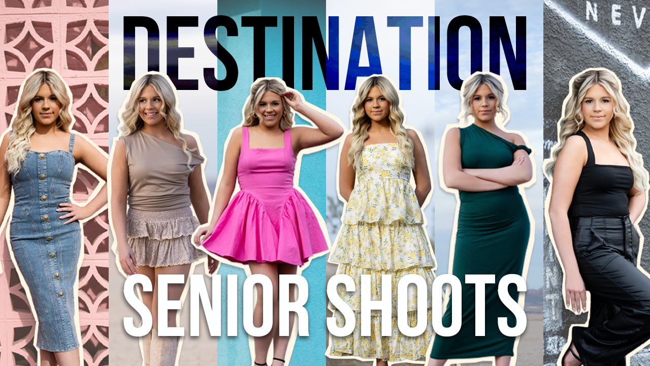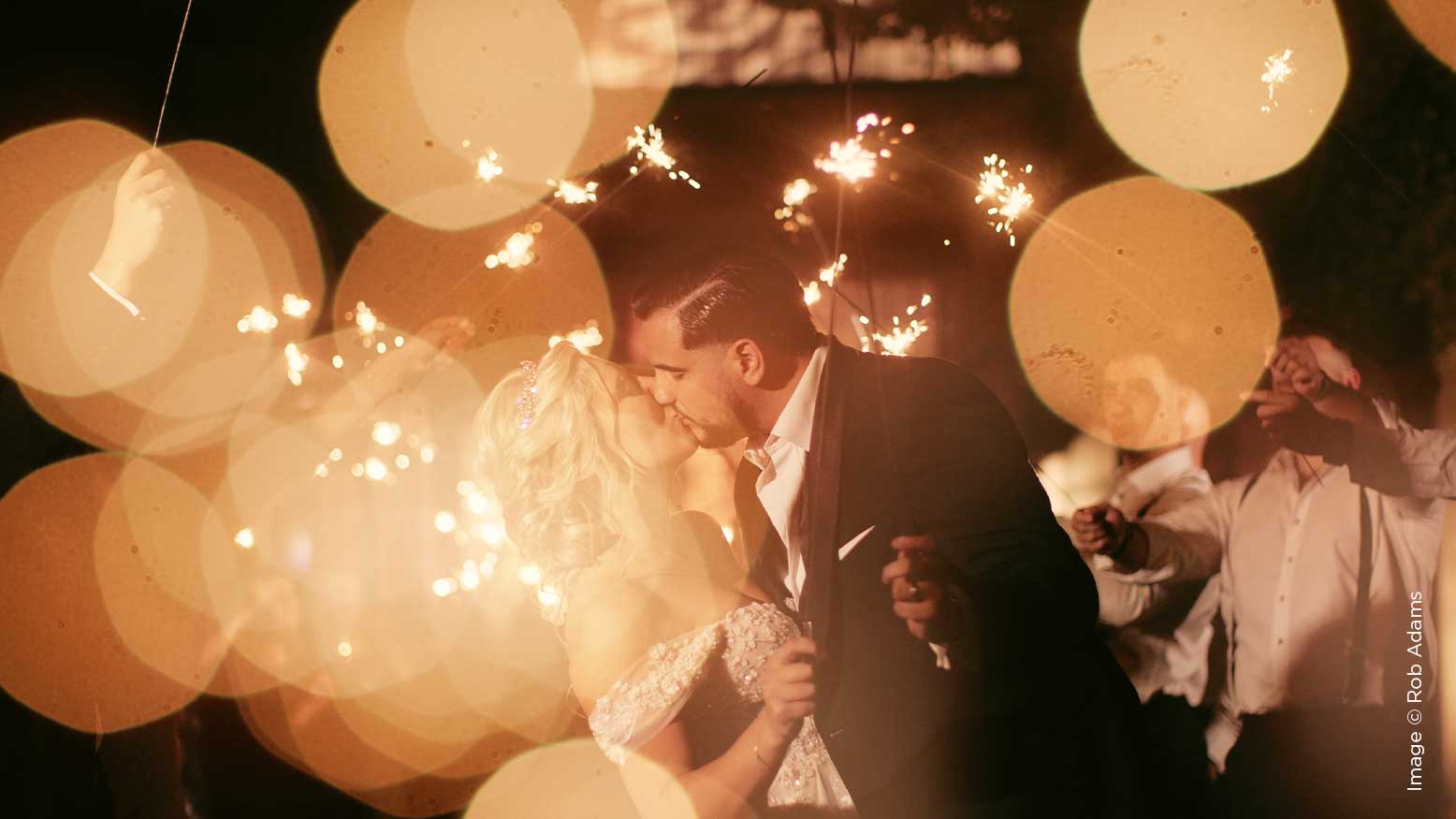
Color Grading for Videographers with Rob Adams
Video production is a complicated world. Even if you’ve been involved in the world of video for many years as I have, the speedy technological advancements on the production side and the changing conditions on the business side create a state of constant required learning. If you’re not abreast of these changing dynamics and techniques you’re likely going to be losing money. One aspect of video that probably changes faster than the advancements in technology is the expedient furtherance of visual styles. This is either the bane or passion of any video maker (depending on who you talk to) trying to create a profitable formula with their video work, whether it be weddings, commercial, feature-filmmaking or music videos. In order to be expedient with delivery and creating or emulating a visual style while avoiding spending too much time on the process, any video post-production artist must be proficient in color grading. On the contrary, a video producer must have the resources and funds to hire a professional colorist. In the case that they do not, the producer/editor themselves must exhibit a basic comprehension of coloring in order to meet a client’s expectations. In more simple terms: you must know how to color grade efficiently and effectively if you cannot hire a dedicated colorist.
Color grading video footage is an art. I recognize that there are dozens if not hundreds of LUT (look up table) packs for sale and plugins that promise “easy” color grading to “any footage” but these solutions more often than not end up acting as the “get-rich-quick” band aid to a more complicated process. In this article, I will attempt to explain the difference between manual color grading and just applying a LUT to your footage. And if you don’t know what a LUT is, pay careful attention. It’s a car salesman’s term that can be very misleading, albeit attractive.
Color grading is one of those types of skills that has many different levels of execution. That means you can either create a minimal grade to sweeten your footage and make it look polished for mood, feeling, or to exhibit time of day. Or you can take it to an extreme where every little detail of the motion image is manipulated, from grading the background to adding supplemental light, to skin retouching and changing the texture of fabrics, hair, or environment to where it almost borders on computer-generated imagery. Advanced color grading is very similar to photo re-touching or compositing in many ways and is commonly used in commercial broadcast production and motion-picture finishing. We aren’t going that deep in this article. I just want to introduce you to the 3 main modules of color grading:
- Exposure Correction and Enhancement
- Secondary Grading for Mood and Style
- Basic Re-Touching of Key Elements
Steps 2 and 3 are fluid and almost interchangeable in that they, in certain cases, either stand alone in the presented order or they can be swapped or merged into one step. This will be become clearer as we move along here.
Let’s start with the tools used in color grading. Nearly every desktop video editing application on the market has some sort of color manipulation tools included but they are not created equal by any means. They are, however, divisively split in how they are viewed by the user market. Final Cut Pro X has a nicely equipped suit of proprietary color tools built in, which some find adequate but others find lacking in how they manipulate the footage based on its algorithm and use of the color-space. Adobe Premiere uses third-party-created Lumetri plugins that are included with the application. Some love it and some hate it. Both contain what are considered to be pro-level color grading capabilities, but the reigning king application in the world of color grading is a program from Blackmagic Design called DaVinci Resolve. Resolve in recent years has also become a powerful editing platform in its own right, making it a direct competitor with FCPX and Adobe Premiere in that space, too.
Resolve boasts color grading “node-based” tools that are more indicative of what major motion-picture production companies and special effects design artists and colorists use, so depending upon what level you work and are comfortable with, you can choose the tool that is right for you. The irony here is that despite its quite sizable time-draining learning curve, DaVinci Resolve is a FREE program whereas the color grading capabilities built in to FCPX and Premiere come along with the respective price tags of those programs.
All of these programs have video scopes which will guide you with a graphical representation of your visual image. The waveform monitor scope gives you a vertical representation of luminance levels (and some color saturation) as opposed to the horizontal wave-based readout of a histogram, while the vector scope gives you a graphic basis for referencing accurate color and saturation, both of which you likely won’t be able to do “by eye” on an uncalibrated video reference monitor. A histogram and various other forms of waveform monitors are included with all of these applications and are measurement tools. Learning to read and use these scopes is paramount to being a successful and accurate colorist. Honestly however, most of today’s video editors who need to color grade their own footage “eyeball it” and use the scopes for basic reference to avoid clipping the highlights or crushing the shadows and making sure skin tones are properly exposed for most playback sources.
We’re talking about very basic color grading so I’ll be demonstrating using FCPX to illustrate the main techniques.
If you’re filming your video with a DSLR or mirrorless camera using a baked-in picture profile containing some level of contrast and saturation, and if you are taking care to watch your white-balance while filming, you may not need to do a heavy grading process in order to get your footage to its desired result. But since color grading is a highly subjective process, it’s entirely up to you how far you want to go. If you’re filming with a LOG (logarithmic) picture profile, you will no doubt have to do some moderate to heavy grading to get the footage looking sexy and appealing.
LOG mode filming is a baseline standard designed to make use of your camera’s maximum potential dynamic range capture, creating images that have a very wide falloff between light and shadow, thereby allowing far more of the image to retain details despite a wide disparity between the lights and darks in the image. It was originally used in the processing of film negatives to digitally recreate the most “flat” image possible that would retain the most detail. But before we start making our footage look artistic, we must first correct any exposure levels and get the luminance curve set.
In this example I’m using footage shot in V-LOG on my Panasonic S1 and filming in 4K at 150mbps 10-bit so I have lots of latitude in my raw footage to push it hard without having artifacts or noise introduced once we start adding contrast and lifting the overall exposure. It’s not quite as good as using a RAW format, but the processing of RAW video is a more complicated process that requires heavy processing power.
Step 1
Raise the overall exposure to get the mid-range of image above under-exposed and to get skin tones around the 70%-75% IRE mark on the waveform monitor (scope). This is similar to “pivoting” the overall levels higher or lower to adjust the global exposure. Next we use our individual color curves or wheels to adjust the highlights, mid-tones, and shadows to create a nice S-curve on the footage. This is a very similar process to photo editing if that’s the world you originate in. We need to be very careful not to push the high-key highs and deep black lows too far to avoid clipping and crushing. We’re likely not dealing with video shot in the equivalent of a RAW format so you will be limited by the compression codec used upon recording the video. Once you have the image looking how you want it in the highs and lows, we can move on to adjusting skin tones. We now apply a second color curve and use the eyedropper to select the luminance point or range of the subject’s skin to individually adjust the exposure levels of this range of pixels. We can apply blur or softening here to smooth out skin texture or simply brighten or darken (mute) selected areas for a smoother, more vibrant and even appearance. You can also make minor adjustments to the color in these areas to ensure the look is close to what you expect overall. Don’t overdo this part though. The color and mood of the image comes in the next step.
Step 2
Start applying a mood-style to the image by adjusting the warmness/coolness and hue of the overall image to create a global environmental look. This is the part that most LUTs handle, although most LUTs may be too powerful on exposure correction to use at this point. I’ll illustrate how LUTs are used at the end of this article. By adjusting the color temperature and hue of the image and the color parameters in each of the color wheels you can dial in the mood of your creative look. Darker, more monochromatic tones tend to denote dusk, dawn, cold or twilight/night settings while warm, bright, and saturated color tones exhibit the feel of sun, daytime, morning or heat. It’s purely subjective but the goal is realism that works in the context of your story. If the grade stands out as too harsh, it’s likely going to be noticed by the viewer and take them out of the moment. The rule of color grading is if it goes unnoticed to the untrained eye, you’ve done your job well.
Step 3
Step 3 comes after you’ve got the image looking close to the final image you had in mind. The final corrections or enhancements come in the form of tweaking certain areas of the image to attract attention to or detract attention from a specific subject or area. This can be done using masks or vignettes to blur out the peripheral and draw a viewer’s focus to something. Be careful not to overdo this step. It’s easy to do and very noticeable if applied with a heavy touch. Masking can also be used to change the color of a specific item in a scene that may be overpowering the image and drawing too much attention away from the main action. To judge this you have to be aware of where the eye gets drawn when the image first appears on the screen.
Finally, let’s talk about LUTs for a moment. LUT stands for Look-Up-Table. It’s a mathematical formula that is used to distinguish two images from one another. The idea is to re-map certain colors of the original image to different colors in the a new image. 3D LUTs are the most commonly used type of LUT in color grading and contain data for changing the color of one image to a set of colors or a color chart in the new enhanced image. Essentially they are filters, like any photo filter. When used properly you may get a desired look but final tweaks more than likely will be necessary to get all of your footage to match, especially if the footage you filmed was shot in differing light scenarios, or with different cameras using different color-science and picture profiles. Most LUTs are designed to be used on footage filmed in LOG. LUTs are sometime created and based on color charts to give a scene a consistent look based on a series of colors to create a mood. Before committing to a LUT or pack of LUTs, experiment with some free LUTs found online to determine if your shooting style and camera settings work well with a blanket approach to color grading or to determine whether LUTs give you a good starting point with which to tweak and mold a specific look that works for you.
I will leave you with this. Shooting and editing/grading footage shot in Log format is a very advanced workflow. If you’re new to color grading, it may be best to work with a baked-in color profile like neutral first and play around with color grading to get a sense of how it manipulates the image. If you intend to grade your footage, you should also be shooting with the highest bit-rate possible. 8-bit video files won’t hold up under grading as well as footage shot in 10-bit or 4:2:2 color space.