How to Build Your Photography Website With WordPress in 2020: Part 2 with Alicia Simpson
Last month, I covered the very beginning stages of creating a WordPress site choosing your host and theme, and setting it up. Now it’s time to take that foundation and start building our pages.
But first, install some plugins
If you’re following along, you’ll need to install a few new plugins at this point. The first ones are for our page builder: Elementor (free) & Elementor Pro. ($49/year for one site, and totally worth it. Just trust me on this.) Elementor can be installed from the Plugins > Add New screen. If you buy Elementor Pro, you’ll need to upload the zip file by going to Plugins > Add New > Upload Plugin.
If you are not planning on embedding a contact form from a CRM like 17hats, another plugin you will need is a form plugin. In this article, I’ll be using a plugin called Formidable Forms which has a free version and paid version. However, some other good options are WPForms or Gravity Forms.
Elementor Setup
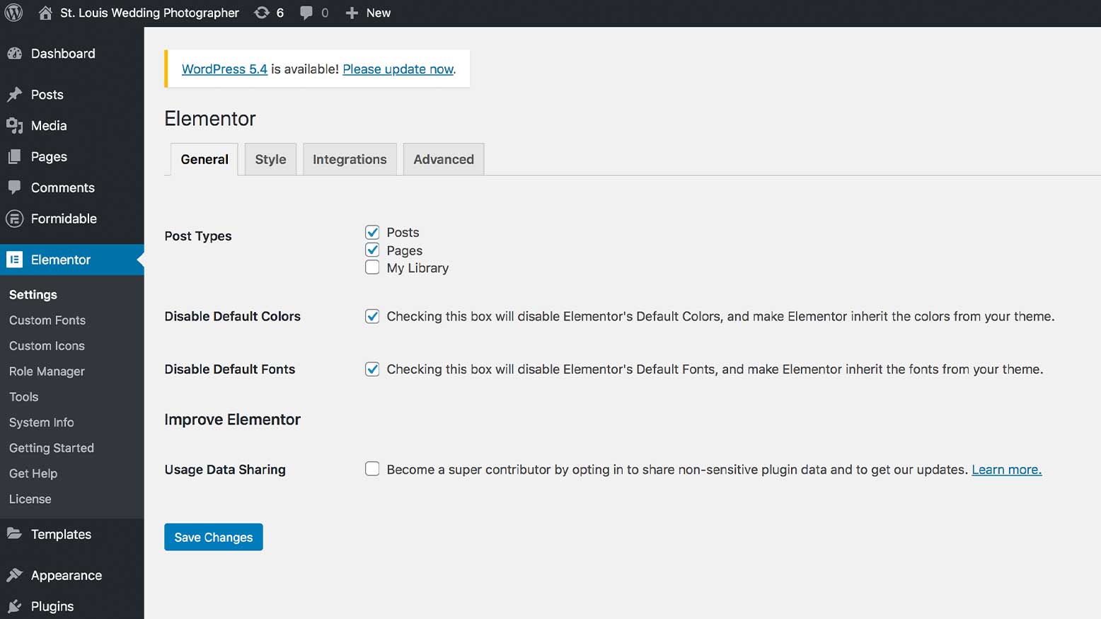
First things first, go to Elementor > Settings. Check the boxes to disable default fonts and default colors. This will allow the site to use the settings we chose in the customizer while setting up our theme, and ensures we only have to go to one place in order to change site-wide colors. This makes for a much faster workflow down the road.
Next, click the Style tab at the top of the page. Everything can be left at the default settings here except for the second option, Content Width. You’ll need to make sure the number here matches the number in Appearance > Customize > General Options > General Settings (if you are using the OceanWP theme). In the demo site, I’ve set it to 1200px. On Sal’s site, this is set to 1000px because there are many full-width vertical images that I felt were taking up too much scrolling space at 1200px wide. Use whatever width you feel looks best here, just make sure they both match so your pages are consistent. On any pages you don’t use Elementor, the width will be determined by the Customizer setting.
Next, go to Settings > Media and adjust your image sizes. Change the max width of your medium size to half of the content width we just set and the max width of the large size to match the content width. Change the max height of both to 9999. Finally, go to Settings > Permalinks and make sure you have Post name selected. This is the best setting for SEO and making sure this is correct from the start of your site is very important.
Creating the Home Page
Now we’re (finally) ready to actually start designing a page. Let’s start with the home page. Go to Pages > All Pages and find the page you created that has “Front Page” next to the title. Hover over it and click on Edit.
For all pages you create, you should set a featured image in the right-hand sidebar. I like to make them 1200px wide by 630 tall, which is the recommended image size for Facebook. This will be the image that shows up if that page is shared on social media.
Another area to get into the habit of checking is the OceanWP Settings, located below the page content. The page settings we chose in the customizer in last month’s article should keep us from having to change anything here, but if the page ever looks unexpected (i.e. the content is not going edge to edge, the page title is showing up when you don’t want it to, etc.) this is the place to change that.
Next, click on the Edit with Elementor button at the top. The page builder will load, and if there’s any sample content on the page, you can delete it to start with a blank slate.
Click the plus button to create a new section and select the layout you want. I’m recreating Sal’s home page, so I’ll select one column to make the “hero” section. Since we’ve set up our theme correctly, the blue outline of the section should go edge to edge, and you shouldn’t have to change your content width settings or ever use the “stretch section” switch (this adds unnecessary Javascript to your site, which ultimately makes it slower).
In the style tab, I’ll click on the paintbrush icon to select a classic background and add a background image. For full-width backgrounds, I size them at 1920px wide by however tall I’d like the section to be (which is usually not more than 700px tall). Make sure to set the position of the image as needed, the repeat setting to “no-repeat” and the size to cover so that it always goes edge to edge. Finally, I’ll go to the Advanced tab and add some padding to the top and bottom of the section. I don’t want to add any padding to the left or right, so I clicked the lock icon next to the top, bottom, left, and right areas before entering in the numbers. Now the full background image is visible, and the text I want to add inside the section will have some nice white space around it.
Pro Tip: Margin adds space outside the background of your section, and padding adds space inside the boundaries of your section.
Next, I’ve added a heading element to the section by clicking on the dial pad icon in the top right corner of the Elementor panel and dragging the heading element inside the section. This is going to have Sal’s tagline. I want this text to really stand out so potential clients know exactly what they’re going to get. However, the phrase “Creative. Stylish. Award-Winning” doesn’t really tell Google a whole lot about what Sal does. So I chose to change this to an H5 tag, which is pretty small by default. That should be fine for the rest of the site, but we want this particular text to be large. So I’ll go to the style tab and click the edit button next to typography and change the size of the text. You can also change the size and add some text effects in the style tab, too.
SEO Tip: There should only be one H1 on your page, and it should be the most important (in terms of SEO) text on your site. You can have multiple H2–H6 tags on a page, but try to categorize them in order of SEO importance. This makes it easier for Google to index your site. They can always be styled differently!
I built the rest of the page using standard sections, images, heading and text editor elements.
For images, make sure that none of them are sized wider than the content width you set (for me that’s 1200px) and that you’ve sized them for web, meaning none of the images are larger than 250KB. I use the Save for Web option in Photoshop, and then upload the image to tinypng.com to compress it further without losing quality. When you add the image in Elementor, make sure that you always choose “full” for your image size.
The last step before finishing up any page is to check how it looks at different screen sizes. To do this, click on the Responsive Mode button at the bottom of the screen and choose a device. Now you can change various settings that have a device icon next to them like text size or alignment, and the changes will apply to that size and smaller. If you have many of the same elements on a page, you can quickly apply consistent styling by right-clicking on the first element, clicking “Copy,” then right-clicking on the other elements and clicking “Paste Style.”
After you like how your page looks on all devices, click the green Update button. To exit Elementor, click the three lines in the top left corner, and click Exit to Dashboard.
The Wedding Gallery Page
Next, let’s work on the wedding gallery page. This is a pretty simple page with a hero section at the top, followed by a little text, the gallery of images, and a contact form. On this page, the H1 tag is where you would expect it to be, at the very top of the page with an H2 below it. I also added a background overlay to this section to make the text more readable.
For the gallery, Elementor has quite a few options available. The first is the basic gallery, which is available in the free version of Elementor. I uploaded my images (58!) and set the image size to thumbnail so that they would all be cropped to a square. I set the link to Media File, which means that when someone clicks, it will open up the full-size image. I left the lightbox setting to Yes, so that the full-size image will open up in a slideshow format with some social sharing options. (This also includes an option to download the file, but you can turn these share settings off in Global Settings > Lightbox.)
While these gallery settings are probably the fastest in terms of page speed, it’s not the prettiest. We can’t control how the thumbnails are cropped, which results in some of the subjects getting cut off. And as soon as you set the image size to anything other than a square, it looks like absolute shit. On top of that, it’s atrocious to use on mobile since the number of columns can’t be changed. To get around that, you’ll have to duplicate the gallery, change the settings, and use the responsive options in the Advanced tab to show it only on mobile devices and hide the original gallery on mobile devices.
Elementor Pro’s Gallery widget can give us a much nicer-looking, Pinterest-style gallery that can be more easily managed on all device sizes. First, you can choose single or multiple gallery. With multiple, you could easily create a way for users to filter and see only destination work, engagements, or even different venues in your area. (Think of the SEO value there!) The lazy load option will help with page speed. Finally, there are three layout options: Grid, Justified, and Masonry. Grid will look very similar to the basic gallery, but provides more aspect ratio and size options. Justified looks similar to an N-Vu gallery, with the images in rows, un-cropped. Masonry looks similar to Pinterest, with your un-cropped images in columns. If there are any awkwardly long columns of images, just rearrange them by clicking on the images and dragging and dropping to change the order.
Finally, I added a simple contact form that I created with my form plugin.
Blog Post
Last but not least, if you have Elementor Pro, you can use it to design a template for all your blog posts. (If you don’t have Pro, you can still use the Customizer to set up how your posts look.) On your WordPress dashboard, go to Templates > Theme Builder and click Add New at the top. Select Single, Post, and give your template a name. You’ll immediately be taken to the page builder with a library of pre-made templates to choose from. I’m going to make my own from scratch, so I’ll exit out.
Since this is a template, Elementor gives us some “tokens,” which are items that all posts have, like a title, content (everything you write), and featured image. Here I set up a section at the top with the title, featured image, post info (I selected category and post date) with the content of the post below. Next to the post content, I added some social share buttons that scroll along with you. At the bottom, I used the Posts element to show some related posts.
Note: Elementor will use data from your most recent blog post to preview your template. If all you have so far is the “Hello World” sample blog post, I recommend editing that post to add all the things you would have in a typical post: featured image, category, etc., so you can get a more accurate idea of how your template will look.
After making a few adjustments so the design looks good on all devices, click Publish. I want to use this template for all my posts, so I will leave these settings as is and click Save & Close. The template is now live, and all my blog posts will now be displayed with this design.
Go forth and design
That covers the basics of page building with Elementor & WordPress. Use these tips to finish building out the rest of your site. Next month, we will add analytics, backups, look at SEO, and tackle site speed.