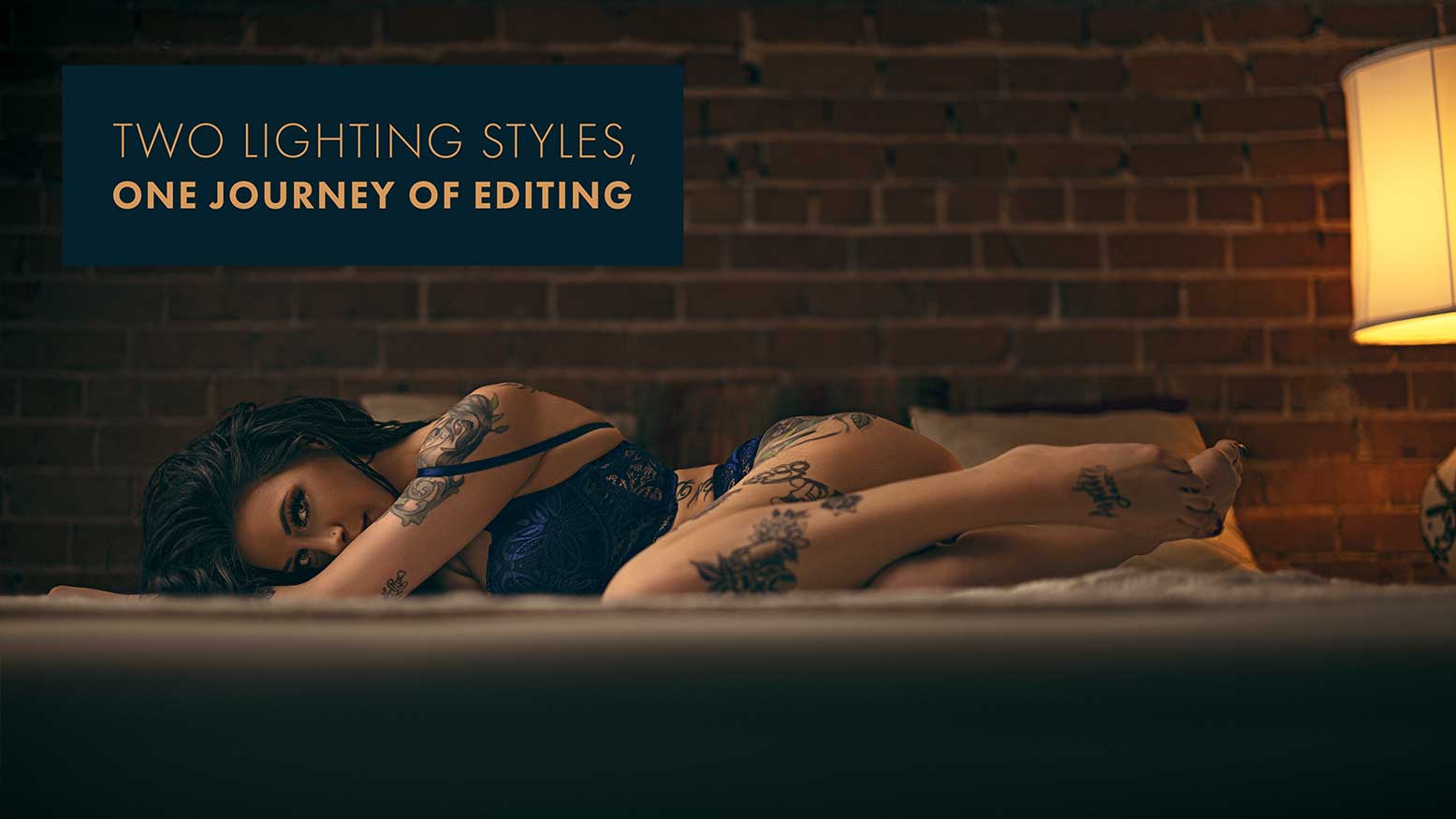
Two Lighting Styles, One Journey of Editing with David Byrd
Photography has so many disciplines to master if you want to move freely between lighting styles, composition, story, genres… It feels almost endless. That’s why it’s often recommended to focus on one genre of photography so you can master all of the elements that are typical to that genre. Creating artwork in Photoshop, however, is much, much easier because it’s simply a journey of asking yourself some questions about the art you want to see, and you can often use the image itself as your guide to answering those questions. Let’s start the journey today by looking at a recent boudoir image shot in natural light.
Adding Light to Natural Light
When it comes to editing natural light images in any digital photo editor, it is vital that you remember one major principle: It is always easier to add light than it is to take it away. Look, let’s just establish the obvious that you need to get a proper exposure to an image if you want to create some great artwork with it. Yes, raw files give us the option of bringing an image back from the depths of under/overexposure hell, but just because that is an option doesn’t mean you can’t drop your guard as a photographer.
It’s all about the data that is captured and what consequences you have to pay, depending on the exposure error. Either way, over/underexposing the data is going to be “damaged.” Meaning that it’s going to go through a significant transformation when you try to reduce or add more light to the image. The biggest area where this is noticeable is in the color data and subsequently is why overexposure is worse than underexposure. Reducing the light requires colors to be rebalanced and since they are overexposed, accurate color is virtually lost. Skin tones will be off, clothing, background elements, everything. However, when light is added to an underexposed image, the general consequence is seeing a lot of noise in the darkest parts of the image as you increase the exposure. That noise is filled with color data damage, but it’s generally minimal and can be cleverly hidden with attention to contrast.
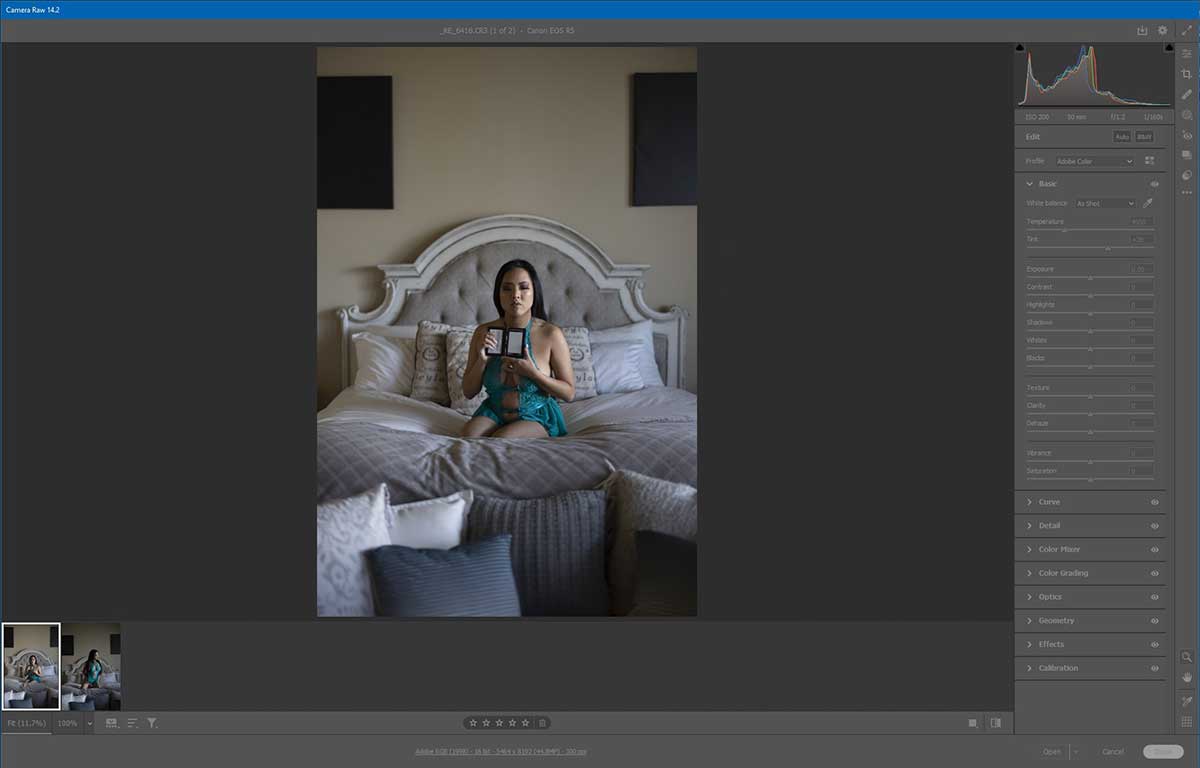
With that in mind, my recommendation is to always capture natural light just a touch underexposed, so you have good data to work with in Photoshop. Now let’s dive into the natural light image of Sarah and get to work. The image we’ll work on was captured with a Canon R5, the RF 50mm F1.2 prime lens, shot at ISO 200, f1.2 and a shutter speed of 1/160th of a second.
The first step I want to take with the image of Sarah is to get a proper white balance by sampling the gray card image I took before we began our series. In Adobe Camera Raw I will use the eyedropper tool to sample the gray card and establish a new white balance, which will also affect the color of the scene. It’s important to note that the original temperature of the color and the tint (before a proper white balance) are 4950 and +28 respectively.
After the white balance, the new values are 5300 and +25, which is adding a bit more of an orange/yellow tone to the colors and a little more magenta rather than green in tint.